Contents
DASHBOARD
Overview
Easily track relevant information with a consolidated collection of charts in a single location.
The Dashboard is a NetChart module that enables the creation of multiple charts in one centralized platform. It offers the flexibility to apply diverse parameters simultaneously, such as real-time aggregation based on distinct elements and various key performance indicators (KPIs), among others.
With its modern design, the Dashboard provides a comprehensive and well-structured overview of the KPIs crucial to your project.
How to use
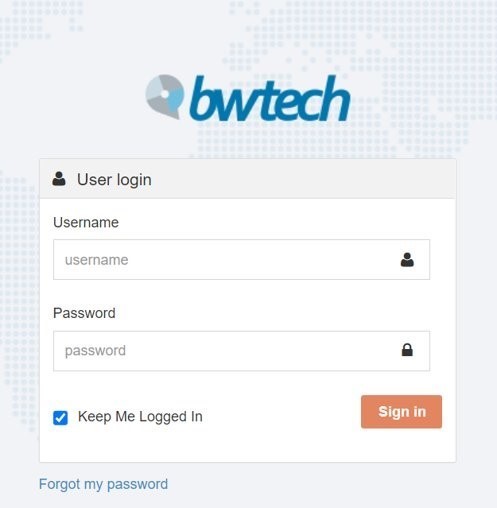
Log in to your NetChart account.
Create a dashboard
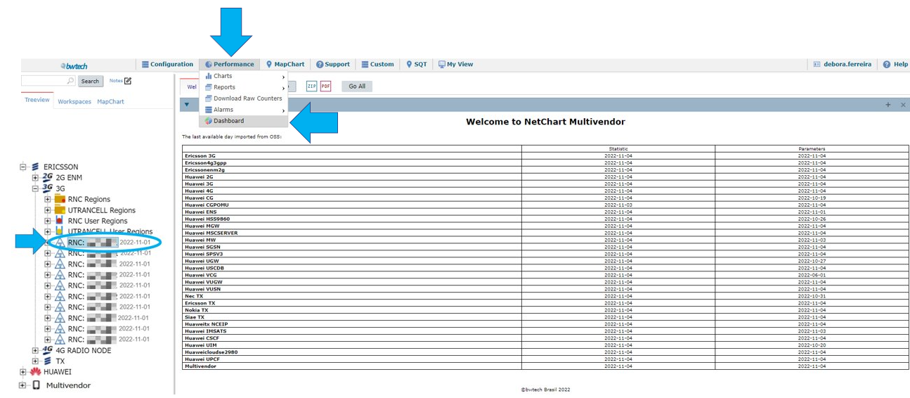
Select the desired vendor/tech and network element.
On the top menu, click on Performance > Dashboard.
Write a name for your dashboard.
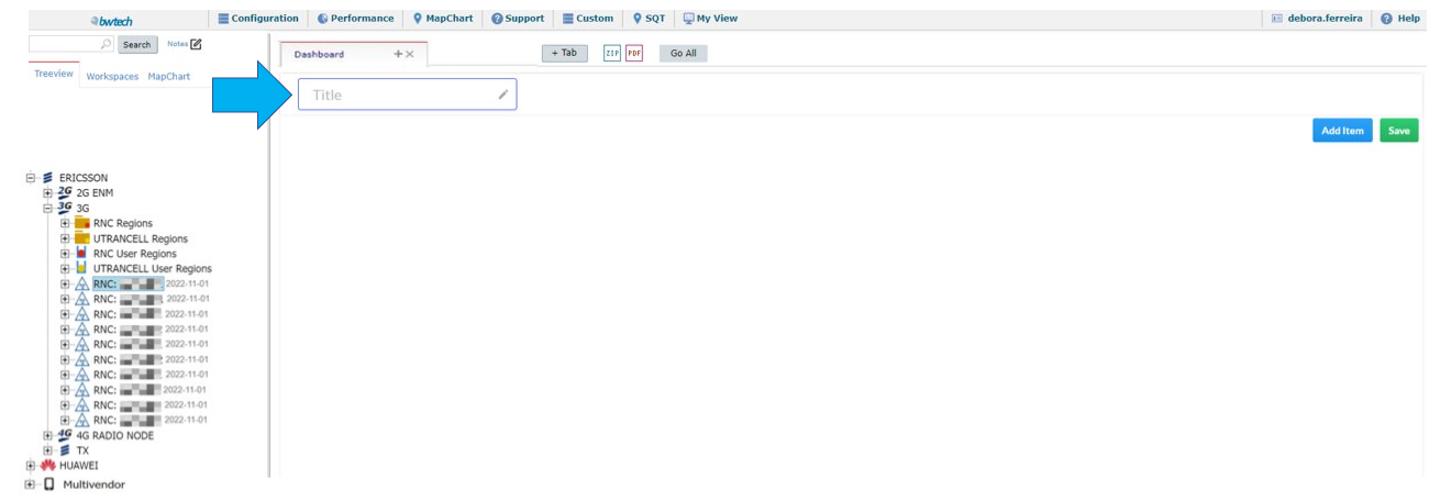
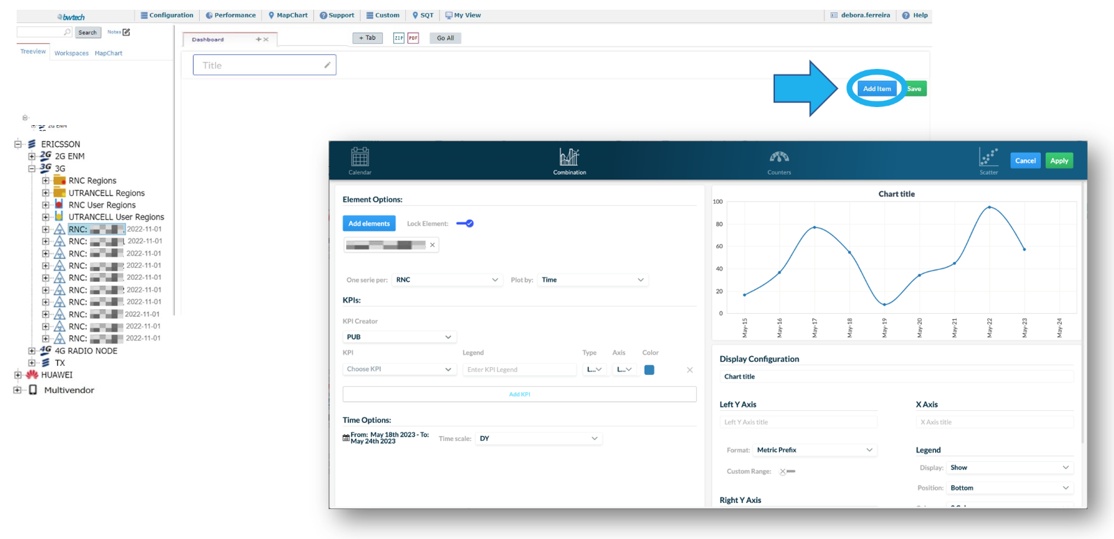
Click on Add Item to create a chart.
Use cases
Learn how to configure a chart for your dashboard.
Configure a chart
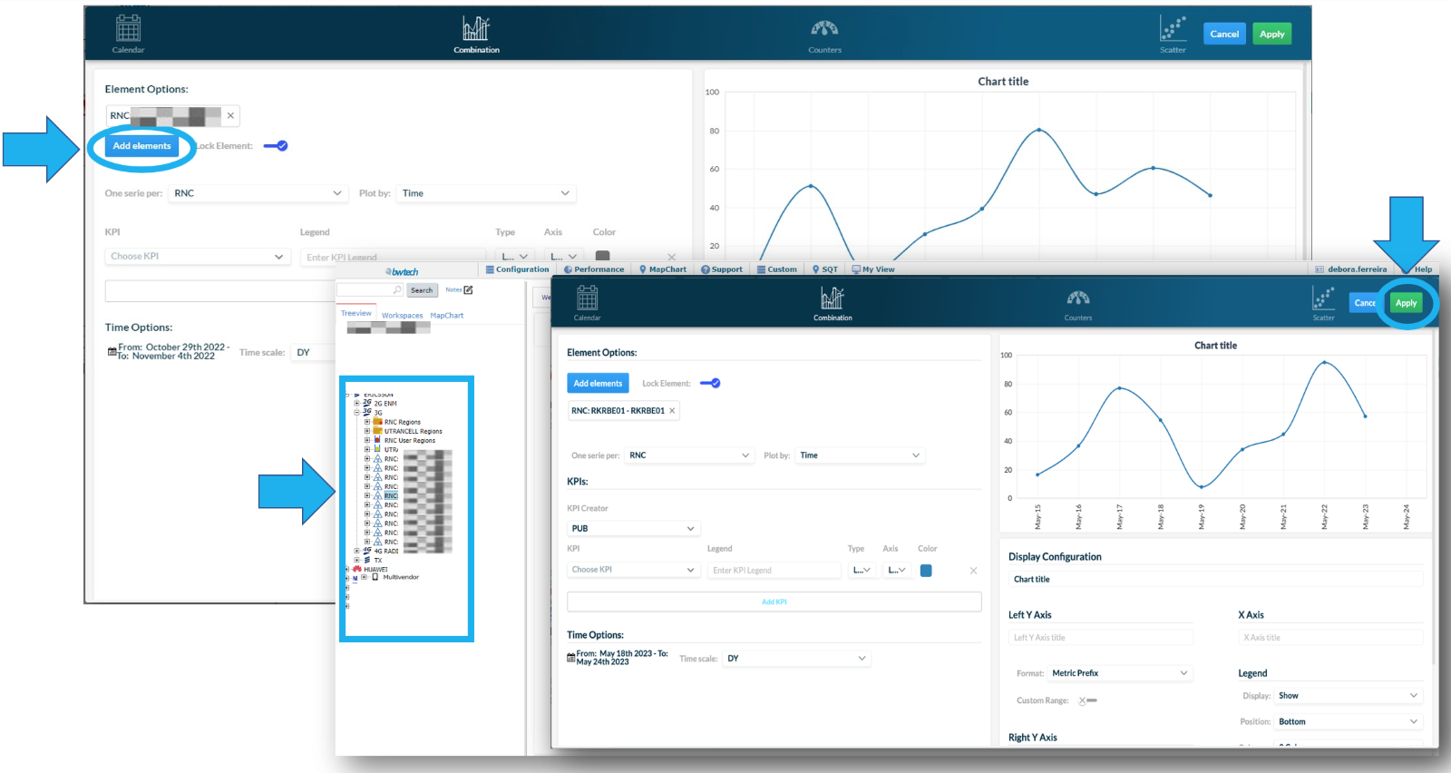
Click on Add elements. Then, select an element from the treeview and click on Apply.
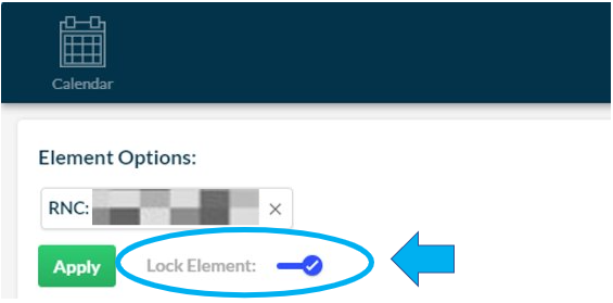
Enable the Lock Element button to guarantee that NetChart will always use the locked element when running your dashboard. This means that it will not consider the element that might be selected in the treeview at the time of the dashboard execution.
Choose a type of chart
There are four types of chart available.

A – Calendar
B – Combination
C – Counters
D – Scatter
Calendar type
Configure the Calendar chart following the instructions below:
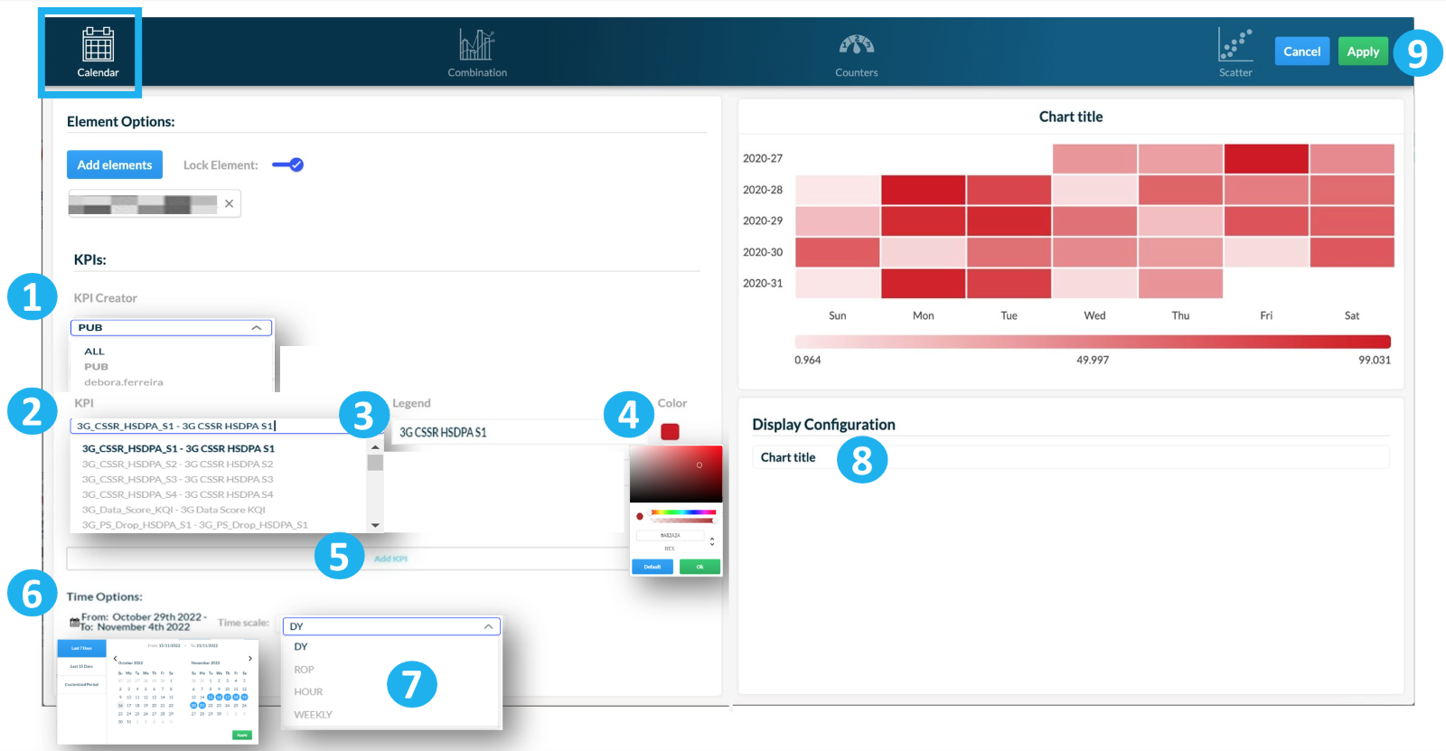
1 – Select KPI Creator to choose from a list of KPIs available. Select PUB to view all public KPIs, ALL to view all KPIs or select your username to view the KPIs created by you or that were shared with you.
2 – Choose the KPI from the list you previously selected.
3 – [Optional] Add a legend for the KPI. Use the automatically generated legend or write a personalized one.
4 – [Optional] Choose a color for the KPI and click on OK.
5 – Select Add KPI.
6 – Click on Time Options to select the period of time for which the chart will collect its data.
There are three options:
- Last 7 days
- Last 15 days
- Customized period. This option allows you to select the period you want to analyze.
Click on Apply.
7 – Choose the time aggregation of your chart.
8 – Write a title for your chart.
9 – Click on Apply to save the changes.
NOTE: Select only one KPI for the Calendar type chart.
Combination type
There are four types of Combination chart available.
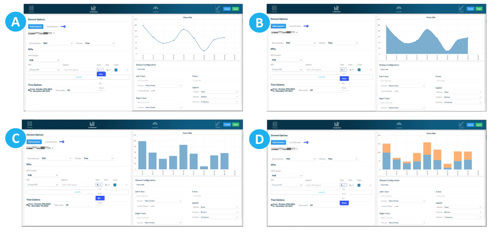
A – Line
B – Area
C – Bar
D – Stack
Configure the Combination chart following the instructions below:
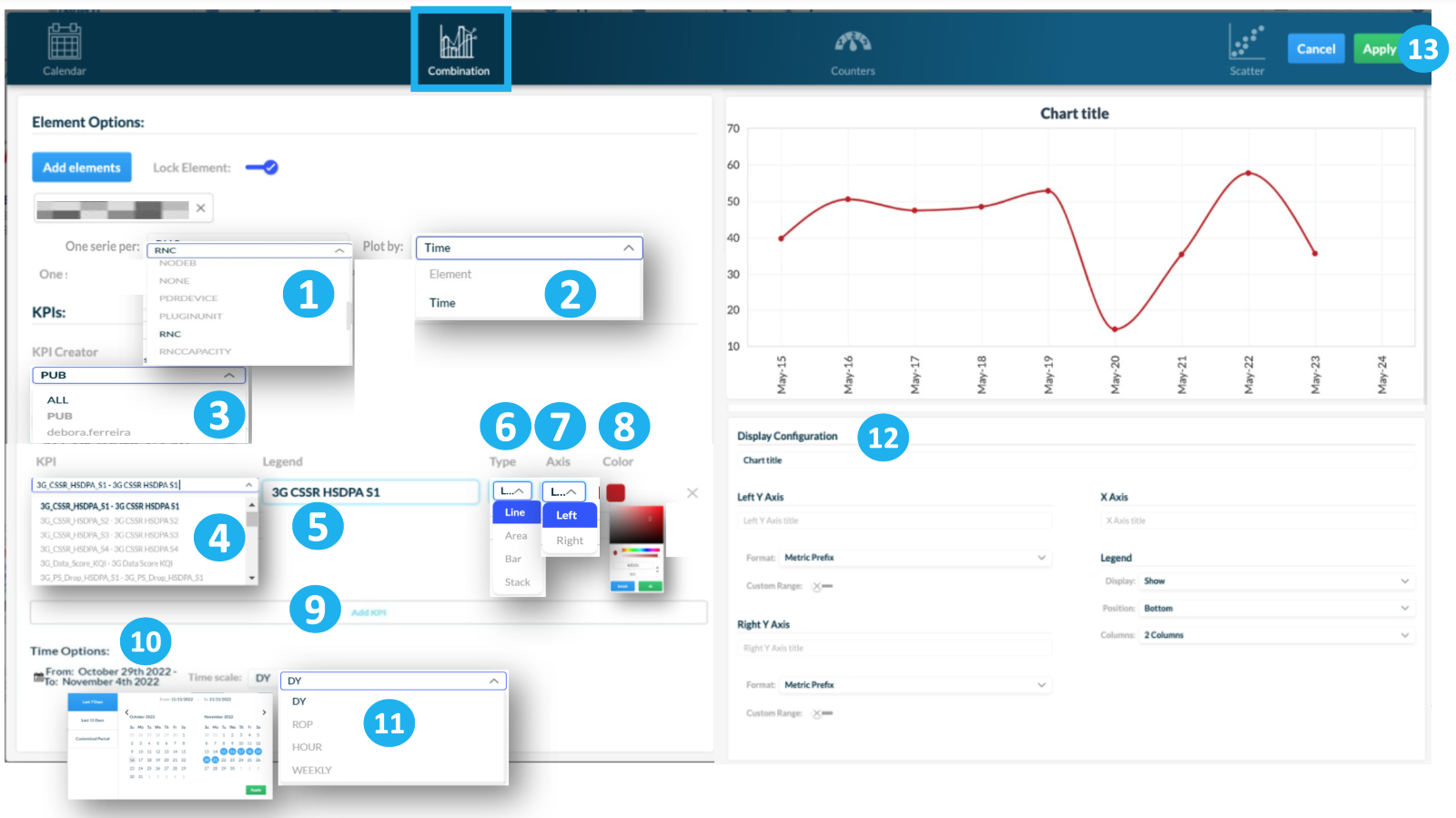
1 – Choose the element aggregation criteria.
2 – Plot the KPI value by element or time.
3 – Select KPI Creator to choose from a list of KPIs available. Select PUB to view all public KPIs, ALL to view all KPIs or select your username to view the KPIs created by you or that were shared with you.
4 – Choose the KPI from the list you previously selected.
5 – [Optional] Add a legend for the KPI. Use the automatically generated legend or write a personalized one.
6 –Choose a type of Combination chart: Line, Area, Bar or Stack.
7 – Choose the axis, left or right, in which the KPI will be shown.
8 – [Optional] Choose a color for the KPI and click on OK.
9 – Click on Add KPI.
10 – Click on Time Options to select the period of time for which the chart will collect its data.
There are three options:
- Last 7 days
- Last 15 days
- Customized period. This option allows you to select the period you want to analyze.
Click on Apply.
11 – Choose the time aggregation of your chart.
12 – Change the display configuration of your chart, such as:
- Its title.
- The X and Y-Axes’ names, formats and range.
- The legends.
13 – Click on Apply to save the changes.
NOTE: Repeat steps 3 through 7 to add more KPIs.
Counters type
There are two types of Counters chart.
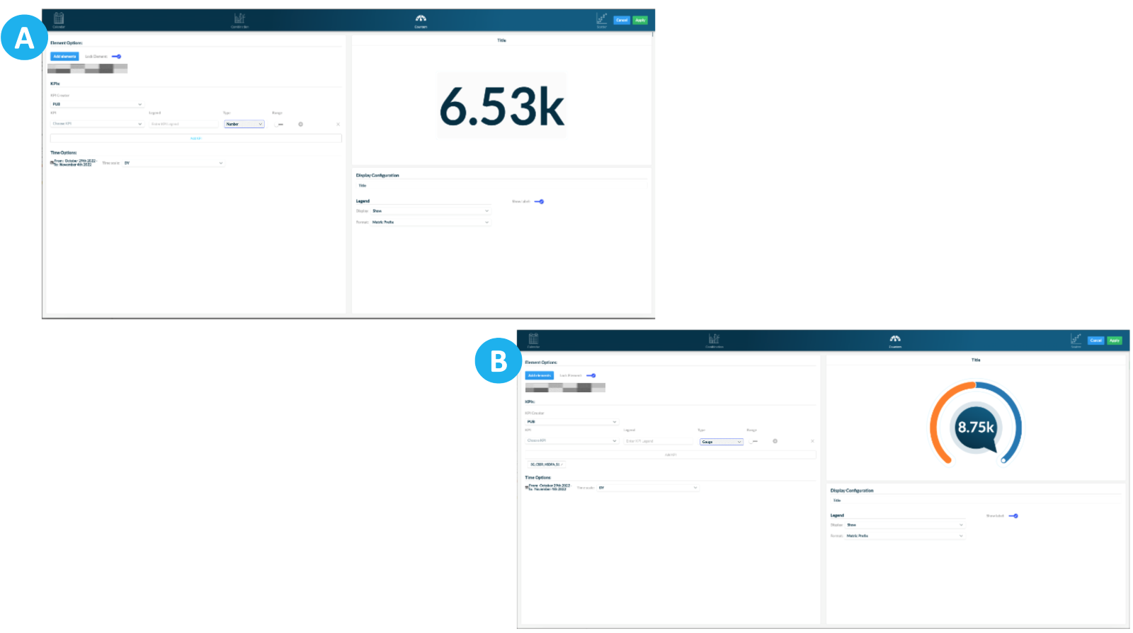
A – Number
B – Gauge
Configure the Counters chart following the instructions below:
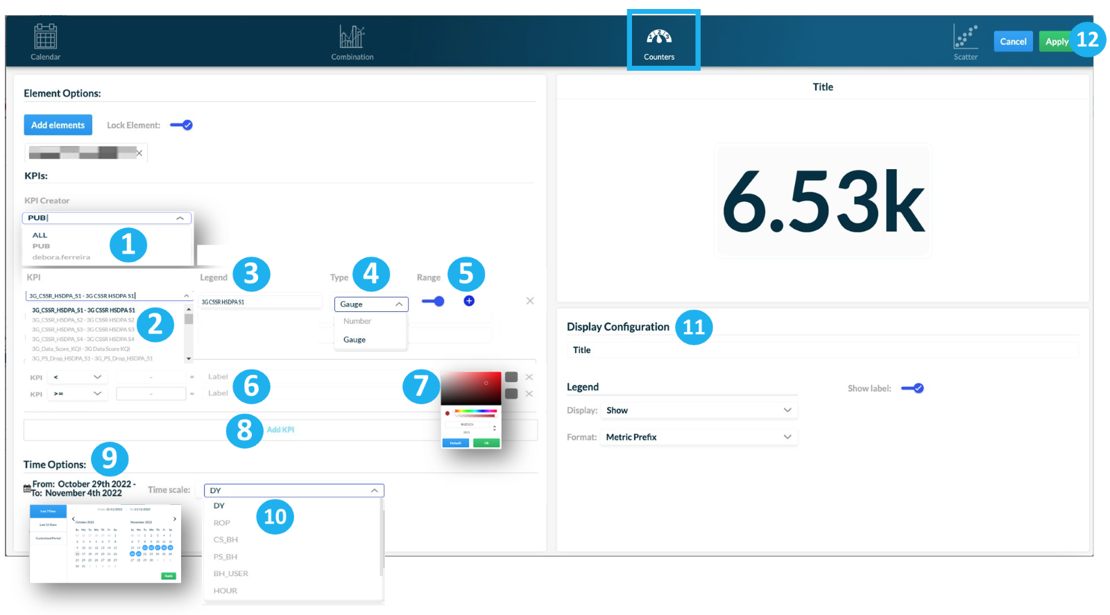
1 – Select KPI Creator to choose from a list of KPIs available. Select PUB to view all public KPIs, ALL to view all KPIs or select your username to view the KPIs created by you or that were shared with you.
2 – Choose the KPI from the list you previously selected.
3 – [Optional] Add a legend for the KPI. Use the automatically generated legend or write a personalized one.
4 – Choose a type of Counters chart: Number or Gauge.
5 – Activate or deactivate the range. Click on + to add more subranges.
6 – Configure the subranges’ threshold value and write an optional legend for each subrange.
7 – [Optional] Choose a color for each subrange and click on OK.
8 – Click on Add KPI.
9 – Click on Time Options to select the period of time for which the chart will collect its data.
There are three options:
- Last 7 days
- Last 15 days
- Customized period. This option allows you to select the period you want to analyze.
Click on Apply.
10 – Choose the time aggregation of your chart.
11 – Change the display configuration of your chart, such as:
- Its title.
- The legends: Hide or Show.
- The formats: Default, Metric Prefix or Decimals.
11 – Click on Apply to save the changes.
NOTE: Select only one KPI for the Counters type chart.
Scatter type
Configure the Scatter chart following the instructions below:
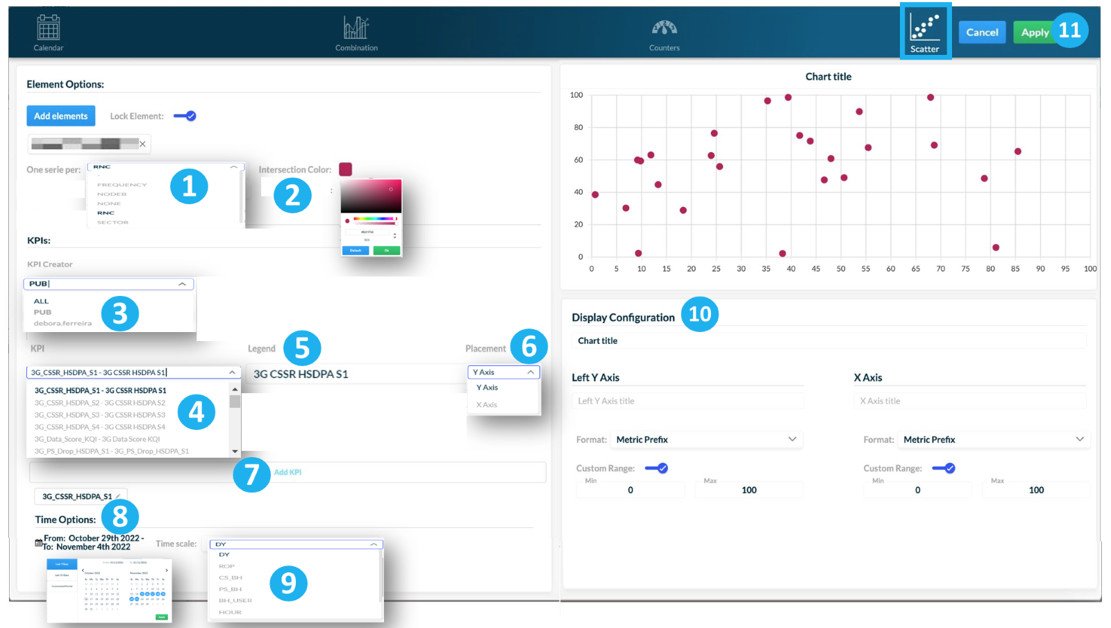
1 – Choose the element aggregation criteria.
2 – [Optional] Choose a color for the intersection.
3 –Select KPI Creator to choose from a list of KPIs available. Select PUB to view all public KPIs, ALL to view all KPIs or select your username to view the KPIs created by you or that were shared with you.
4 – Choose the KPI from the list you previously selected.
5 –[Optional] Add a legend for the KPI. Use the automatically generated legend or write a personalized one.
6 – Choose a placement for the KPI in the chart: Y or X axis.
7 – Click on Add KPI.
NOTE: Repeat steps 2 through 5 to add the next KPI. Choose different axes, X or Y, for each KPI.
8 – [Optional] Choose a color for the intersection.
9 – Click on Time Options to select the period of time for which the chart will collect its data.
There are three options:
- Last 7 days
- Last 15 days
- Customized period. This option allows you to select the period you want to analyze.
Click on Apply.
10 – Choose the time aggregation of your chart.
11 – Change the display configuration of your chart, such as:
- Its title.
- The X and Y-Axes’ names, formats and range.
12 – Click on Apply to save the changes.
Save and run the dashboard
View the chart on your dashboard.
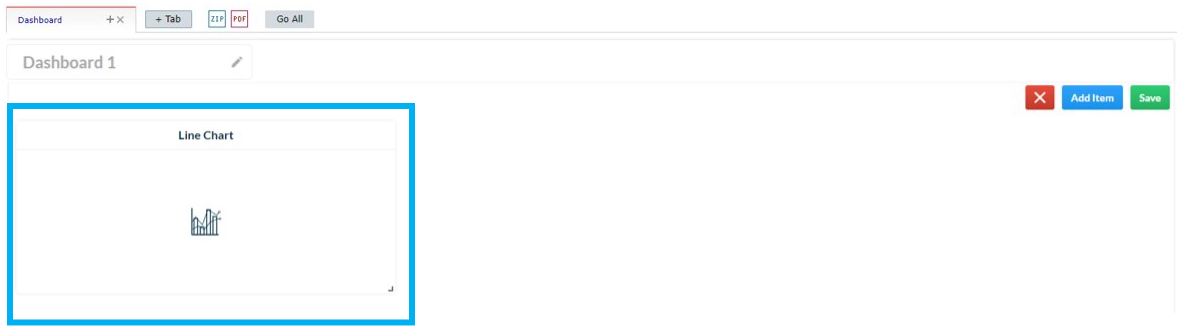
Click on Save.
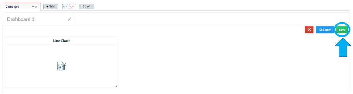
Click on I understand to view where the dashboard was saved.
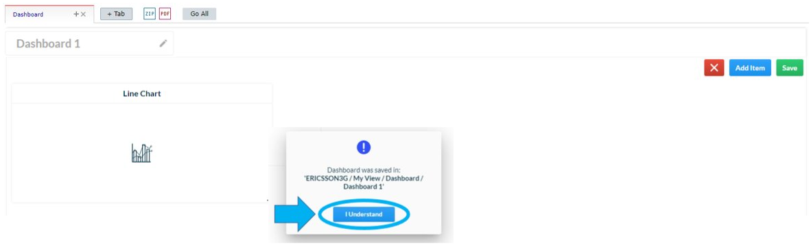
The message “Successfully saved in…” informs where your dashboard was saved.

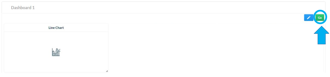
Click on Go to run all charts in your dashboard.
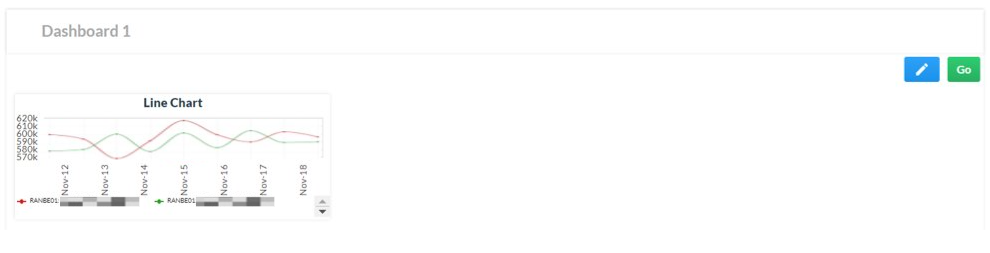
Your new chart is ready.
Add more charts and customize your dashboard.
Go to My View > Dashboards and click on the dashboard you created.

Click on Edit > Add Item to add more charts to your dashboard.
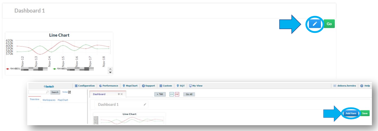
Follow the procedures described above to configure your new charts.
Configure your dashboard
Learn how to configure your dashboard.
Customize your dashboard
This feature allows for the customization of the dashboard such as moving the charts throughout the page, enlarging or reducing their size and getting detailed information about a specific point of a chart.
View some examples of different dashboards customized by users:
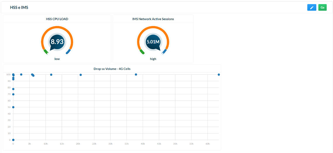
Example 1 – HSS and IMS
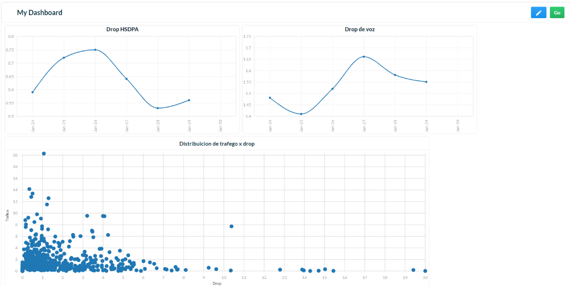
Example 2 – Drop
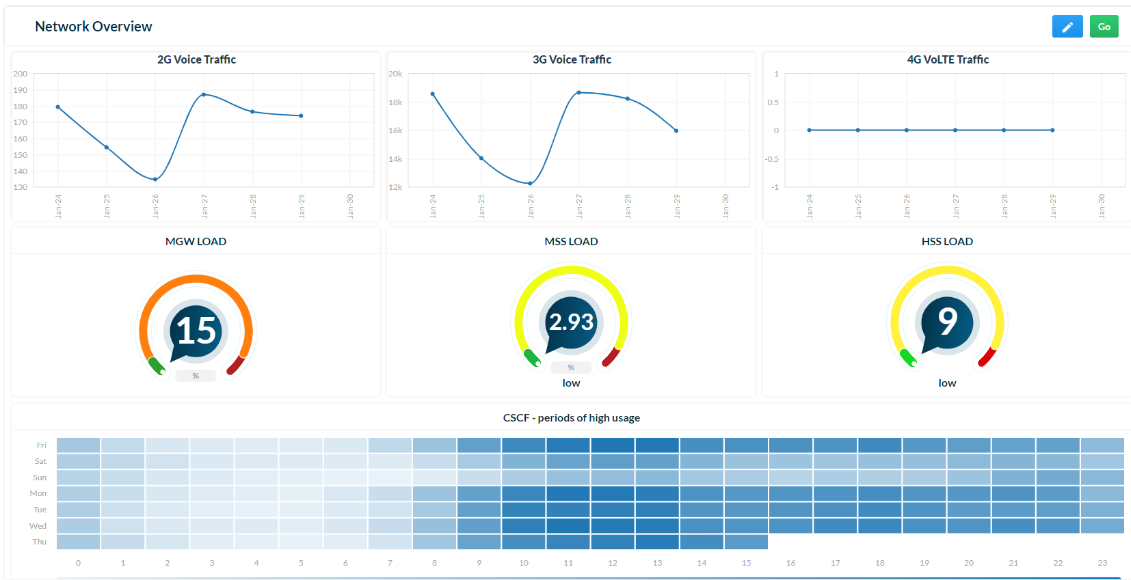
Example 3 – Network overview
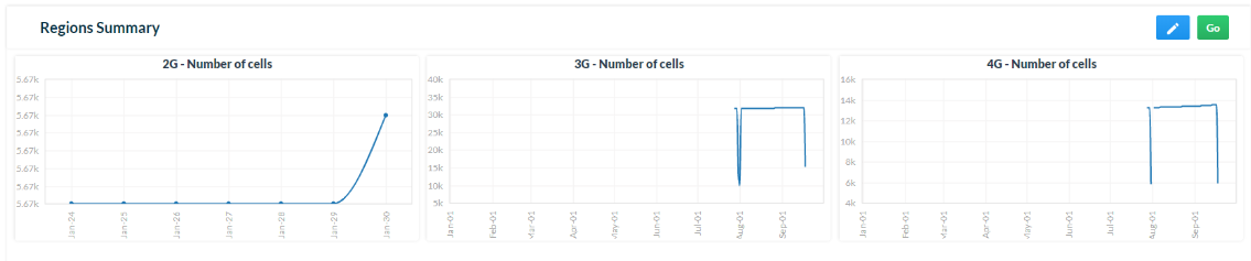
Example 4 – Regions Summary
Resize the chart
To enlarge or reduce the size of your chart(s), click on Edit. Then, click on the Expand button on the bottom left corner of the chart to enlarge or reduce its size. Use the mouse to adjust the chart’s size.
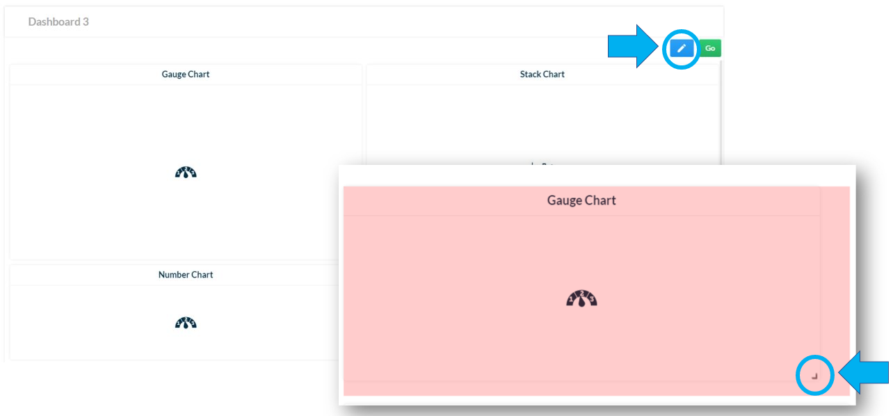
Click on Save to keep the changes made.

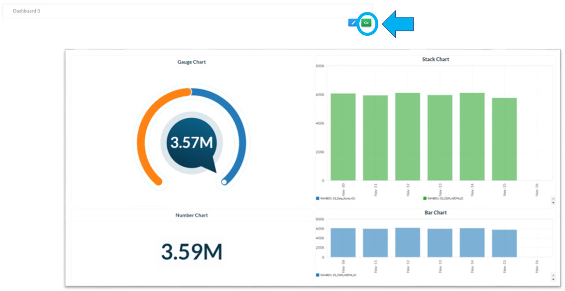
Click on Go to view how your dashboard looks.
Zoom in/out
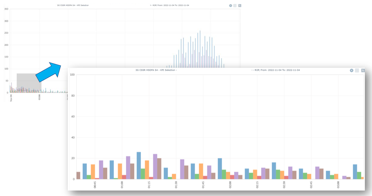
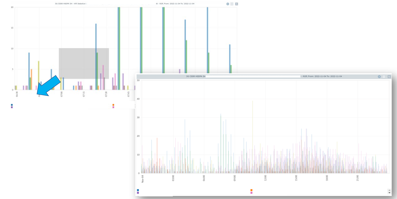
Zoom in or zoom out the data of your charts for better visualization.
To zoom in, select the desired area, hold the mouse’s left button and drag the cursor to the right.
To zoom out, select the desired area, hold the mouse’s left button and drag the cursor to the left.
Drill down
Obtain more detailed information about a specific point of a chart.
By double-clicking on the chart, NetChart opens a new tab with the same chart on the KPI Selection chart module, where you can perform the drill down.
View the example below:
Double-click on the chart with two KPIs for a specific RNC.
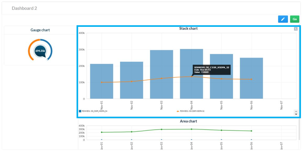
Double-click on the point for which you want to obtain more details. In the case below, the point was a specific day. View the new slot showing details of the value for the two KPIs on the selected day for each NodeB that belonged to the selected RNC.
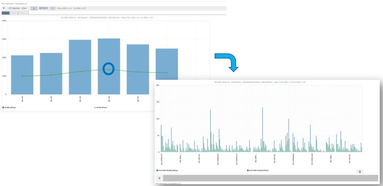
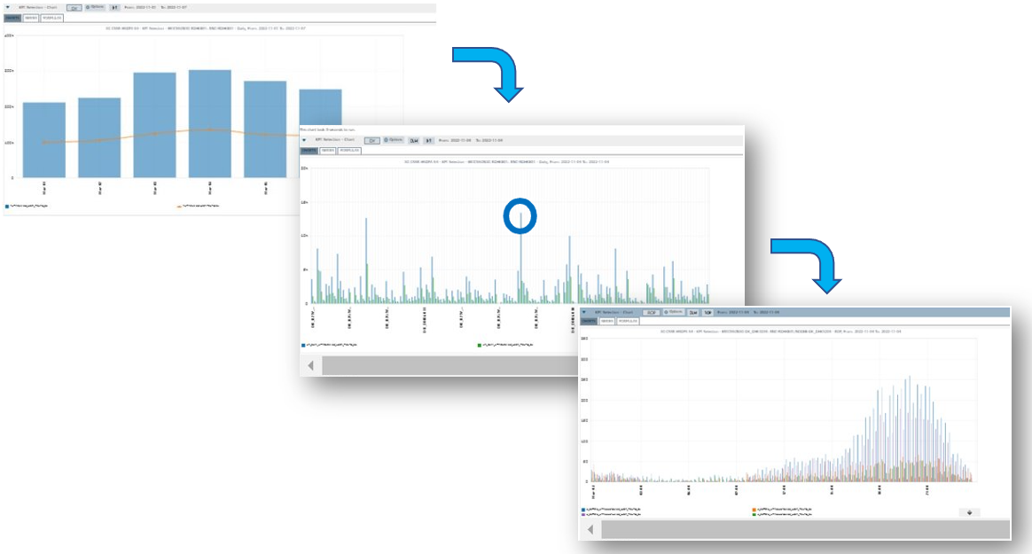
If needed, double-click on another specific point of the new chart.
NetChart will perform the next level of drill down, creating and running another chart which displays the KPI ROP values, now grouped by cells.
Observe the example below:
Edit a chart
Make changes to the charts you have created.
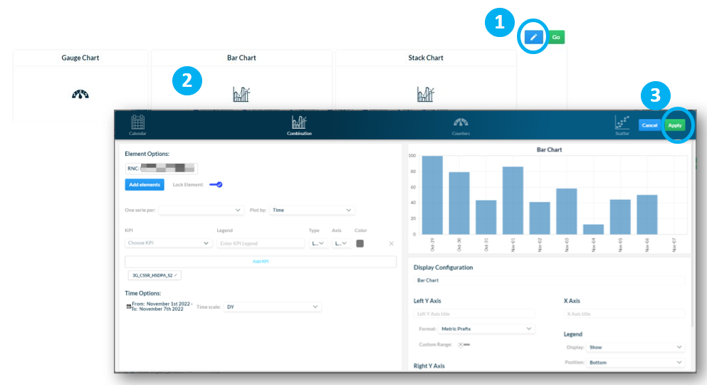
1 – Click on Edit on the upper right-hand side of the page.
2– Click on the chart you want to edit.
3– Make the changes and click on Apply.
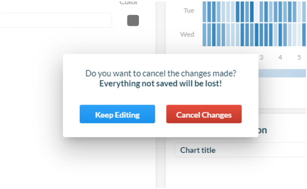
To cancel the changes made, click on Cancel and confirm it by clicking on Cancel Changes or refuse the cancelation by clicking on Keep Editing.
Delete a chart
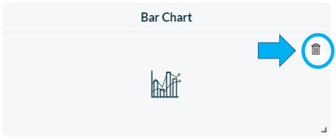
Hover the mouse over the chart you want to delete. Click on the Trash Bin icon on the upper right-hand side of the chart.
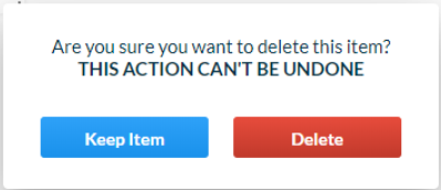
Click on Delete to proceed or Keep item in case you prefer to not delete the chart.
Delete a dashboard
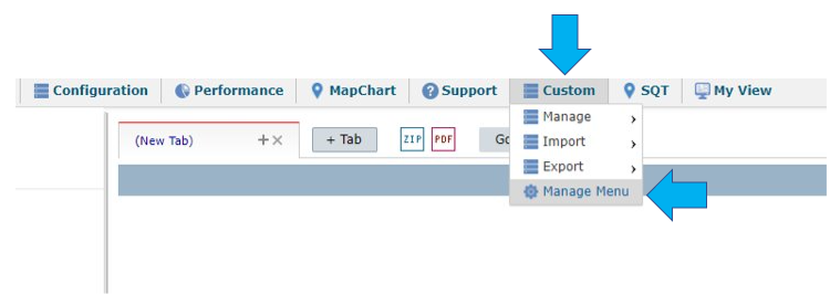
To delete a dashboard you have created, go to the top menu and click on Custom > Manage Menu.
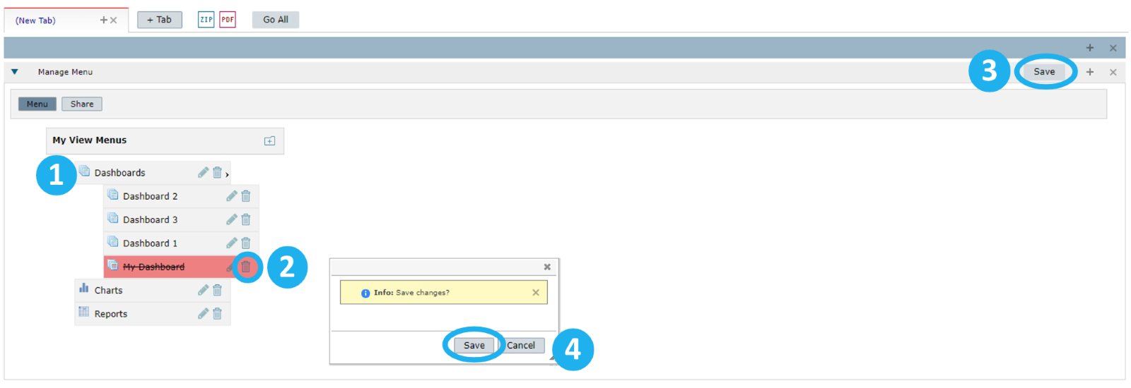
1 – Click on Dashboards.
2 –Find the dashboard you want to delete and click on the Trash Bin icon next to its name.
3 – Click on Save.
4 –In the dialog box, click on Save to proceed or Cancel to give up on the action.
Notice that once you delete a dashboard, it no longer appears in your list of dashboards.
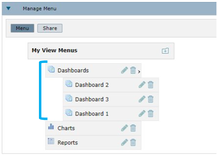
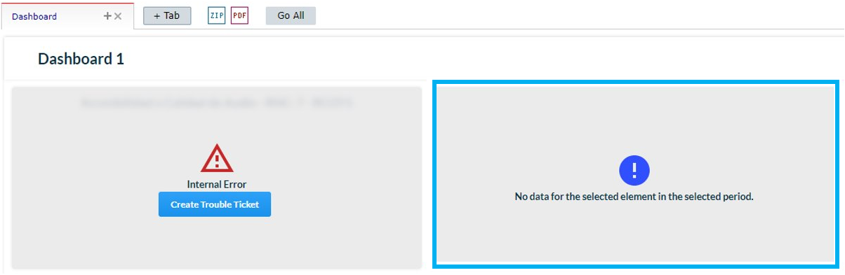
Common errors
- Using a non-existing combination of KPI and element.
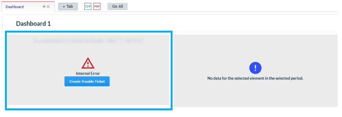
- Selecting a time period for which there is no data available for that type of chart or KPI.