Contents
SERVICE QUALITY TRACKER (SQT) MODULE
OVERVIEW
NetChart SQT is a monitoring and analysis tool for the network service. The module allows the configuration of multiple KPIs and KQIs for all the different network domains: RAN, Core and Transmission. This means that the service monitoring happens for all the network and not only for its elements.
This end-to-end focus allows SQT to handle all those domains’ correlations complexities. So, it brings the capacity to make end-to-end analysis organized by geographical regions.
With a modern interface that is simple to use, SQT is focused on map visualization, allowing the comparison between data from different domains simultaneously.
About KQIs
A KQI is a Key Quality Indicator that is responsible for describing the quality of a service through parameters that are experienced by the customer. So, the use of KQIs allows the user to have a better understanding of the network as it is seen by the customer.
While KPIs are mainly technical and specific indicators of the various parts of the network, the KQIs are the ones that cover the whole network quality, taking into consideration all domains (RAN, Core or Transmission).
Some of the most used KQIs are:
- Accessibility
- Retainability
- Availability
HOW TO USE
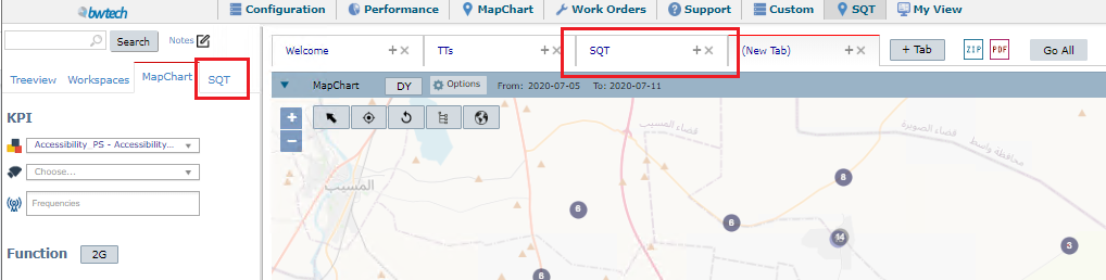
First, on the NetChart’s top menu, click on the SQT option.
![]()
Then, a new tab will appear on the interface.

Then, the user can choose the date interval he wants to monitor by clicking on the “From” and “To” slots that are available on the SQT header.
![]()
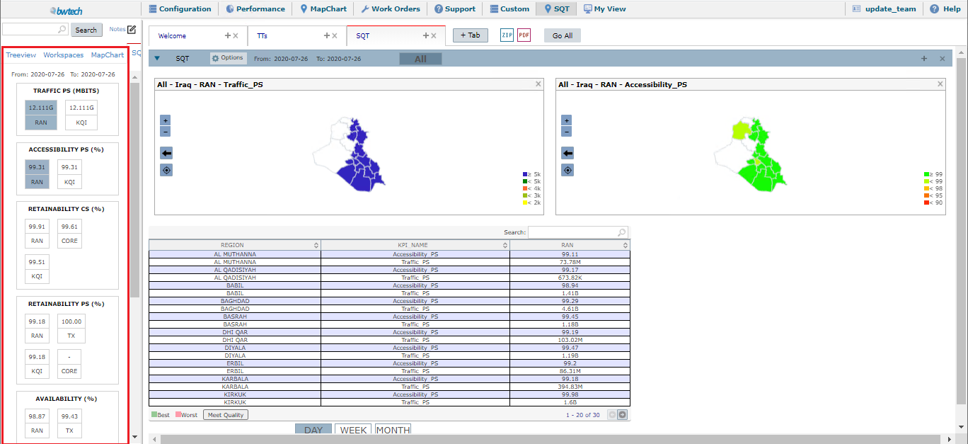
After that, on the left panel of SQT’s interface, he will see the KPIs available and their value by tech type.
Through this panel, the user can set the needed configurations.
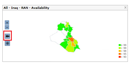
And, on the right panel, for each KPI value selected, a map will appear colored with the KPI results for each region.

There, the user can navigate through map levels (Country, State and City) by clicking twice on the desired region.
Also, when the user selects any KPI in the left panel, the system will show a table with information on the chosen option on the bottom of the interface.

Below the table, the user has the possibility to choose the date aggregation mode (day, week, month).

To know more about a specific KPI, the user can click on the table line with the chosen element and a chart will appear on the right side.


This can also happen when the user clicks with the mouse’s left button on a specific region on the map.
FUNCTIONS DESCRIPTION
Maps comparison
Through the KPI panel, the user can select more than one KPI or group. When this happens, the left panel will show a map for each selection.
This way, the user will be able to compare visually the data for the chosen KPIs.
Configuration
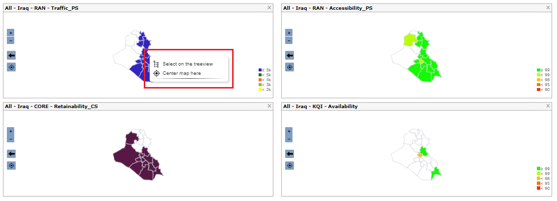
When clicking with the mouse’s right button on any region of the map, the user will see a menu. There, he can choose to select that element on the treeview (here, the treeview with the chosen element will appear on the left panel) or to center the map visualization in the selected region.
Zooming option
The user can also zoom in and out of the maps by using the mouse scroll or the + and – buttons that appear on the left side of the map.
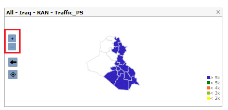
All the maps shown in the panel will be affected simultaneously.
Drill down
There is also the possibility for the user to drill down from Country to State and finally to any City. The KPIs and thresholds (colors) will be automatically calculated to represent the KPIs on that particular level.
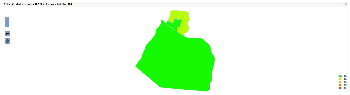
District level
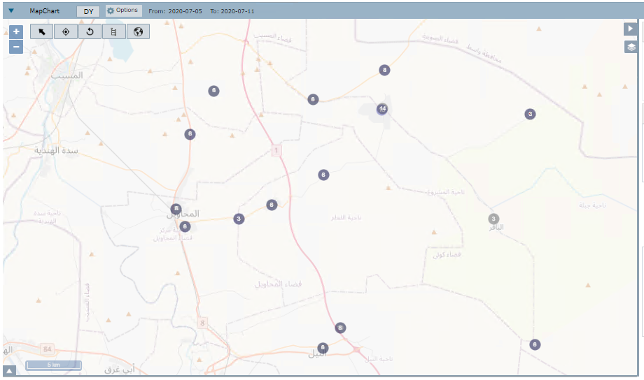
Selected district cell level
The last level will be the transmission links.
![]()
Transmission links
When the user drills down to the district’s cell level, the system will open a new tab with the MapChart interface. To return to the SQT module, the user only needs to click on the SQT tab.
Inside the SQT tab, to return to the previous level, the user can click on the arrow button on the left side of the map.
COMMON ERRORS
Choosing the Day Picking button on the system’s date options to select different days. SQT only shows data from a specific month, week or day.