Contents
KPI SELECTION – REPORTS
OVERVIEW
Easily manage your network performances with NetChart’s reports.
Define the KPI, the period to be analyzed, and how to group the results. Explore data through charts and view formulas’ details.
How to use
Log in to your NetChart account.
KPI Selection
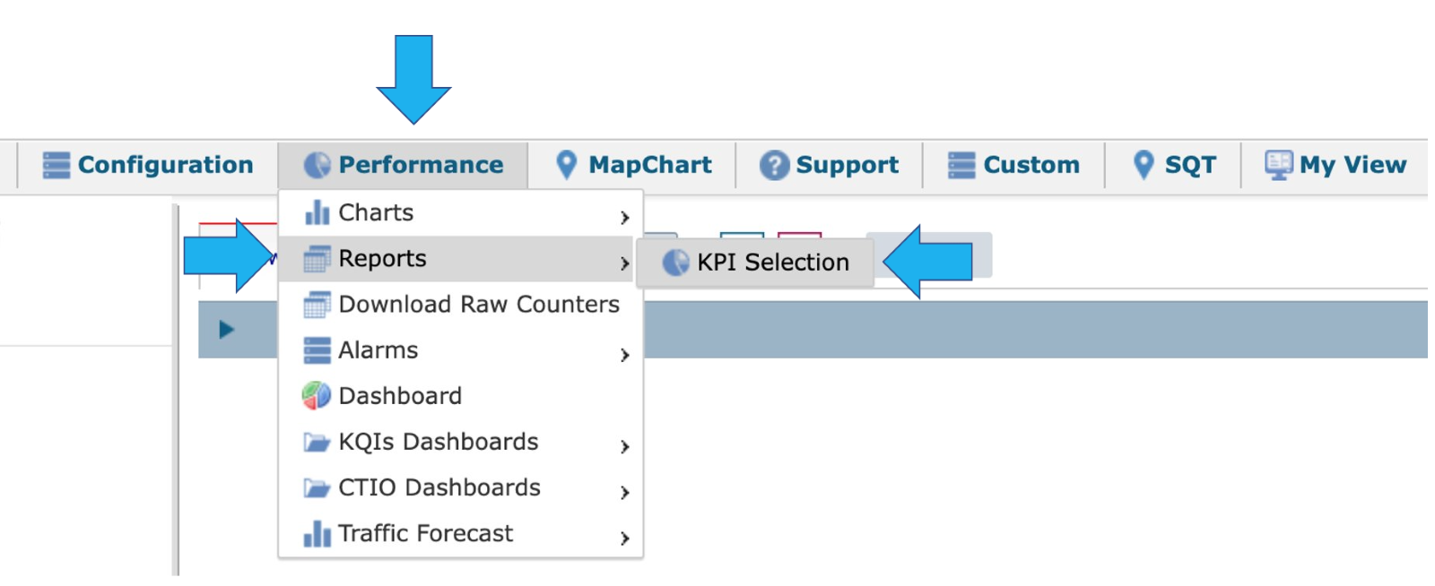
To start selecting the KPI, select Performance > Report > KPI Selection.
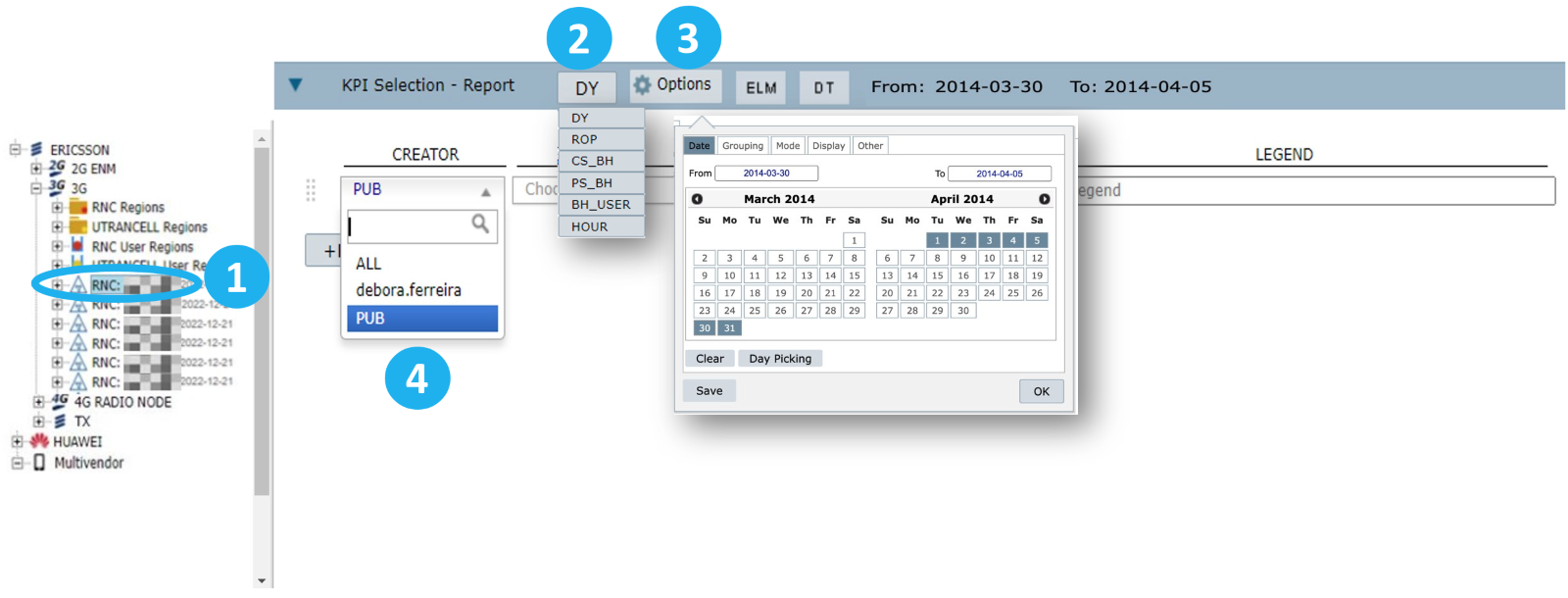
1 – Select an element in the treeview.
2 – Select the time aggregation to be used in the report. The options include:
DY: Daily exports the ROP/HOUR data for an entire day and aggregates it on a daily basis at all network levels.
BH: Busy hour refers to the hour with the greatest traffic of the day at the cell level.
BHRNC: This option considers the busy hour at the RNC level.
BHCS: Busy Hour Circuit Switched refers to the hour with the greatest traffic of the day at the cell level.
BHPS: Busy Hour Packet Switched refers to the hour with the greatest traffic of the day at the cell level.
ROP: Result Of the Period or the minimum aggregation in OSS at all network levels.
HOUR: Refers to the ROP data aggregated by the hour at all network levels.
DY0622: Similar to the Busy Hour concept, it considers the total data from 6 AM to 10 PM. This time interval can change depending on the project, and it is possible to customize other aggregations at cell level.
3 – Select the report’s options, such as Date, Grouping by time and elements, Mode and Other.
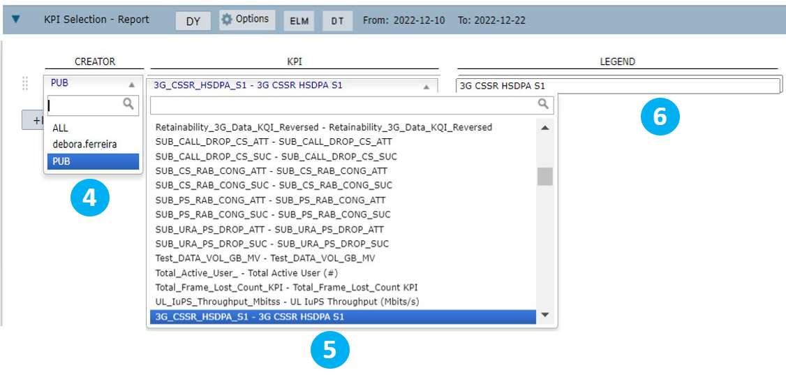
4 – Select Creator to choose from a list of KPIs or counters available. Select PUB to view all public KPIs, ALL to view all KPIs or select your username to view the KPIs created by you or that were shared with you.
5 – View the list of KPIs. To search for specific KPIs, type their names in this field.
6 – The legend of the KPI is its name. It is possible to edit it according to your preferences or analysis.
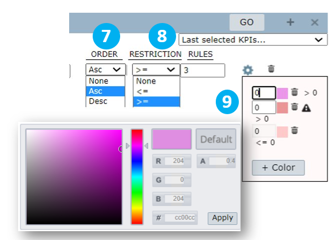
7 – Order the results by ascending, descending, or none.
8 – Apply restrictions to filter report results according to rules and restrictions.
Example: Write >= in the Restriction field and 3 in the Rules field to view values that are greater or equal to 3 when there’s a KPI drop.
9 – Select Color to choose a color for the KPI in the report.
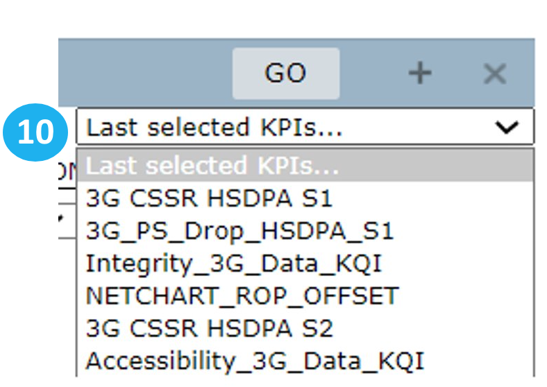
10 – Select Last selected KPIs to view a list of the last selected KPIs that were saved.
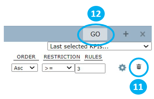
11 – Select the Trash bin icon to clear the series.
12 – Select GO to run the report.
NOTE: When selecting BH as the time aggregation, NetChart uses a predefined formula that aggregates the hour with greatest traffic of the day. The aggregation occurs at the cell level and cannot be used to check for site level.
Options
Select Options to define the chart’s settings.

Date tab
In this tab, consider the set aggregation, ROP, DY, BH, etc., to select the number of days the chart will exhibit.
(Learn more in the Grouping tab section of this document)
Select the desired days on the calendar by clicking on the first and the last day. The period between them is selected automatically.
You can also write the time interval in the fields From and To.
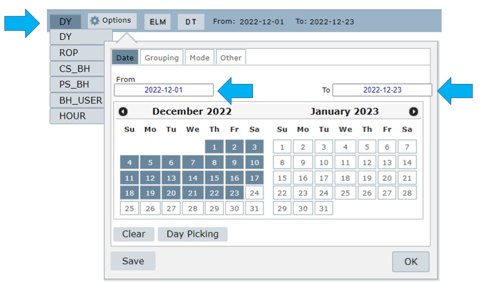
Select:
- Clear to clear the dates selected.
- Clear > Weekends to clear all the weekends in the timeframe selected.
- Clear > Holidays to clear all the holidays in the timeframe selected.
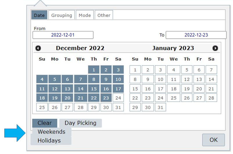
Select Day Picking to manually choose the desired dates.
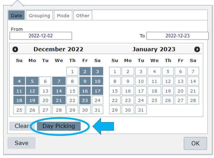
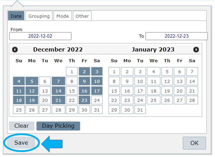
Select Save to save this configuration as a menu in Custom >Manage > Report.
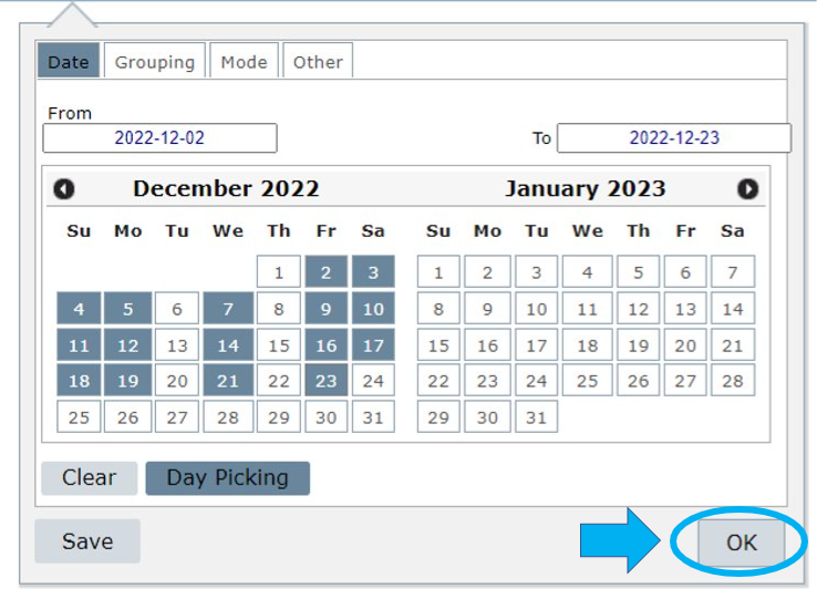
Select OK to apply the settings to the current report.
Grouping tab
Select Grouping to choose the KPI Aggregation level for the consultation.
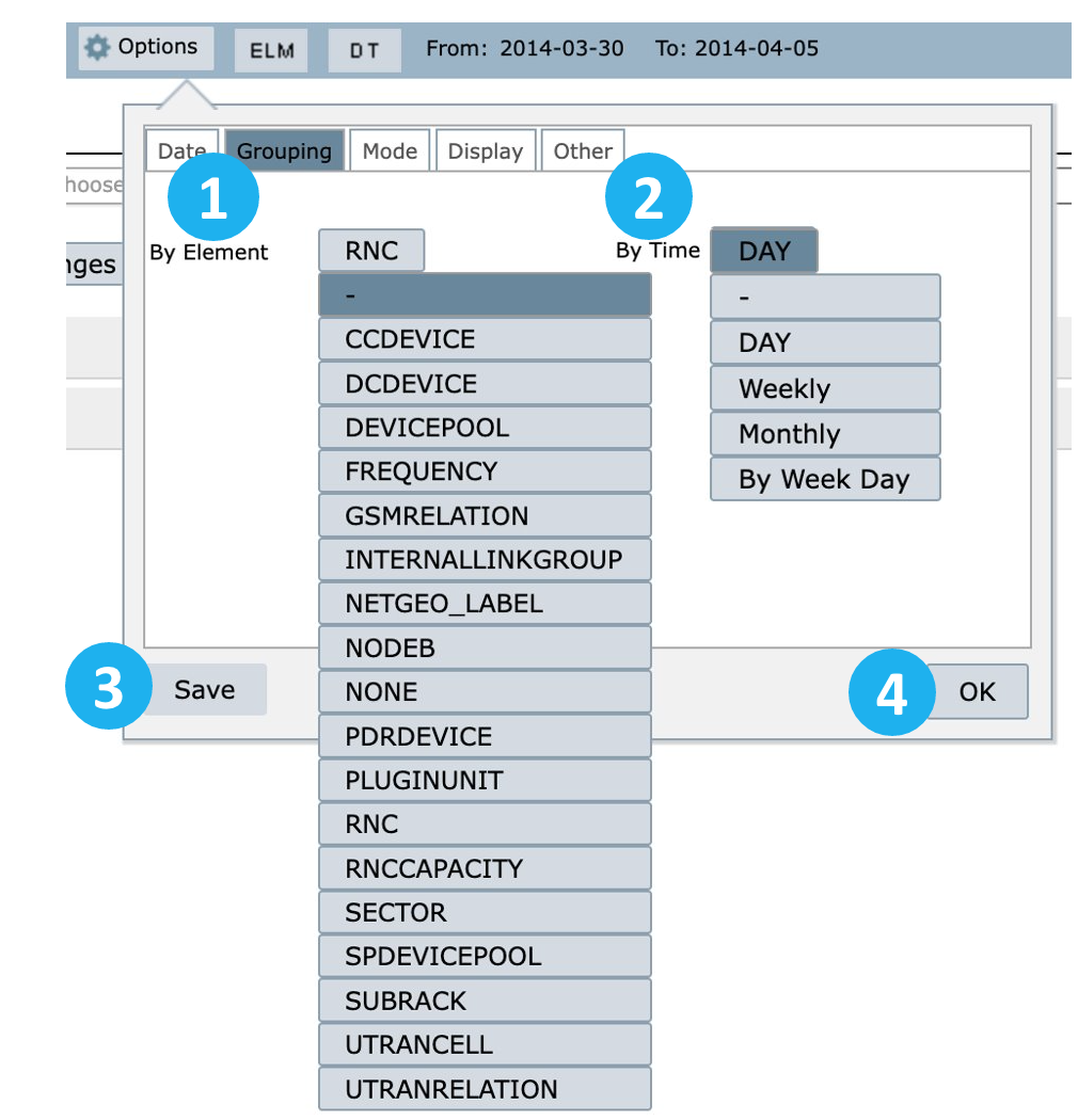
Group results by element or time
1 – Element: group results by element level such as cell, site, controller level, etc.
2 – Time:
Day/ROP: group results by the selected time aggregation, such as DY, BH, HOUR, ROP, etc., generating an outcome for each time aggregation within the selected range.
Weekly: group results by week. Choose the day on which the week will start. The results cover the whole week. For example, if you set the first weekday as Sunday, it will use the data until the next Sunday.
Monthly: group the results monthly relative to the months selected in Date.
This means that if you select, for example, March 15th, NetChart will consider the whole month of March, from the 1st to the 31st. Or if you select March 15th until April 02nd, NetChart will return results for the entire months of March and April.
Week Day: Activate this option to group the results to compare the same weekday in different weeks.
3 – Select Save to save the desired configuration in the menu My View.
4 – Select OKto use this configuration when running a report.
Mode tab
Select Mode to view the following options:
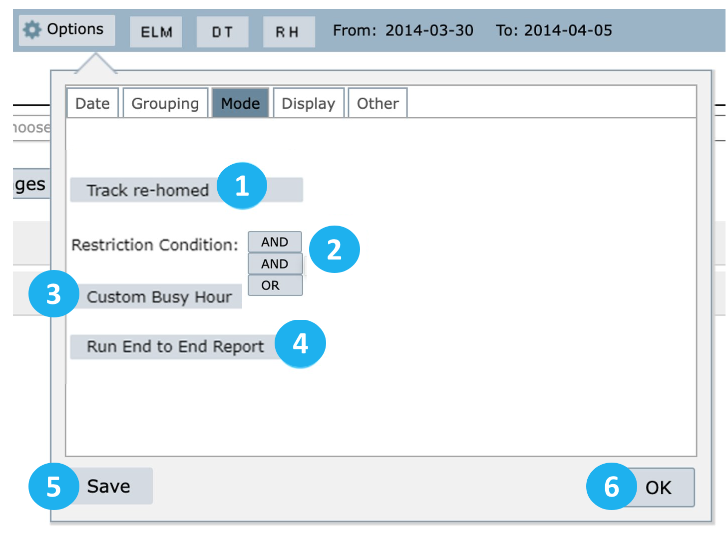
1 – Track re-homed: this option allows using data from the previous host controller and the current one (after re-homed). It will use both data in the same chart/report.
2 – Restriction Condition: define the operation when using multiple KPI restrictions.
3 – Custom Busy Hour: when selected, choose a KPI and an element to be considered in the Custom Busy Hour calculations. The results will consider the maximum value of the selected KPI for the selected element. For example, in the image below, the BH will be the highest value of the KPI ACC_RAB_HSDPA for the RNC-ULA-N element.
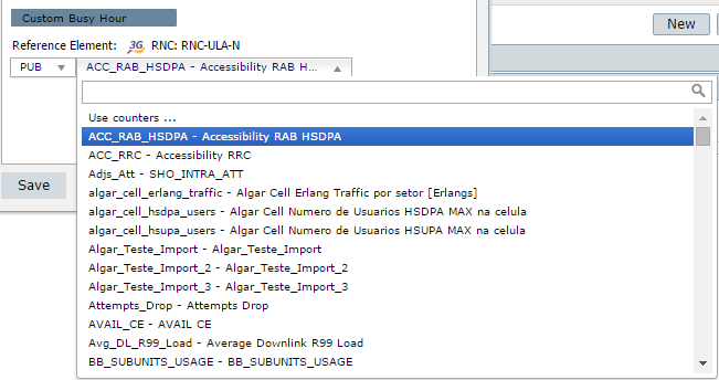
NOTE: The Custom Busy Hour uses ROP as a reference and works for analyses at any network level.
4 – Run End to End Report: This option is only available for projects with other networks besides RAN (e.g., Core and TX).
5 – Select Save to save these settings for a future report in the menu My View.
6 – Select OK to apply the settings to the current report.
Display tab
Select Display to configure the chart’s appearance.
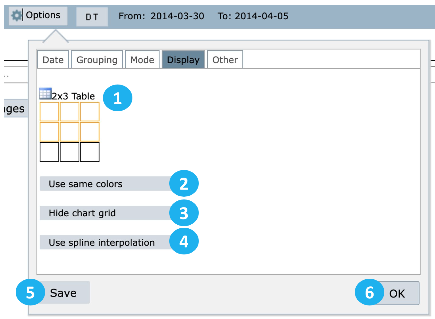
1 – Define the chart’s size by selecting the squares.
2 – Use same colors: use this option so that the same series has the same colors for different elements.
3 – Hide chart grid: use this option to hide the chart grid.
4 – Use spline interpolation: use this option to soften the peaks and valleys of the chart.
5 – Select Save to save these settings for a future report in the menu My View.
6 – Select OK to apply these settings to the current report.
Other tab
Select Other to perform actions such as:
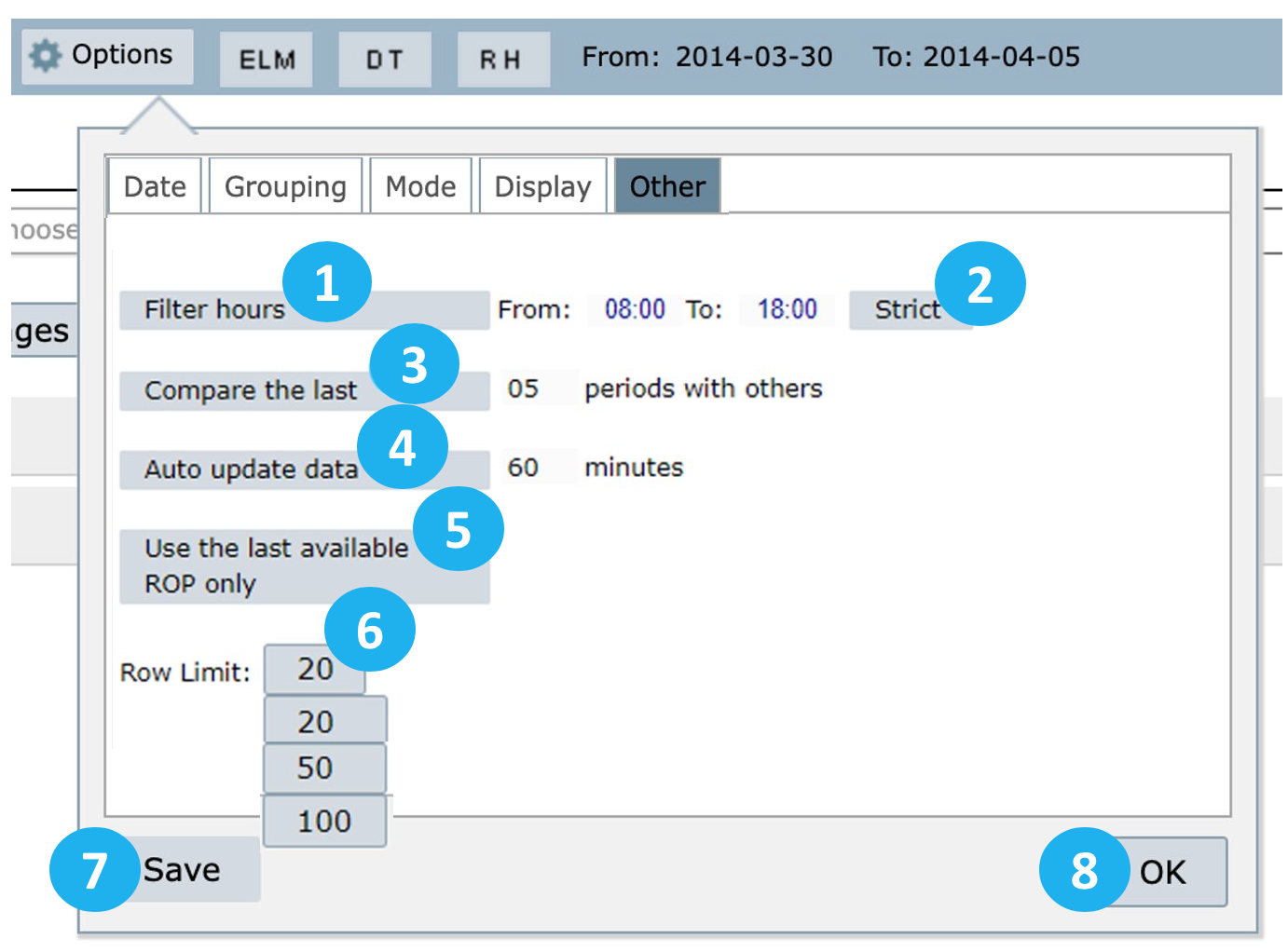
1 – Filter hours: it filters a specific period for each configured day, for example:
From 08:00 to 18:00 of day 01
From 08:00 to 18:00 of day 02
This filter can only be used with ROP and HOUR aggregations.
2 – Strict: when this option is selected, NetChart will consider all the defined period, starting from day 1, hour 1 to day 2, hour 2.
Example:, when Stricttrict is activated, NetChart will, for example, show the data starting from February 25th, at 06:00 until February 28th, at 18:00. If Strict is not selected, users will access only data between the defined period. That is, from 06:00 to 18:00 of February 25th, from 06:00 to 18:00 of February 26th, etc.
NOTE: The Strict feature is only available for ROP aggregation.
3 – Compare the last: this option compares results for two-time intervals and includes both values with their difference in the report.
4 – Auto updates data: this option enables the system to automatically restart the selected chart(s) in a determined period that was set by the user.
5 – Use the last available ROP only: use this option to view results for the last available ROP.
6 – Row limit: use this option to limit the number of data lines displayed in the table per page.
7 – Select Save to save these settings for a future report.
8 – Select OK to apply the settings.
Reports results
After defining the settings and running the report, you can view its results.
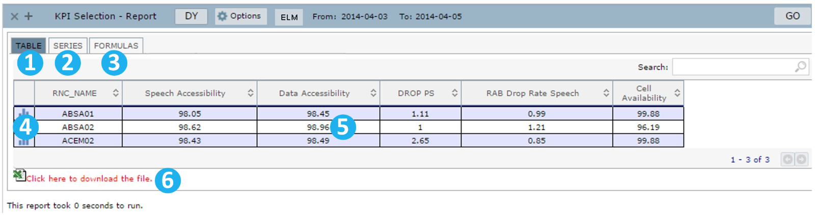
Select:
1 – Table: to view the generated table report.
2 – Series: to view the series used and its settings.
3 – Formulas: to view the KPI formula used.
4 – The chart icon: to generate a chart from this report series.
5 – Each selected KPI’s values by element or time, depending on the settings chosen. Organize the values by clicking on KPI Name in this table (heading).
6 – Select Click here to download the file to download the raw data of this report.
Formulas
Select this tab to view all the formulas used to create the related KPI and its source table.
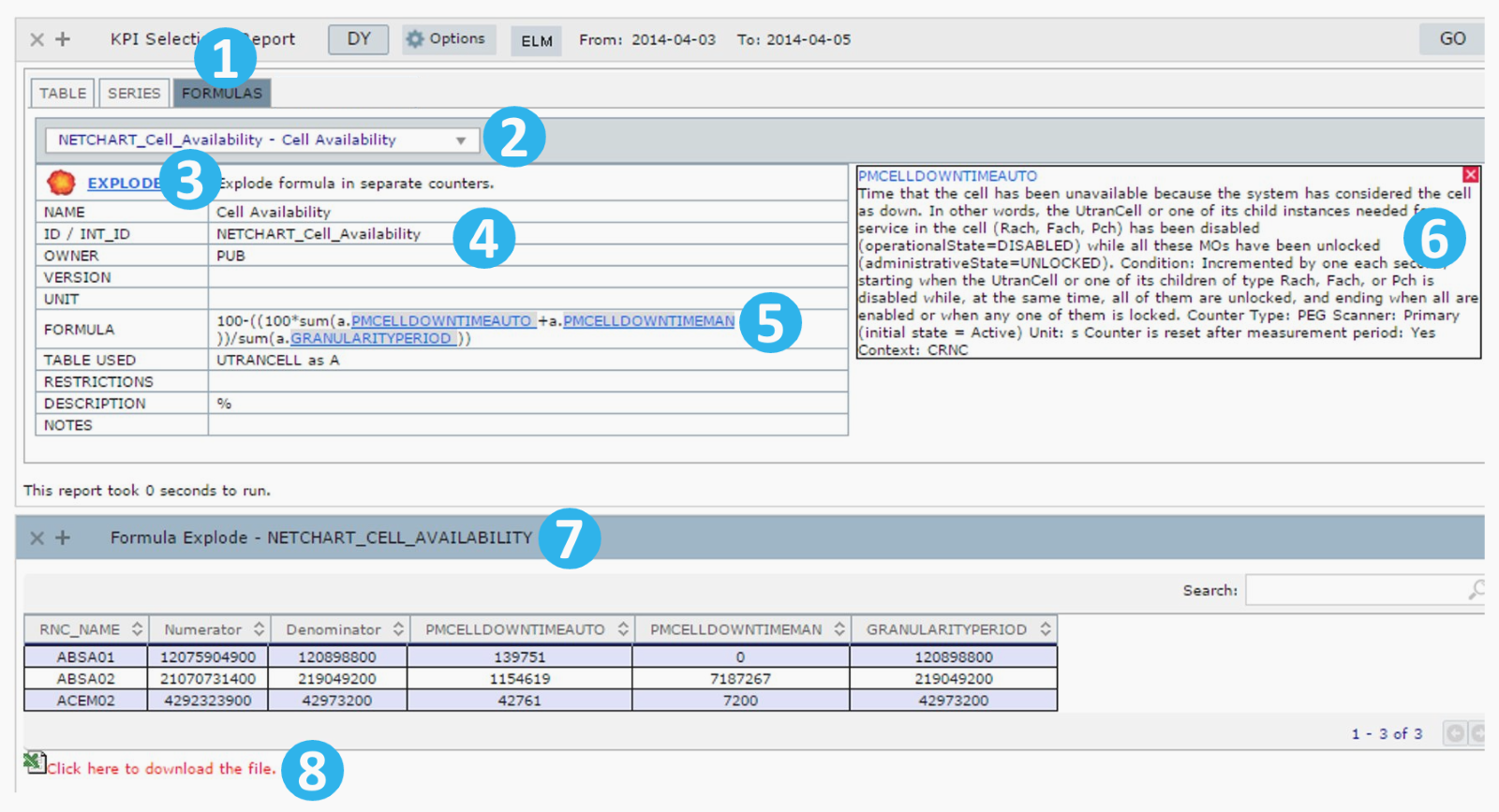
1 – Select Formulas to view the formulas used in the selected KPI.
2 – Select the KPI formula for which you want to view the details.
3 – Select Explode to expand the formulas and visualize the counters used in the KPI separately.
4 – View all the KPI fields.
5 – View the formulas used by the selected KPI. Click on the counter to see its description on the right side of the screen.
6 – View the counter descriptions.
7 – View the formula exploded in numerator and denominator and its counters.
8 – Select Click here to download the file to download the file with the counter values.
Common errors
- Looking for a KPI that belongs to another vendor/technology.
- Looking for Private KPIs in Public.
- Using an invalid element aggregation.