Contents
CUSTOM CHART
OVERVIEW
You can create customized charts directly in the NetChart interface or by importing a text file. Custom charts allow engineers to perform in-depth analysis, displaying the behavior of KPIs and counters in a user-friendly interface that provides better data interpretation.
HOW TO USE
Define which parameters change the chart will track, the KPIs and counters it will consider, and other details, such as date, legend, and group results. It is possible to create charts in NetChart or import files.

FUNCTIONS DESCRIPTION
Creating Charts on the interface
Click on Custom and select Manage, then Chart.

1 – Select the chart position on the menu (see more details in the topic Set Menu Path).
2 – Choose the chart title as it will appear in the menu.
3 – Clear all fields for new chart creation.
4 – Load some charts.
5 – Save the entered chart.
6 – Define the chart properties (see more details in the topic Chart Properties).
7 – Define which parameters changes will be tracked in the chart.
8 – Write a brief comment related to the report, if wanted.
8 – Set the chart’s default options (see more details in the topic Chart Options).
9 – Insert additional Chart Titles, Series, and Properties sections for one more chart.
SET Menu Path
To define the report position in the menu, click on the Set menu path.

In the new window, write the report title as it will appear in the menu.
After that, drag it into your user’s menu. Click on Apply to save changes.
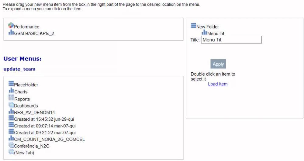
Chart Properties

1 – Define the Chart title.
2 – Type the title of the left vertical axis.
3 – Type the title of the right vertical axis.
4 – Select the KPI creator.
5 – Select the KPI(s) to use in the chart. You can also use counters.
6 – Short KPI description as it will appear in the chart’s legend. As a default, this legend is the KPI name, but you can change it.
7 – Type of data series: line, bar, stack, or area.
8 – Axis that the series will belong to (right or left).
9 – Select the color that you want to set in the chart.
10 – Click on it to remove the selected series.
11 – Click to add more KPIs.
12 – Click to add another chart.
13 – Specifies if the scale will be automatic.
14 – Or set the Manual Scale, fixing Min and Max values.
15 – Number of digits after zero as will appear in the axis.
16 – Delete the current chart.
CM Changes
Click on CM Changes to add parameters changes count. Then, select a preference on the list to load it.

Chart Options
Grouping
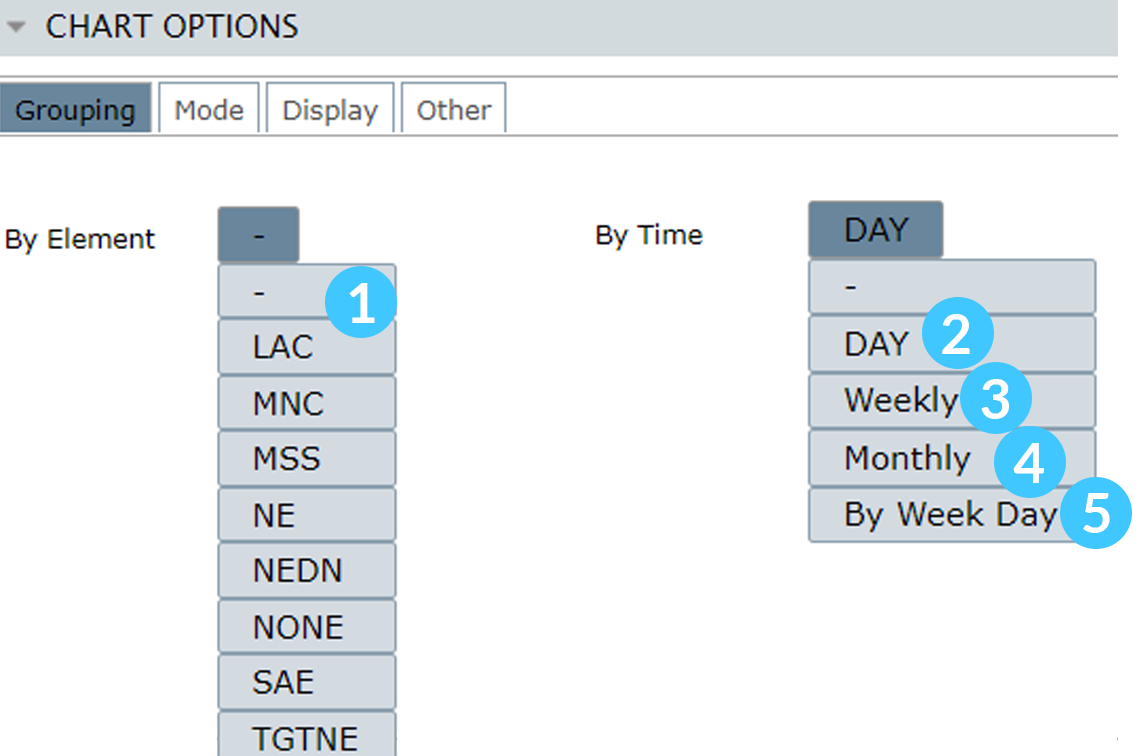
1 – By Element: Group results by elements.
2 – Day: The results will be grouped by day, generating an outcome within the selected range for each day.
3 – Weekly: If enabled, the results will be grouped by week. It requires choosing the day to start, and the results consider the whole week. For example, selecting the first weekday as Sunday will use data until the last selected Sunday.
4 – Monthly: If enabled, the results are grouped by month, generating a result relative to the month selected in Date.
5 – By Week Day: If enabled, the results will be grouped to compare each day in different weeks, thus generating income for the period of one week.
Mode

1 – Track re-homed: If enabled, it will use data from the previous host controller to generate a chart/report.
2 – Custom Busy Hour: If enabled, you’ll need to define a KPI and an element to be considered in the Custom Busy Hour calculations. The results will consider the maximum value of the selected KPI for the chosen element. For example, in the image below, the BH will be the greatest value of the KPI ACC_RAB_HSDPA for the RNC-ULA-N element.

NOTE: The Custom Busy Hour only works together with HOUR/ROP aggregation time.
Display

1 – The same series will have the same colors for different elements.
2 – Set the visibility of the chart’s grids.
3 – Use spline interpolation for line and area series.
Other
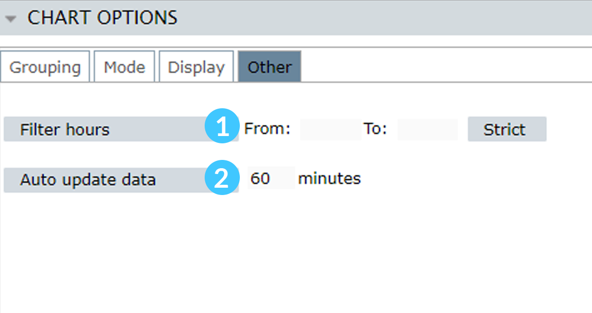
1 – Use just the data collected on a given hour range. This filter only can be used with ROP and HOUR aggregations.
2 – Auto-updates data for the generated charts.
Creating Charts importing a text file
Click on Custom and select Import, then Chart.

1 – Click to download the Import Chart template.
2 – Import the text file template.
3 – Click on GO to create the chart. The created charts will be available on MyView > Created at [Current date and time].
COMMON ERRORS
- Illegal characters: Please try to use alphabetical or numerical characters for titles and legends. The opposite may harm your chart during saving.
- Errors in typed KPI: The chart does not return proper results until errors in KPI are corrected. Contact the Bwtech support team for help if needed.