Contents
MAPCHART
OVERVIEW
See cells geolocated in the map and analyze performance and configuration data, such as cell configuration, adjacencies, timing advance, and KPIs. The user can also zoom the map to see the sites.
HOW TO USE
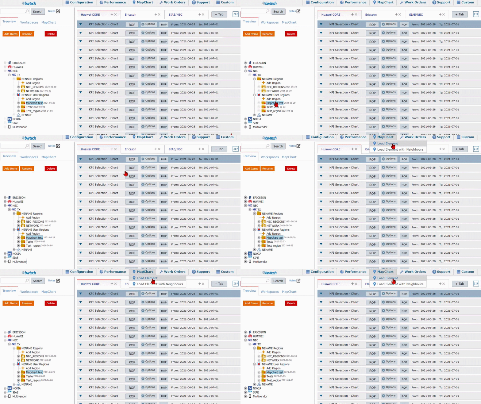
Select an element on the treeview, then click on Load Elements on the MapChart menu.

MapChart home screen will be loaded.

The interface shows:
1- Navigation bar.
2- Color KPI.
3- Size KPI.
4- Frequencies.
5- Function.
6- Maps menu.
FUNCTIONS DESCRIPTION
Color KPI
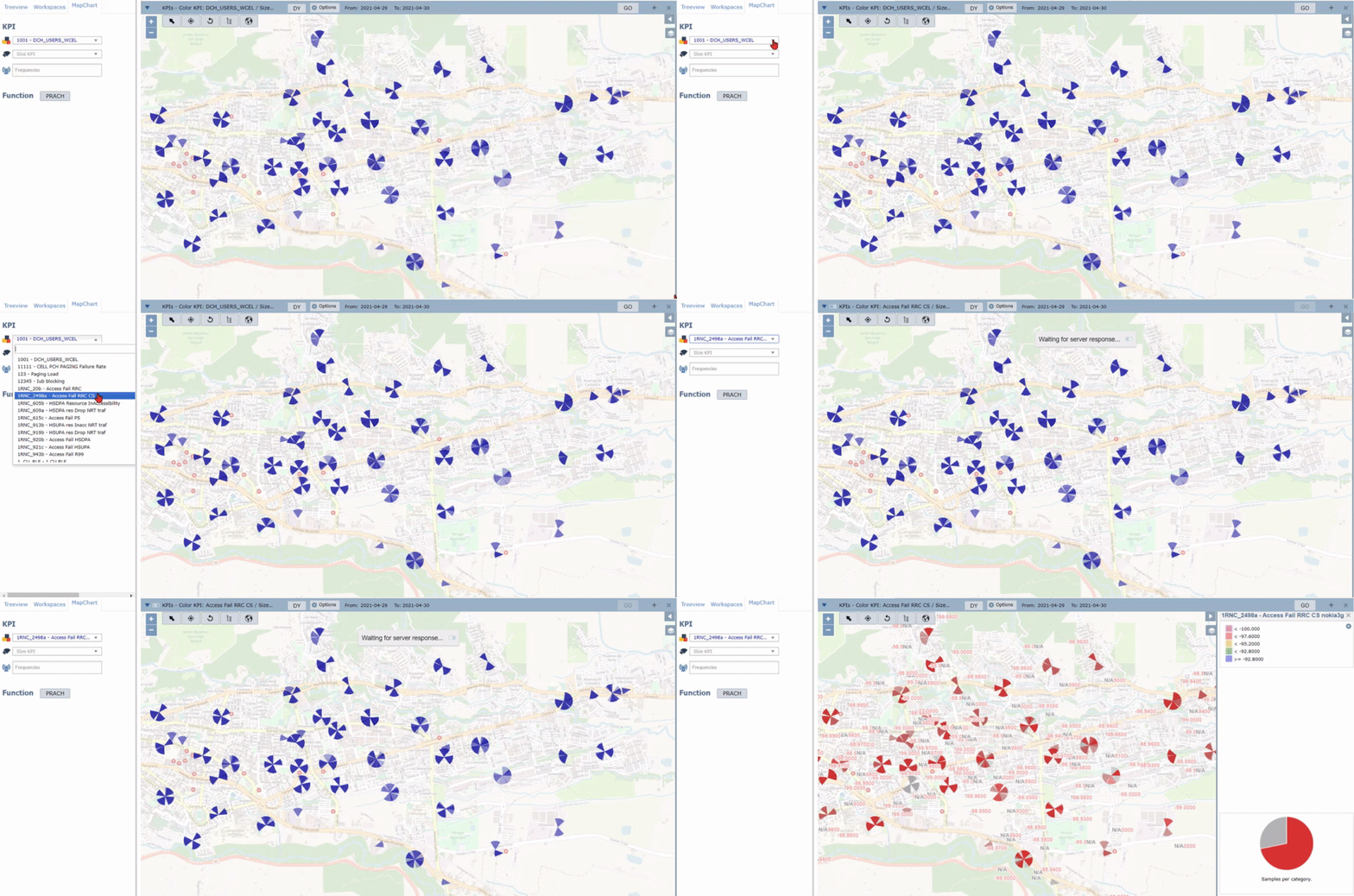
Click on the KPI Colors option. Select a KPI from the list. The cells will appear in different colors, according to the selected legend. The threshold color scale and a chart of samples per category will appear on the map right.
Size KPI
Click on the Size KPI option. Choose some KPI and plot it on the map in different sizes. The legend size will appear on the map right.

Frequencies
It is possible to select all frequencies or a specific one. Just click on Frequencies to see the options.

Function
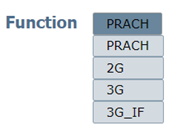
Click on the Function list to choose between PRACH, time advance, or handover frequency – depending on the technology.
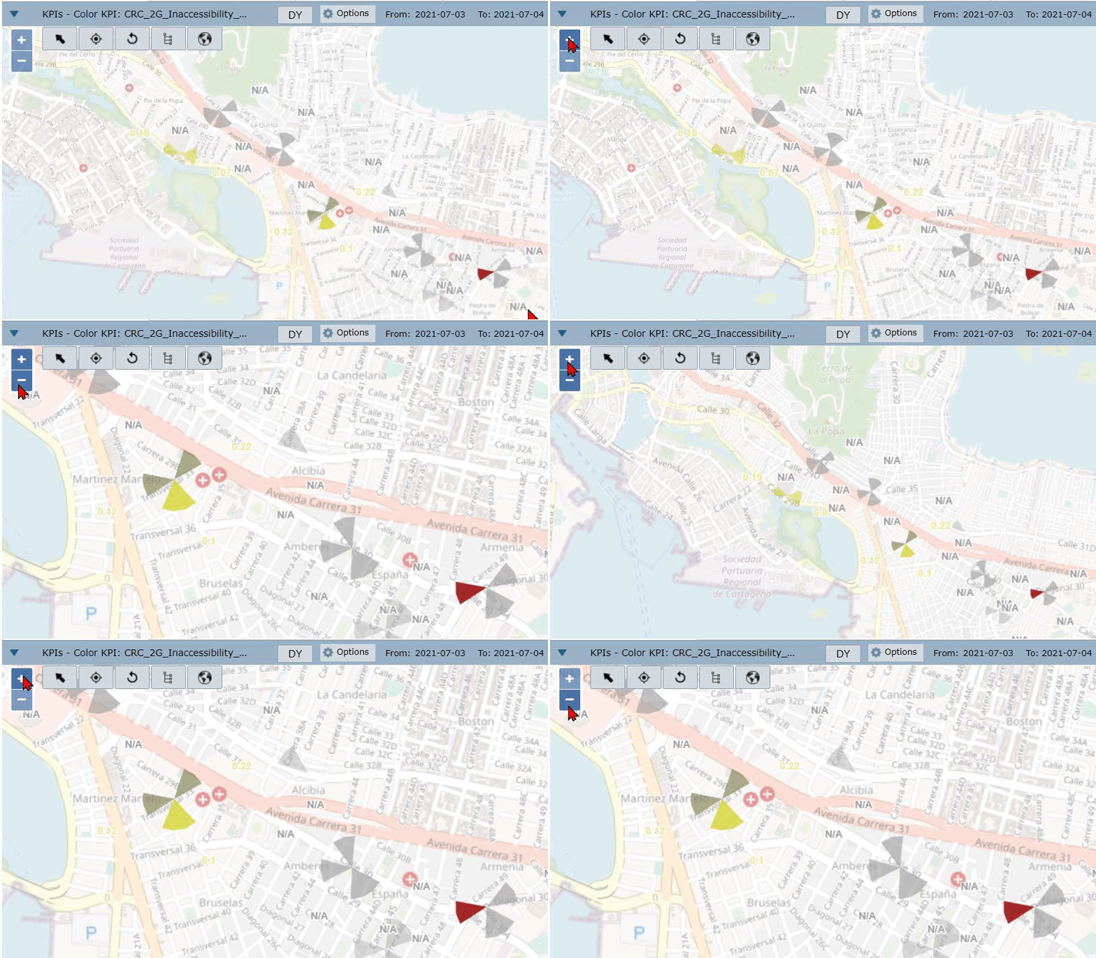
Use the buttons + and – to zooming the map in and out.
You can also use the mouse scroll.
Click on the arrow to the Arrow on the Map Menu to choose between the Cell Selector, Region Selector, or the Rule.
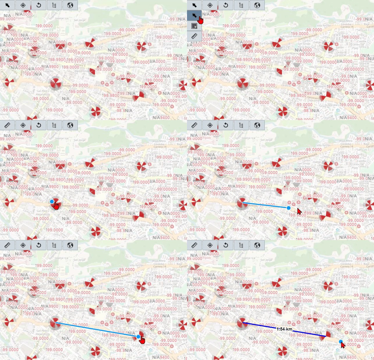
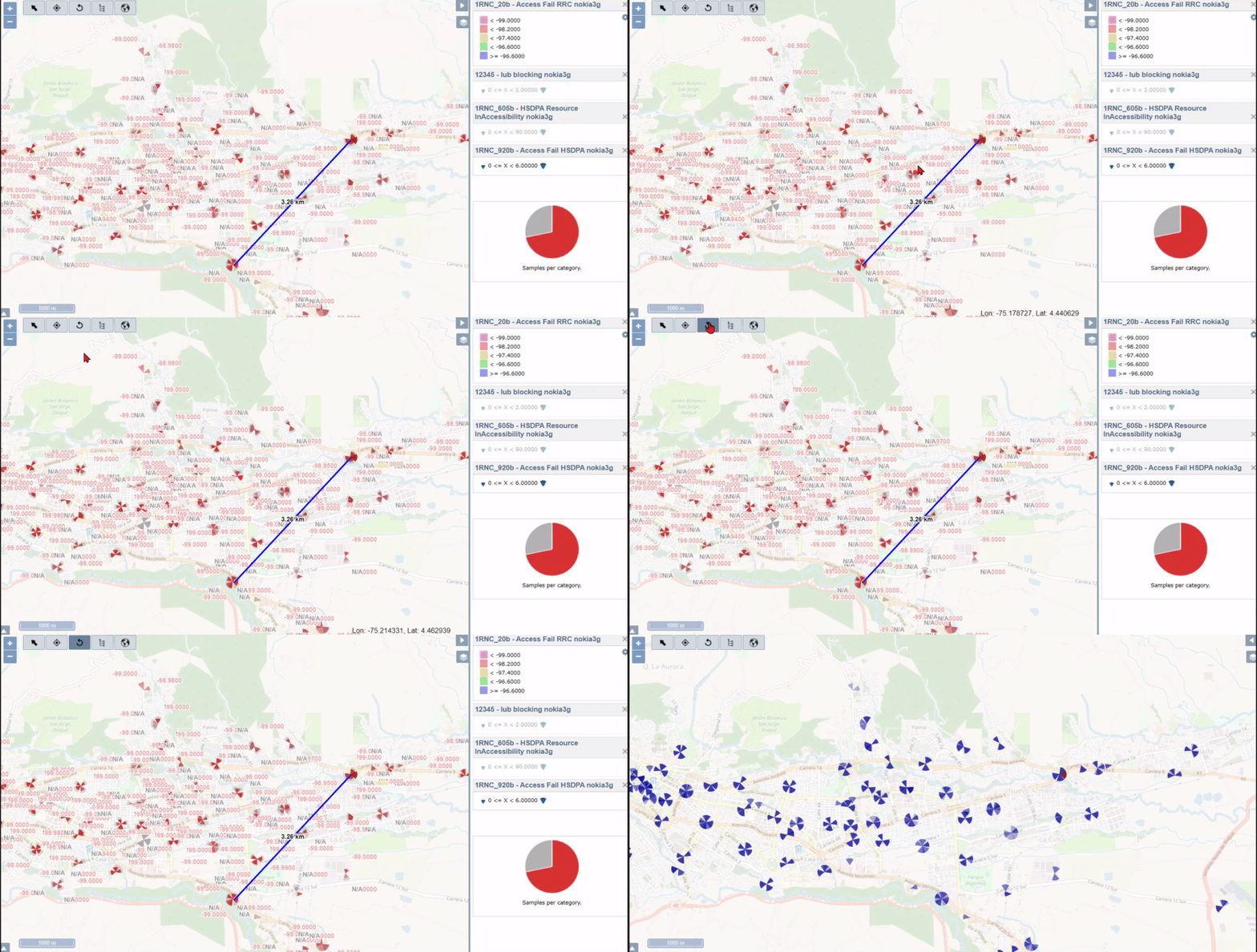
NOTE: To use the Rule, click on the map to set the starting point, then click to define the endpoint. The distance between them will be displayed.
To center the map on the selected cell, click on the Center button.
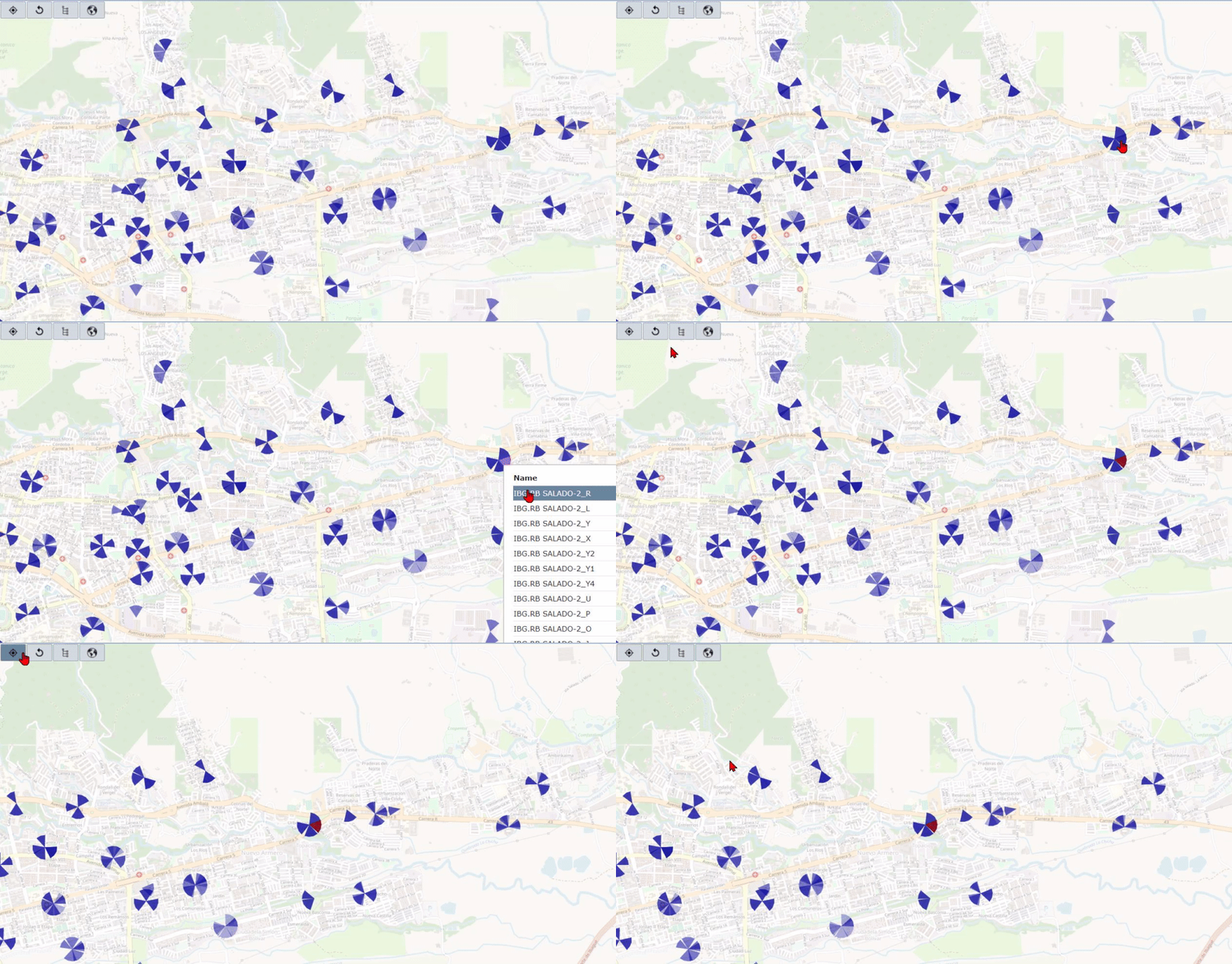
Click on the Re Undo button to clear all drawings and analyses on the map.
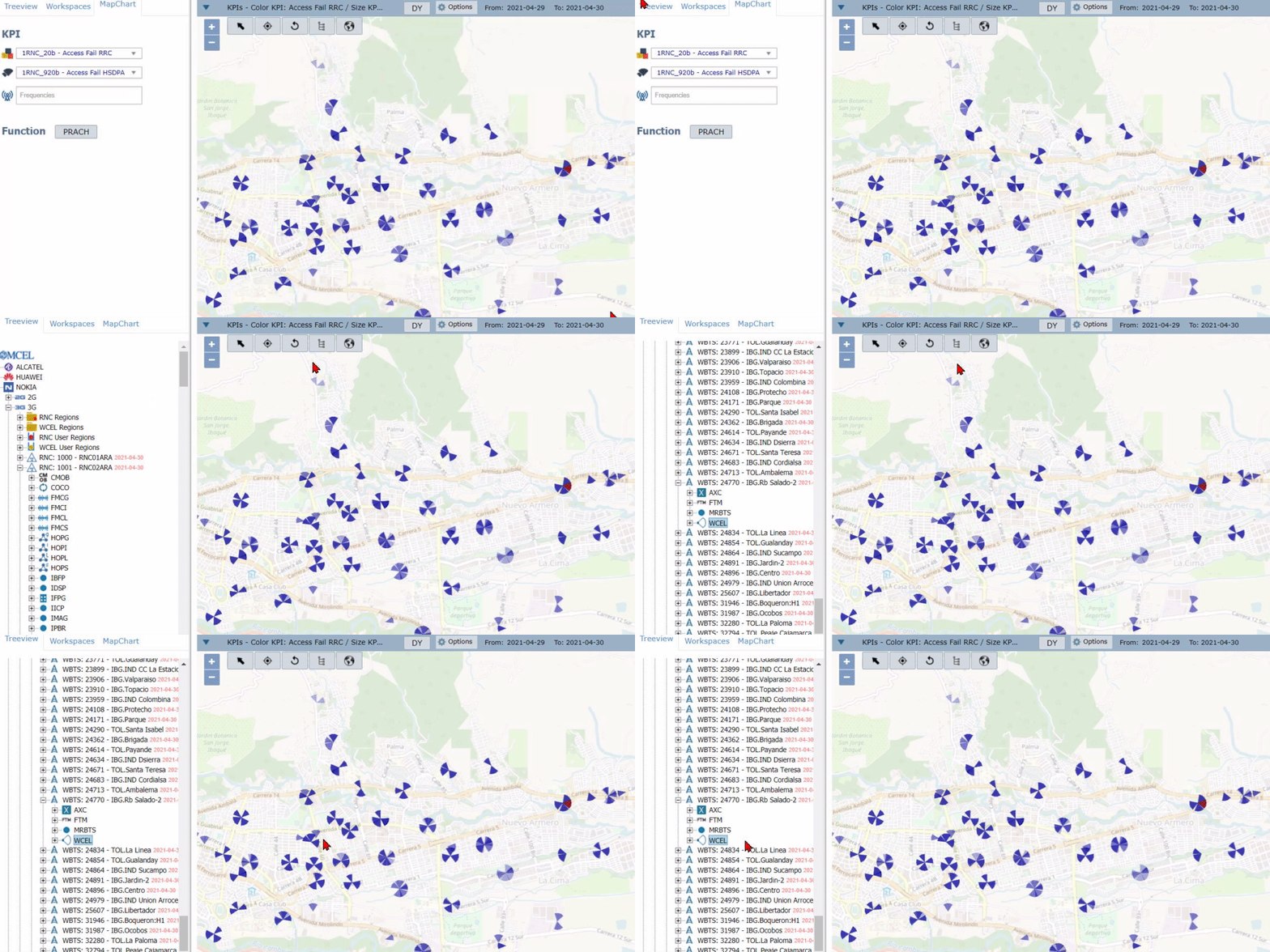
Click on the Treeview icon to select the element in the Treeview.
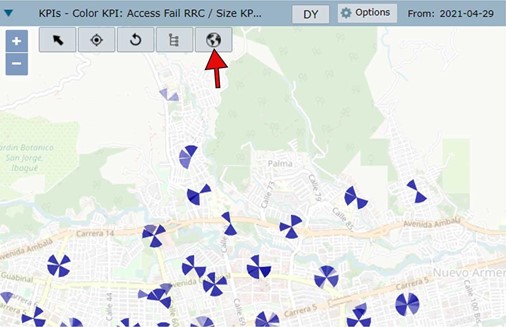
Click on the Earth icon to export all loaded cells and plotted functions to Google Earth. The file MapchartExport.kml will be download.
Click on the Arrow on the bottom left of the map to see Element Properties.

NOTE: Click on the buttons LAC , RNC , and ScrCode to highlight the cells that belong to the same group.
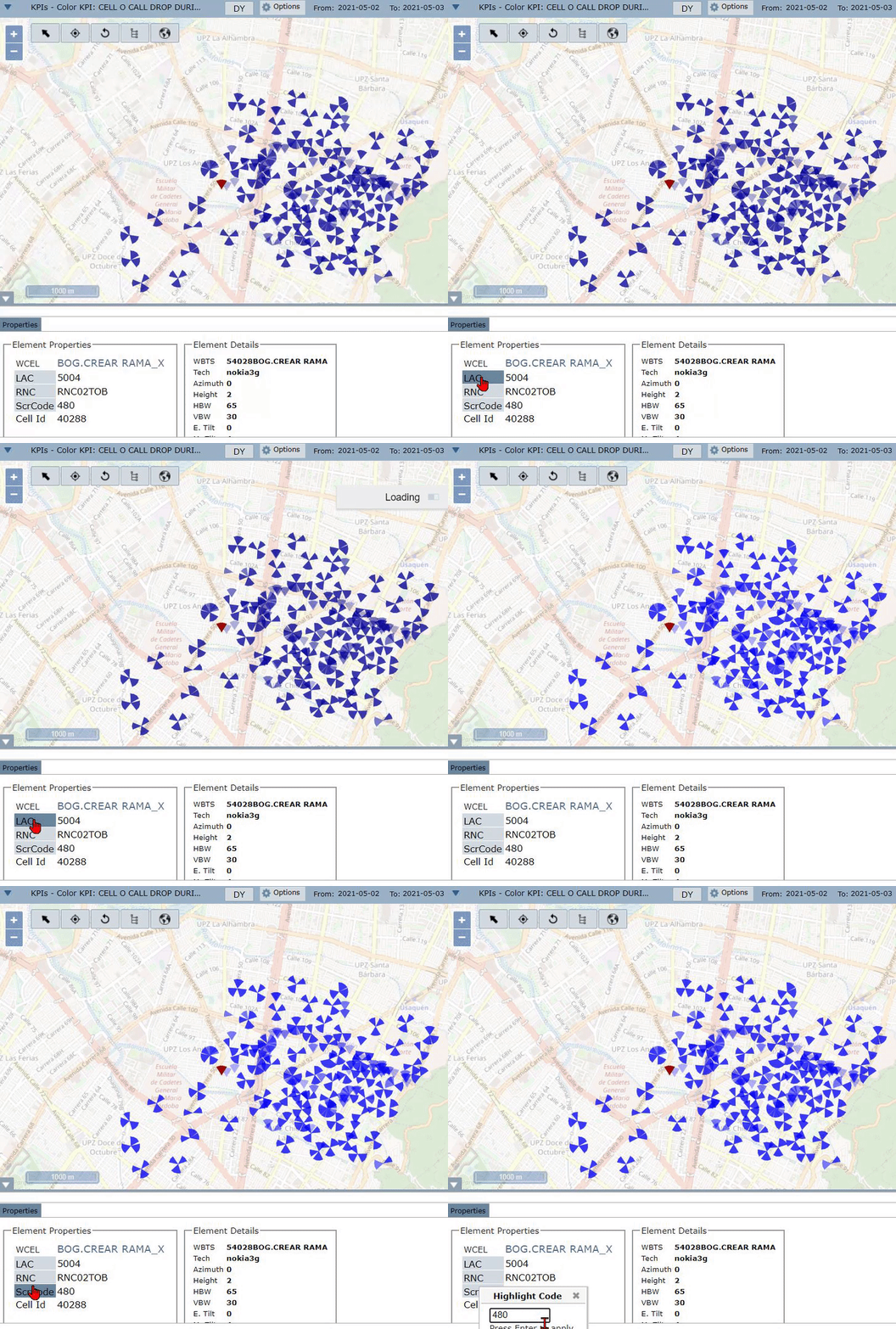
By clicking on the ScrCode button, the cells with the same scrambling code of the selected cell, or the ScrCode number – 1 or + 1, will be highlighted on the map.
Base Layers
Click on the Layers icon on the map top-right to see layers options.
1- Base Layer: Choose if you want to see the streets on the map (Open StreetMap) or not.
2- Antennas: Check the technology of the antennas that you want to see on the map (2G, 3G, 4G, all or none).
3- Element Text: Check what details you want to see on the map (technology, antenna, propagation, handover, and backhaul).
4- Site Names: Check the technology of the site names you want to see (2G, 3G, 4G, all or none).
5- Others: Check to see the KPIs, Backhaul, Handovers, Propagations, Measure, NetGeo, Punctual, Lines, Regions, and Drive Test.

Report Settings
It is possible to choose the report’s periodicity. The default mode is daily. To change, just click on the DY button.
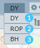
1- DY – daily or 24 hours aggregation.
2- ROP – the minimum aggregation in the OSS. It can be by 15 minutes or per hour, depending on the element and table.
3- BH – busy hour of the day, at the cell level.
Date
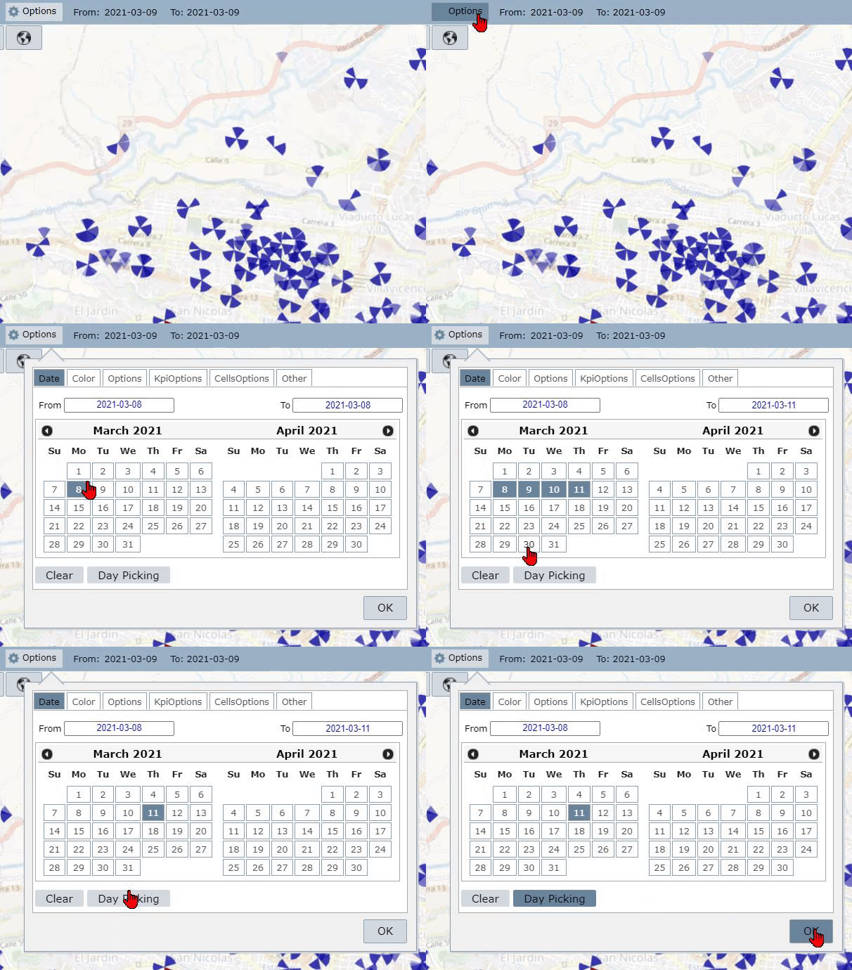
Click on the Options button. It is possible to type a date or select it by clicking on the calendar. For random days, click on the Day Picking button.
Clear all dates, the weekends, or the holidays by clicking on the Clear button.
Color
To change the default color, click on Options and then select the Color tab.
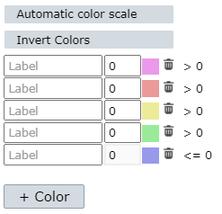
It is necessary to disable the Automatic color scale to make changes.
It is possible to invert the select colors by clicking on the Invert Colors button.
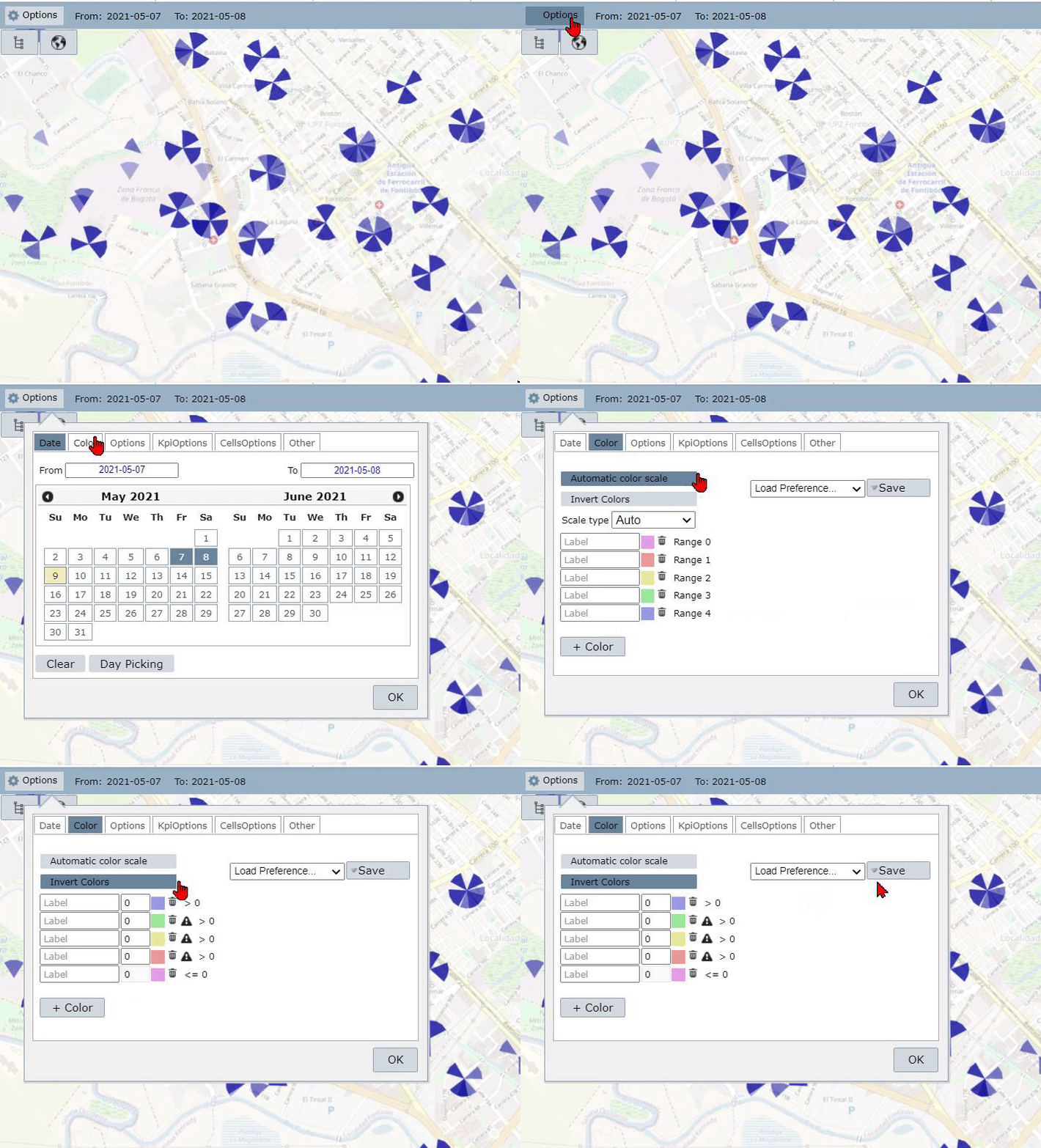
NOTE: The Automatic Color Scale calculates a scale based on the highest and lowest function results. Five equal intervals are made between these two extremes.
After disabling the Automatic Color Scale, you can build your scale. Write the desired label and value for each color. Click on the Trash icon to exclude it.
Click on + Color to add a new legend.
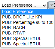
Click on Load Preferences to see a list of previously defined scales.
After configuring the color options, click on Save.
Select Private for the scale is visible only to your user. Mark Public if you want the settings available to all users.
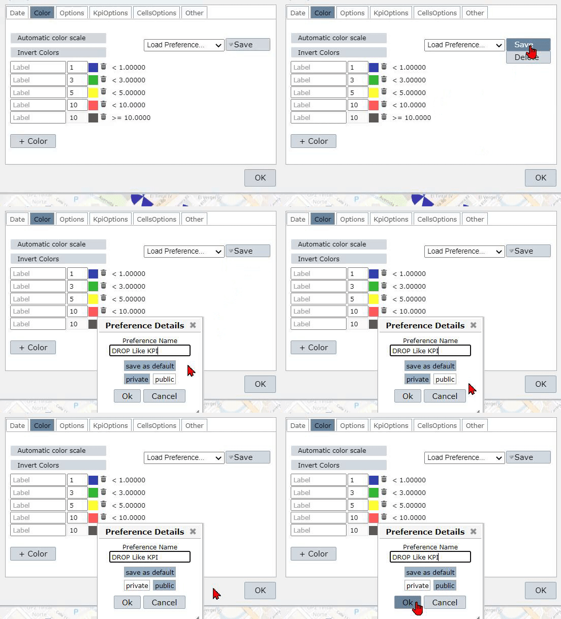
NOTE: When Save as Default is selected, this color scale will be loaded by default when you open NetGeo.
Options
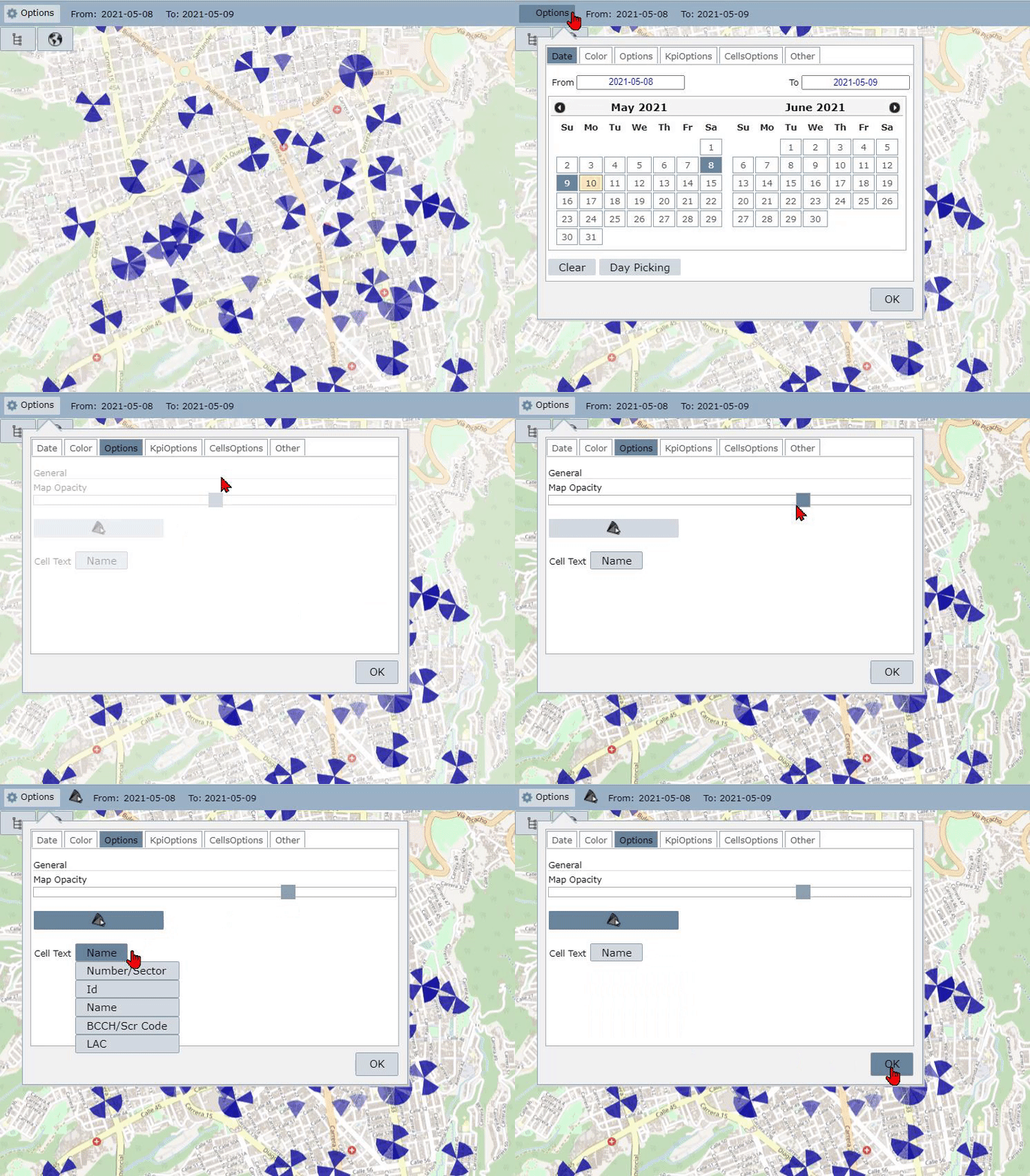
Drag the Map Opacity slider to define the map background opacity. You can choose from 0% transparent (on the right side) to 100% transparent (at left).
Active the Select all Sector option to select all cells when clicking on a sector.
Click on the Cell Text option to choose the information that is displayed. The list includes number or sector, id, name, BCCH or SCR code, and LAC.
After configuring the options, click on OK to save the settings.
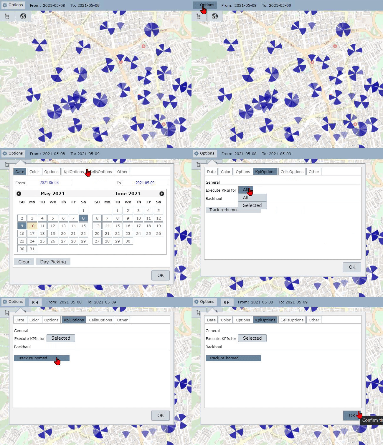
Kpi Options
Click on the Execute KPIs option to define if MapChart will calculate KPIs for all loaded elements or only for the selected cells.
Active the Track re-homed option to keep track of re-homed cells during the calculation.
Cells Options
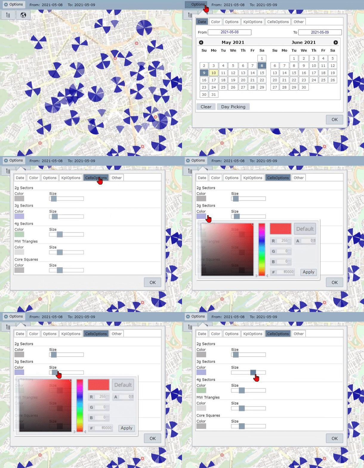
Define each technology’s cell size and color by clicking on the Color menu and dragging the Size slider.
The scale varies from the smallest representation (on the left) to the largest (on the right).
Others
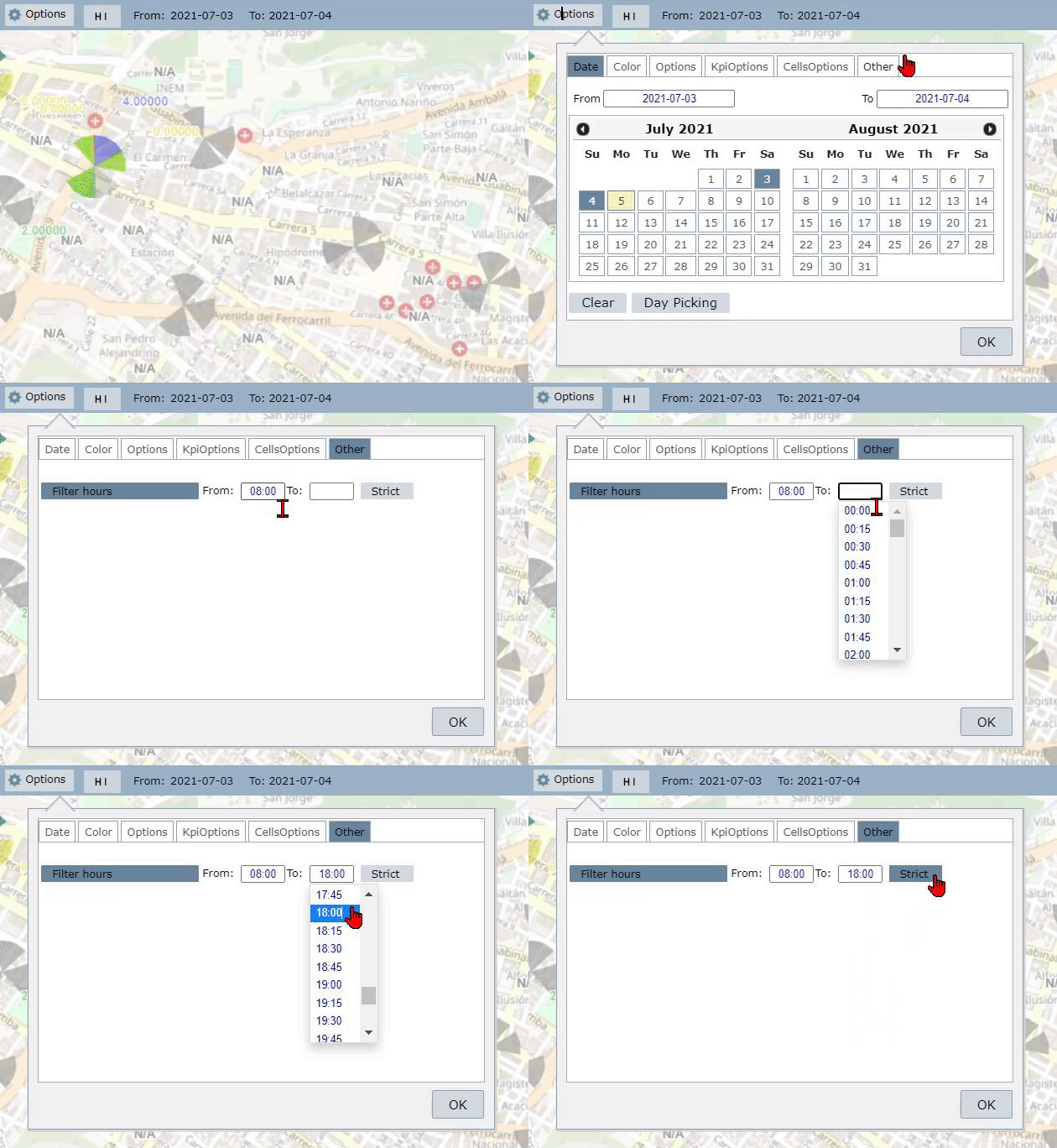
Activate the Filter Hours to define an hour range to collect data. After clicking the button, write the beginning and end times.
Activate Strict to calculate the values considering all measurements between the time interval.
LAC / RNC / ScrCode
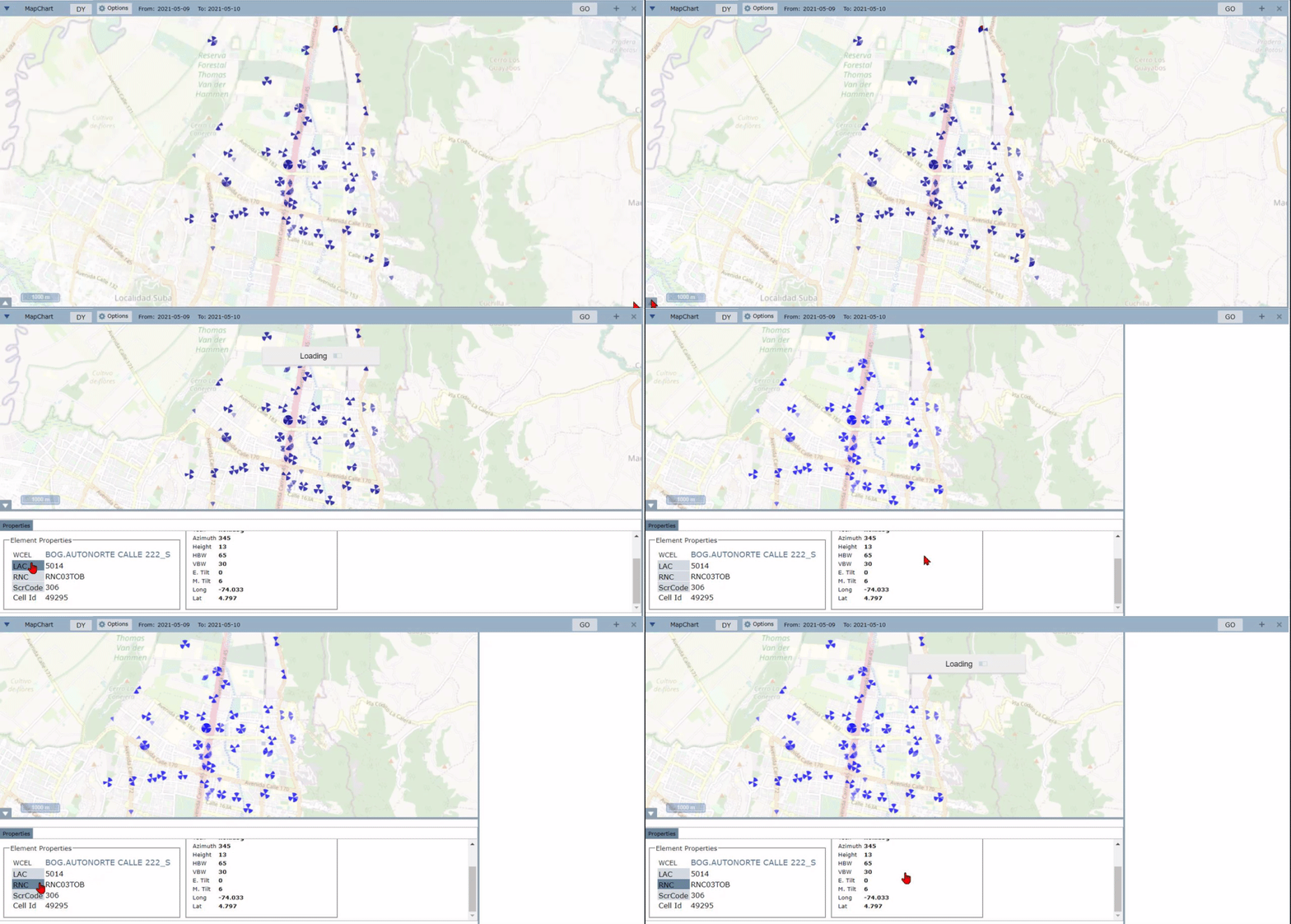
Click on the Arrow on the bottom left of the map to see Element Properties. Click on the LAC button to highlight all the cells that belong to the same LAC.
This behavior is typical of the RNC and ScrCode buttons.
Neighbors
Select a cell on the map. Click on the Function list to choose the kind of adjacency you want to plot. The adjacency lines leaving of the select cell (source) to the target cells.
NOTE: The color of the lines is related to the done scale shows on the left. The thickness of the lines is associated with the attempt number: the thicker, the more attempts.
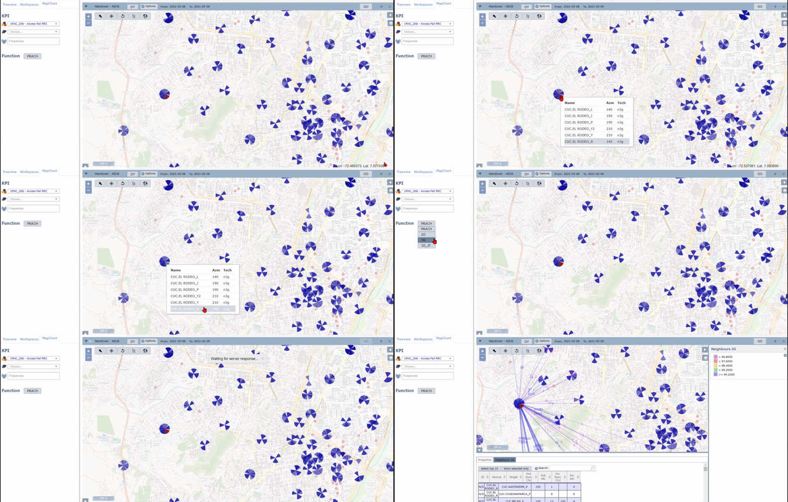
Below the map is the Neighbors’ information.
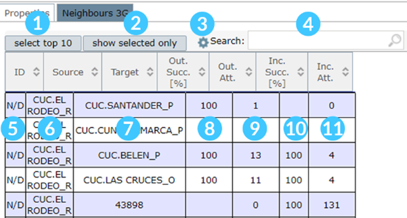
1- Click to select the first ten rows in the table and also highlight these cells on the map.
2- Click to show on the table just the selected lines. (Click above each table line to select it).
3- Click on the Settings icon to set the Handover Lines (Outgoing or Incoming) and the Line Text (Attempts, Success, Distance, or all).
4- Search by some specific cell.
5- The first column brigs the adjacency ID. (N/D means Not Declared adjacency).
6- This column informs the source cell.
7- The target cell is also shown on the table.
8- The percentage of success outgoing to the selected cell is presented in this column.
9- This column brigs the attempts of HO outgoing to the selected cell.
10- The percentage of success incoming to the selected cell is seen here.
11- This column informs the attempts of HO incoming to the selected cell.
Attempts per distance
Select a cell on the map. Click on the Function list and select PRACH or Timing Advance, depending on the technology. It is possible to plot how many PRACH you want.
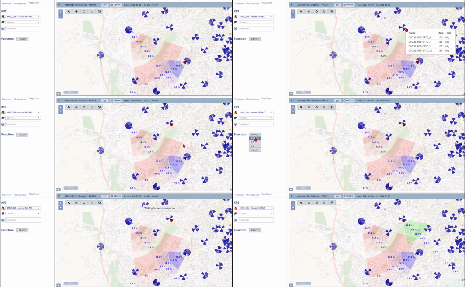
NOTE: The stronger color means the range has more attempts.
Below the map, are shown:
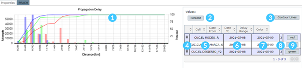
1- The propagation delay chart.
2- The values are shown in the ranges. (Percent, Distance, Absolute, All, None).
3- Click to contour the lines separating the ranges.
4- Click to remove the plot.
5- The name of the selected cell.
6- Date from.
7- Date to.
8- The PRACH Delay Range used.
9- The color of the plotted PRACH. Click to choose another color.
Transmission
MapChart displays the links between all the network layers, including the RAN and CORE elements.
To begin, select an element on the treeview. Then, click on the Load Option on the MapChart menu.
A map will be loaded with the region’s elements and their links.
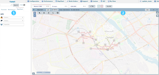
1- On the screen left side are the KPI options. Users can plot the KPIs on the map by color and/or size.
2- The map is shown on the right side.
NOTE: To know more about running a KPI or navigating through the map, read the Functions Description section.
The KPI legend will appear on the map’s right side. Click on the Arrow to show/hide the charts and tables.

Select a link
The links or microwave connections between elements are represented on the map by lines. Click on the desired link to select it.
Click on the line to view a chart with the link’s properties, modulation, and bandwidth. It is also possible to access these details by clicking on the Arrow on the bottom left of the map.


Are shown:
1- Element properties, such as source name, sink name and frequency band.
2- Modulation details, as sink full capacity and source garanteed capacity.
3– Bandwidth sink and source.
4- The link details, for example, device name, slot type and ID, port, and KPI’s details.
NOTE: When the user selects to run a KPI by link, clicking on some line on the map, the aggregation will consider all its associated targets.
Select an element
The elements are represented on the map by the red squares. Click on the desired element to select it. When this option is selected, the KPI will be run by element. The aggregation will be by Port.
Click on the Arrow on the bottom left of the map to see the element details.
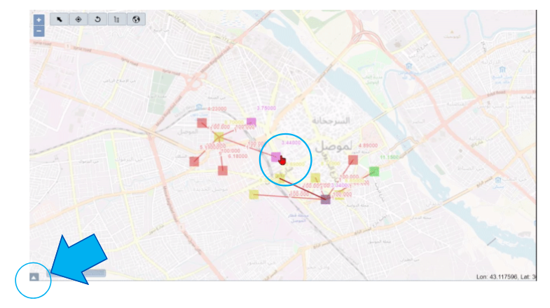
NOTE: When the user selects to run a KPI by the element, clicking on it, the aggregation will be by Port.