Contents
KPI SELECTION – CHARTS
Overview
Easily manage your network performance with NetChart.
How to use
Log in with your username and password.
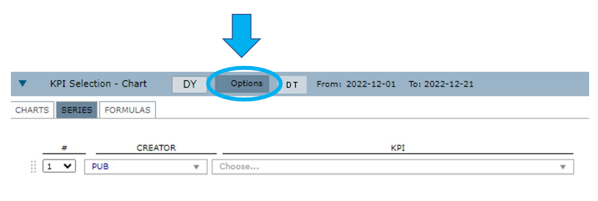
To start selecting the KPI, select Performance > Charts > KPI Selection.
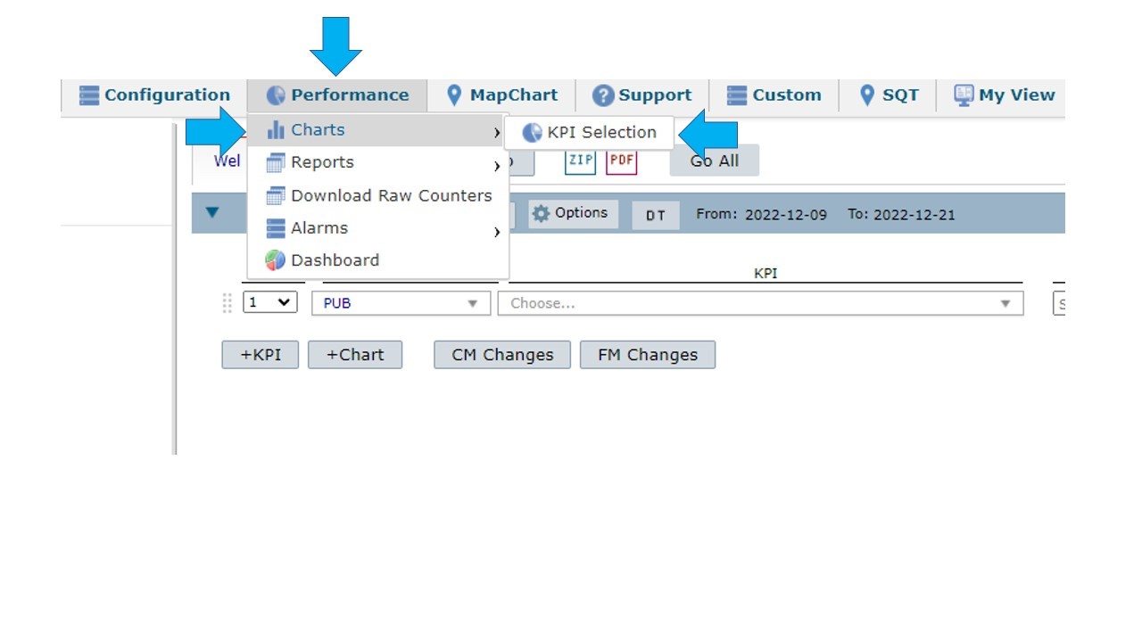
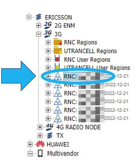
Select an element in the treeview.
Options
Select Options to define the chart’s settings.
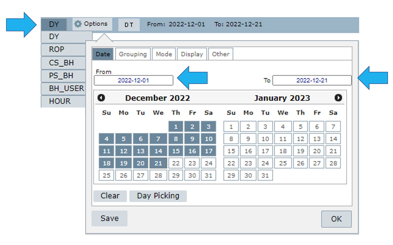
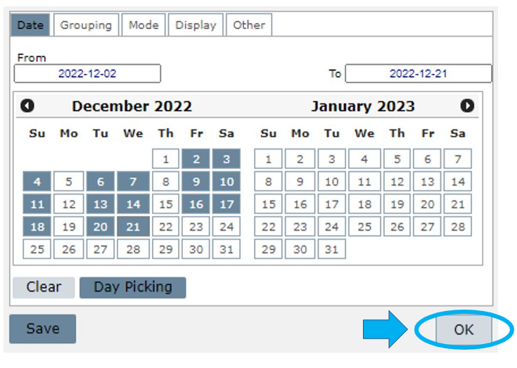
Date tab
In this tab, consider the set aggregation, ROP, DY, BH, etc., to select the number of days the chart will exhibit.
(Learn more in the Grouping tab section of this document)
Select the desired days on the calendar by clicking on the first and the last day. The period between them is selected automatically.
You can also write the time interval in the fields From and To.
Select:
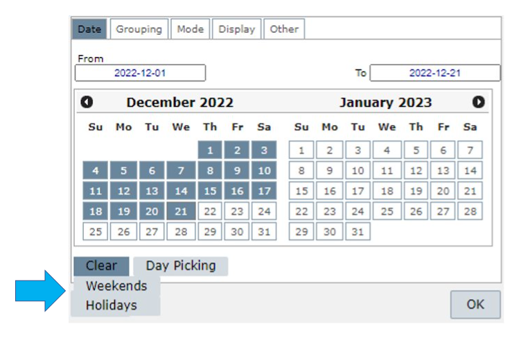
- Clear to clear the dates selected.
- Clear > Weekend to clear all the weekends in the timeframe selected.
- Clear > Holidays to clear all the holidays in the timeframe selected.
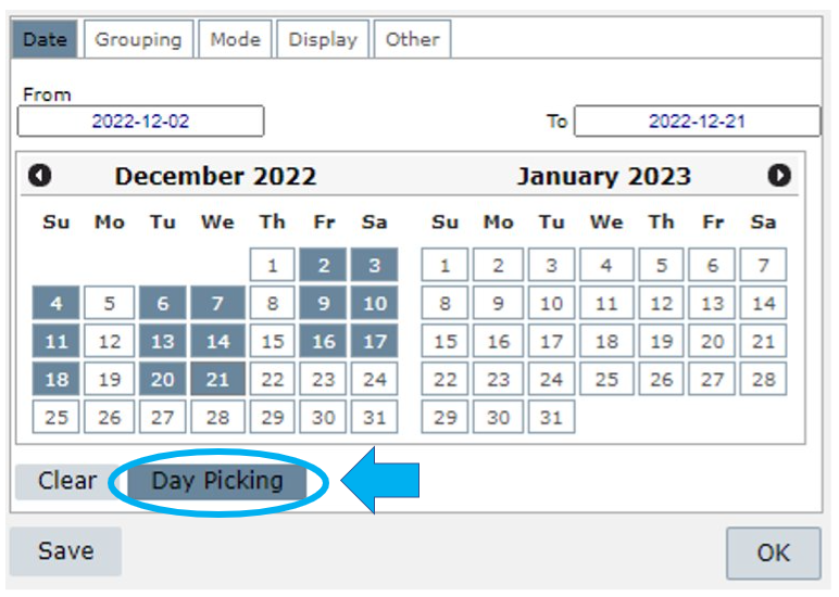
Select Day Picking to manually choose the desired dates.
Click on Save to save this configuration as a menu in Custom > Manage > Chart.
Grouping tab
Select Grouping to choose the KPI Aggregation level for the consultation.
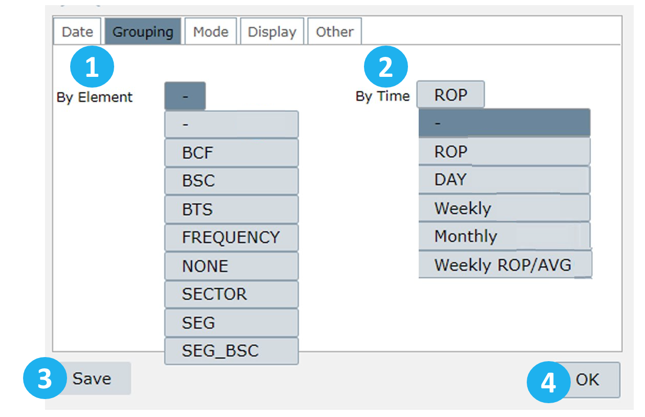
Group results by element or time
1 – Element: group results by element level such as FREQUENCY, MCC, MNC, NONE, RNC, WBTS, WCEL, etc.
2 – Time:
ROP: group results by ROP, generating an outcome for each ROP within the selected range.
Day: group results by day, generating an outcome within the chosen range for each day.
Weekly: group results by week. Choose the day on which the week will start. The results cover the whole week. For example, if you set the first weekday as Sunday, it will use the data until the next Sunday.
Monthly: group the results monthly relative to the months selected in Date.
This means that if you select, for example, March 15th, NetChart will consider the whole month of March, from the 1st to the 31st. Or if you select March 15th until April 02nd, NetChart will return results for the entire months of March and April.
Weekly ROP/AVG: group results by week, considering the ROP average.
3 – Select Save to save the desired configuration in the menu My View
4 – Select OK to use this configuration when running a report.
Mode tab
Select Mode to view two options:
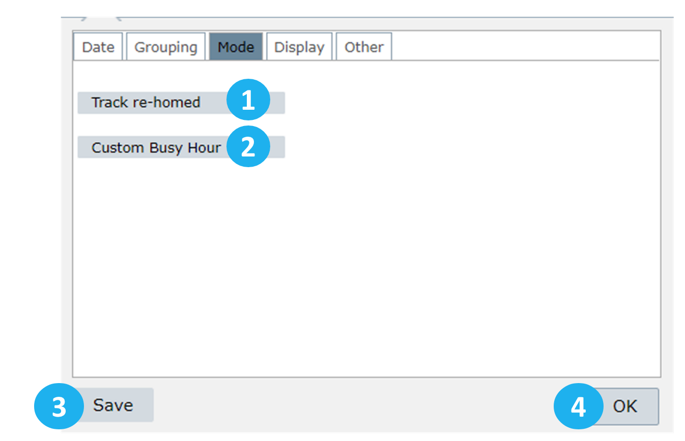
1 – Track re-homed: this option allows using data from the previous host controller and the current one (after re-homed). It will use both data in the same chart/report.
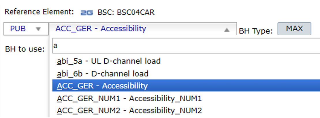
2 – Custom Busy Hour: when selected, choose a KPI and an element to be considered in the Custom Busy Hour calculations. The results will consider the maximum value of the selected KPI for the selected element. For example, in the image below, the BH will be the highest value of the KPI ACC_GER for the BSC04CAR element.
3 – Select Save to save the desired configuration in the menu My View
4 – Select OK to use this configuration when running a report.
Display tab
Select Display to configure the chart’s appearance.
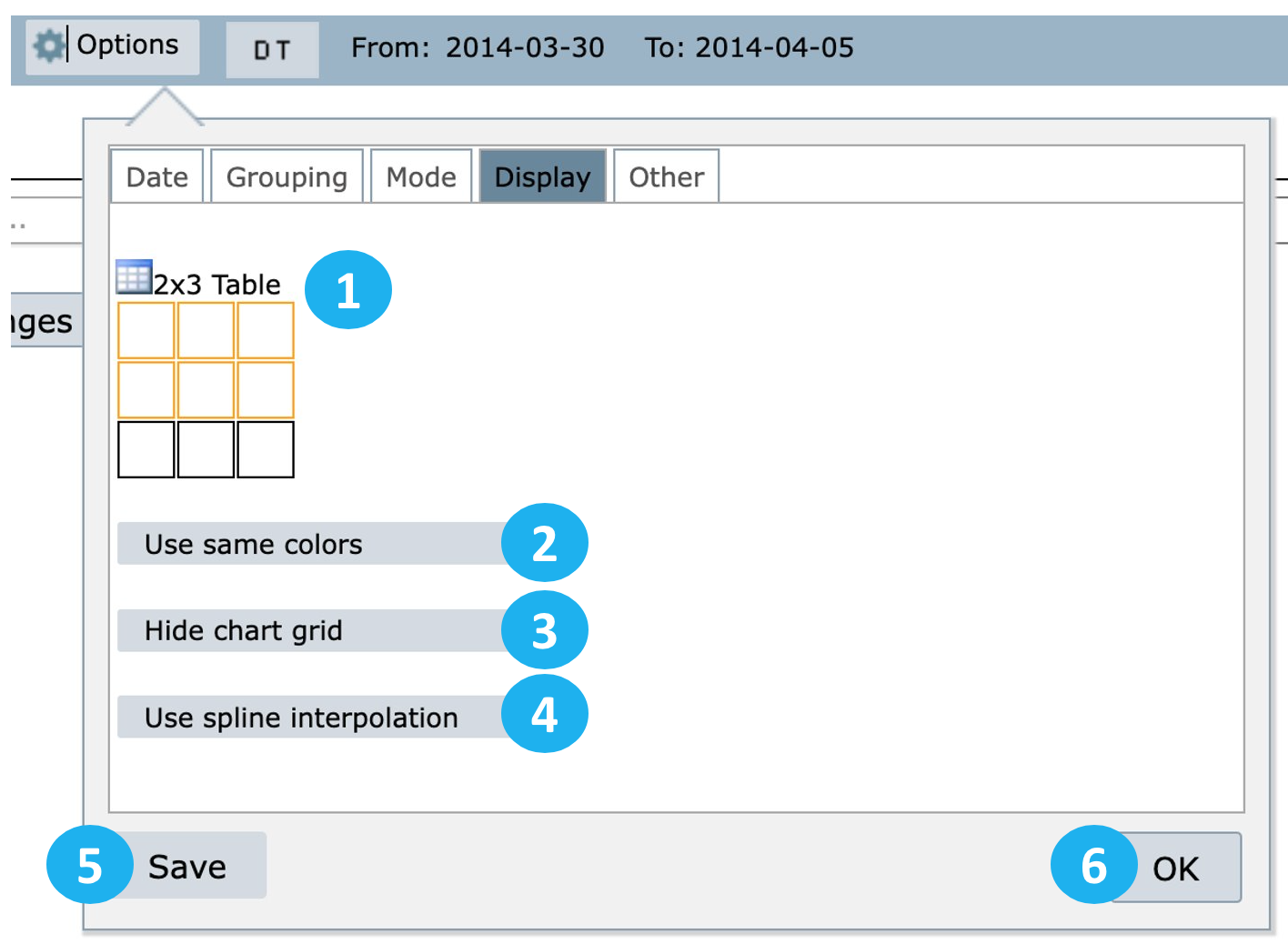
1 – Define the chart’s size by selecting the squares.
2 – Use same colors: use this option so that the same series has the same colors for different elements.
3 – Hide chart grid: use this option to hide the chart grid.
4 – Use spline interpolation: use this option to soften the peaks and valleys of the chart.
5 – Select Save to save these settings for a future report in the menu My View.
6 – Select OK to apply these settings to the current report.
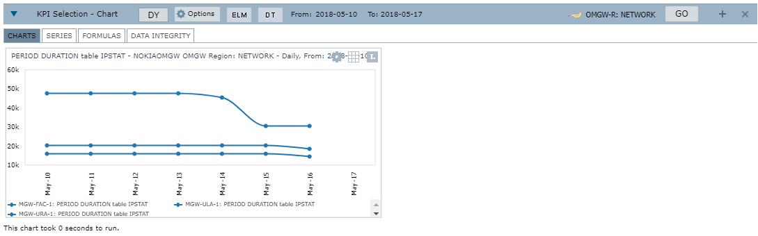
View an example of a chart with options 2, 3 and 4 applied.
Other tab
Select Other to perform actions such as:
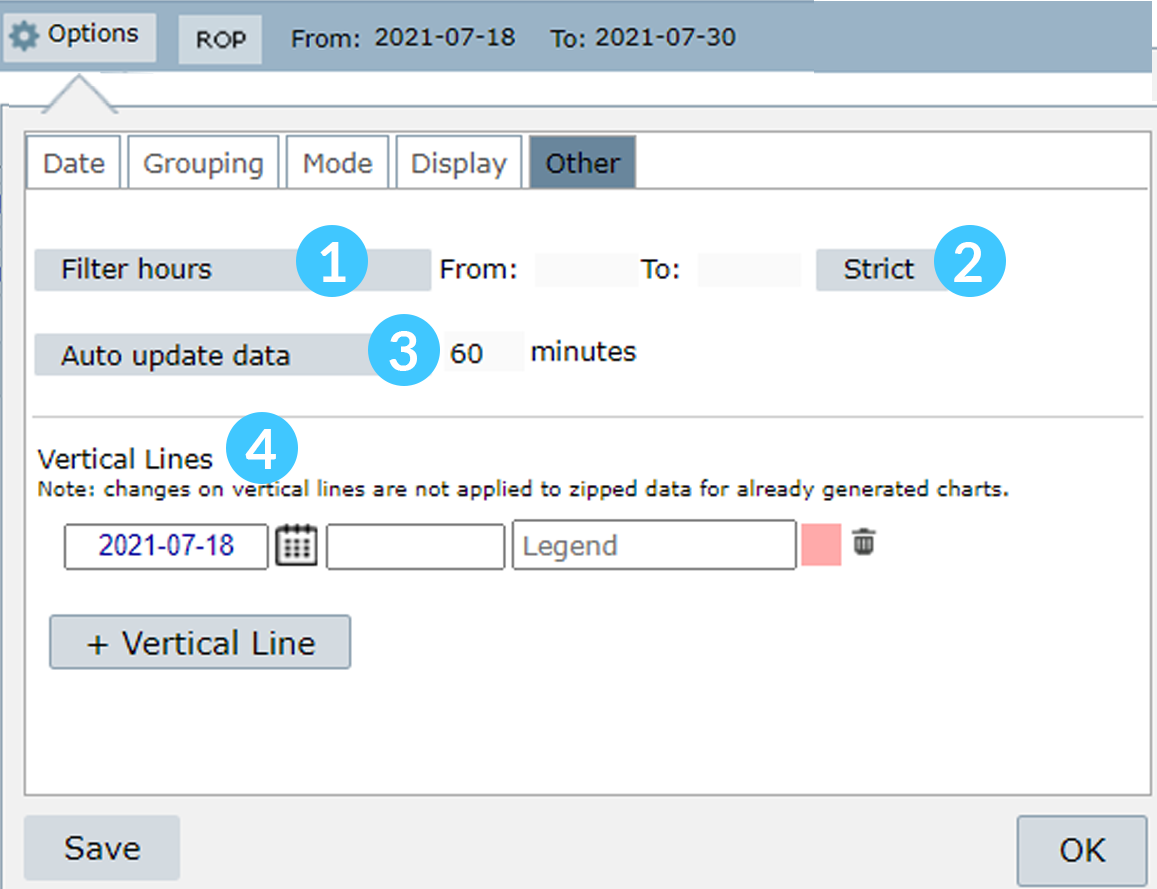
1 – Filter hours: this option filters a specific period for each configured day, for example:
From 6:00 to 18:00 of day 01
From 6:00 to 18:00 of day 02
2 – Strict: when this option is selected, NetChart will consider all the defined periods, starting from day 1, hour 1, to day 2, hour 2.
Example: when Strict is activated, NetChart will, for example, show the data starting from February 25th, at 06:00 until February 28th, at 18:00. If Strict is not selected, users will access only data between the defined period. That is, from 06:00 to 18:00 of February 25th, from 06:00 to 18:00 of February 26th, etc.
NOTE: The Strict feature is only available for ROP aggregation.
3 – Auto update data: this option enables the system to automatically restart the selected chart(s) in a determined period that was set by the user.
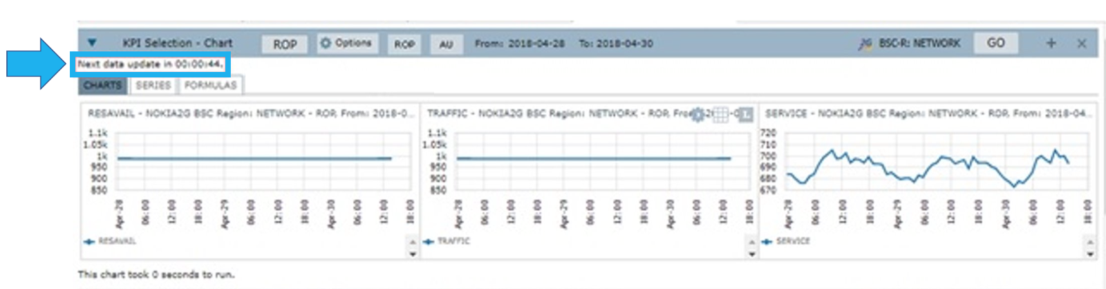
NOTE: This is useful for industries sectors such as NOC or SOC.
4 – Vertical Lines: select this option when you want to highlight a specific point in the chart, as shown in the following illustration

NOTE: When exporting the data/chart to PDF, Excel, or ZIP, you must execute the chart one more time by pressing GO after setting the Vertical Lines. Otherwise, the command won’t be exported, only the chart script previously generated.
Functions description
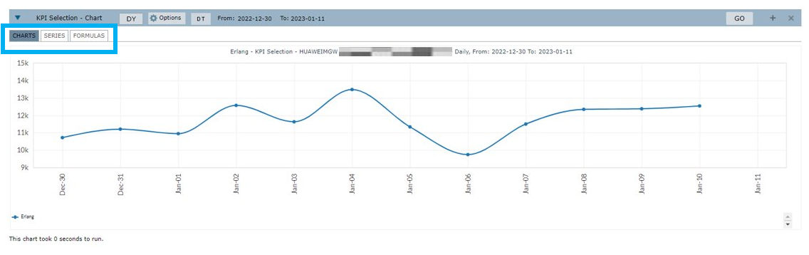
Inside the KPI Selection, there are the following options: CHARTS, SERIES and FORMULAS.
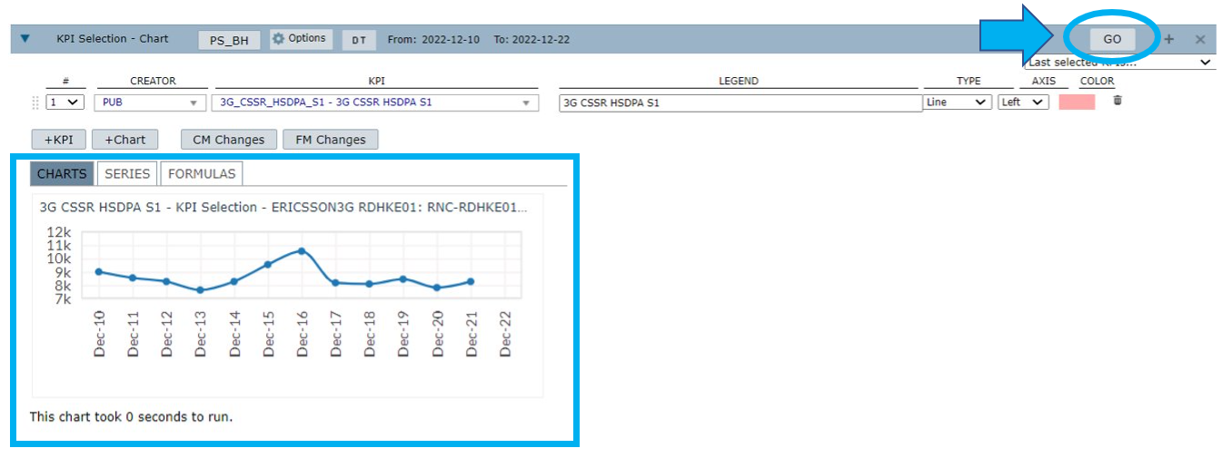
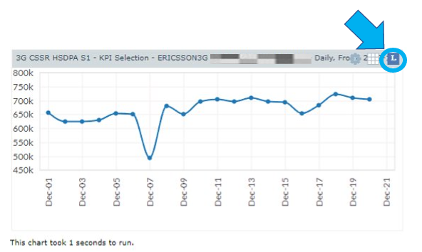
Chart
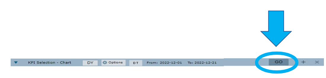
First, select an element in the treeview and the desired KPI. Next, configure the wanted aggregation and a period in the Date field. Finally, select GO to load the chart.
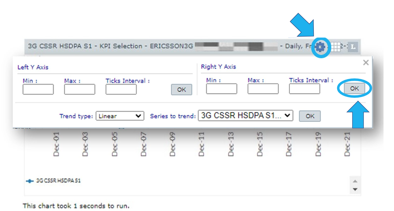
Select the Configurations menu to show or hide the chart’s options such as:
- The maximum and minimum values of the X and Y axes.
- The tick intervals.
- The trend type: linear or exponential.
- The series to trend.
Select OK to apply the configurations.
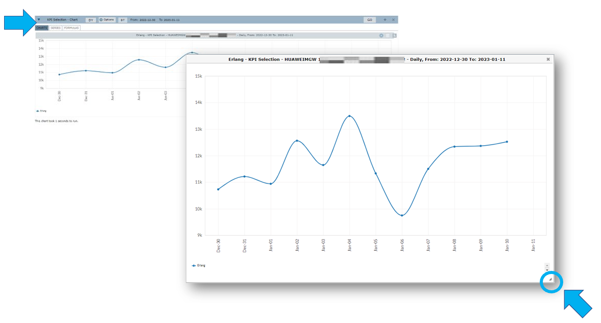
Select the Chart menu to:

1 – Generate the chart’s corresponding table.
2 – Download the chart’s raw data.
3 – Download a ZIP file containing MSWord and MSExcel files of the chart.
4 – Download the chart in PDF format.
5 – Download the chart as an image in JPG format.
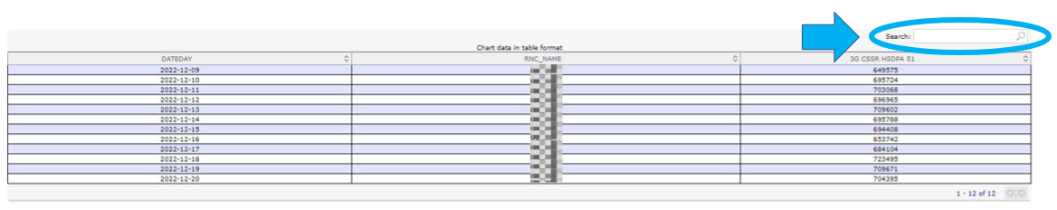
Click on the chart’s head to open the chart. Use the Expand button to resize the chart before downloading it.
Use the Search field to search for specific results in the chart’s table.
Select the Legend menu to show or hide the chart’s legend.
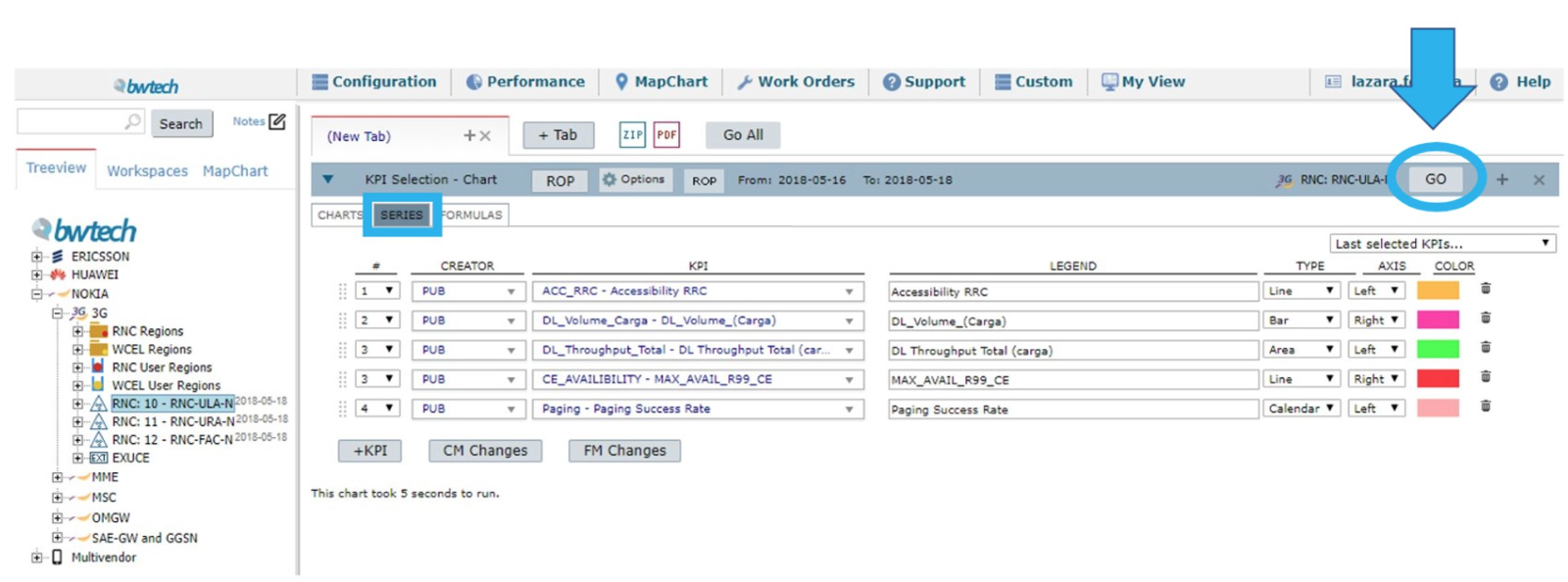
Series
Select the Series menu to edit the configurations of your analysis.
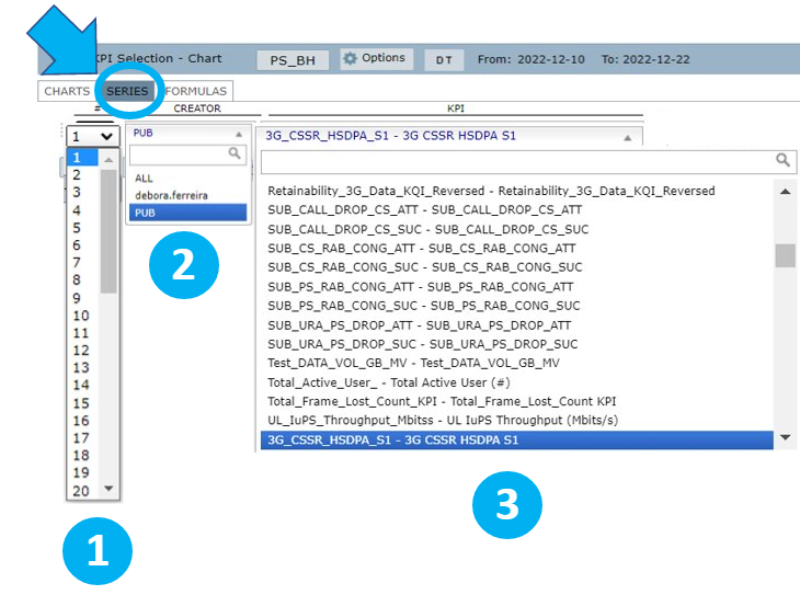
1 – Select the # icon to choose in which chart you want the selected KPI to be plotted.
2 – Select Creator to choose from a list of KPIs or counters available. Select PUB to view all public KPIs, ALL to view all KPIs or select your username to view the KPIs created by you or that were shared with you.
3 – Select the desired KPI or counters.
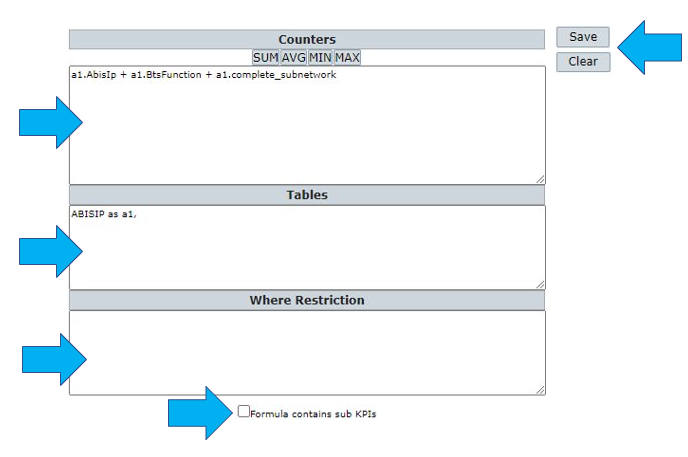
If you select counters, click on the Counters menu and follow the instructions to create your own KPIs.
- Under Performance, view the available tables of performance to the selected vendor/tech and choose the desired counter by dragging and dropping them in the Counters field.
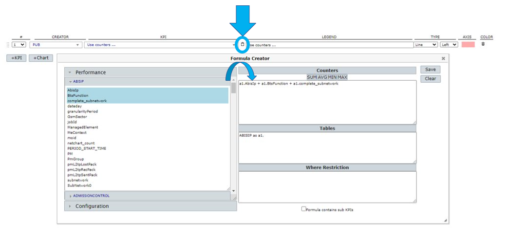
- In the Counters field, write/edit the KPI formula in line.
- Inside the Tables field, write the performance table related to the formula with an alias (as a, b, etc).
- In the Where Restriction field, write the conditional statement in case you want to restrict the results based on any counter.
- Check the Formula contains sub KPIs box if it contains other KPIs (i.e.: (rnc_727a + rnc_183c)/2).
- Select Save to save the new KPI or Clear to all the fields.
NOTE: Normally the KPI Formula is a SUM or AVG (average) of a few counters. If counters from more than one table are used, you need to put an alias of the table in front of each counter (i.e.: a.counter1; qos.counter2). In this case, the alias should be also present in the statistic table description.
View an example of how to use the Where Restriction field:
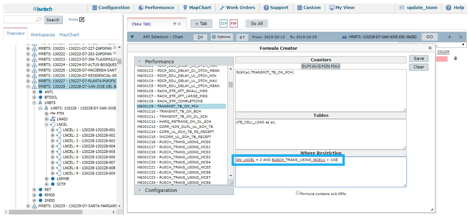
Select the TRANSMIT_TB_ON_PCH counter related to the LTE_CELL_LOAD table. However, you need for the result to contain information related only to lncel number 2, and for the elements from the table PUSCH_TRANS_USING_MCS11 to be greater than 100.
In this case, you must condition these rules in the Where Restriction field. Notice the differences between the results with no restriction and one with the restriction.
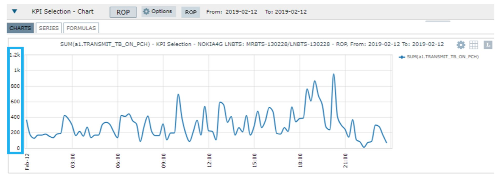
Result without restrictions:

Result with restrictions:
Continue editing the chart’s series.
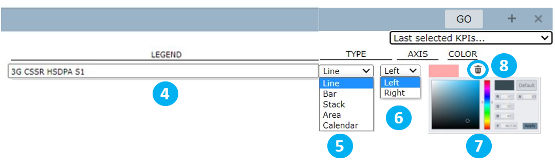
4 – Select LEGEND to write a personalized name for the KPI or use the automatically generated legend.
5 – Select TYPE to choose a type of chart: line, bar, stack, area or calendar.
6 – Select AXIS to choose in which axis the KPI will be: left or right.
7 – Select COLOR to choose a color for the KPI in the chart.
8 – Select the Trash bin icon to clear the series.
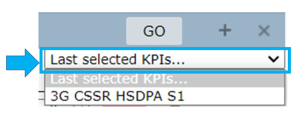
Select Last selected KPIs… to view a list of the last selected KPIs that were saved.
Continue editing the series.
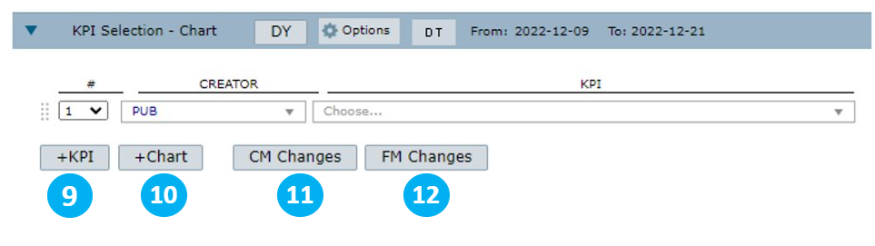
9 – Select +KPI to add more lines and include more KPIs.
10 – Select +Chart to add another chart.
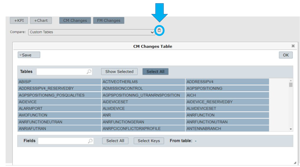
11 – Select CM Changes to correlate the selected KPI, which is a Performance parameter, to Configuration parameters.
12 – Select FM Changes to correlate the selected KPI, which is a Performance Parameter, to Failure management parameters or Alarms.
The selection of CM Changes or FM Changes is useful when you find an anomaly in the performance. It shows information about other parameters that can help improve the analysis of the problem.
View an example.
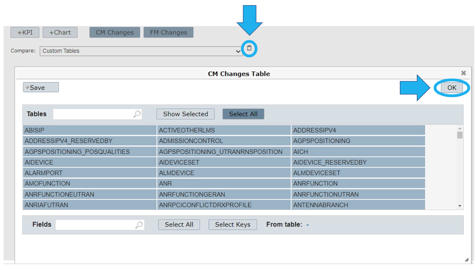
Select the CM Changes and FM Changes related to the KPI you want to correlate. Next, select the Counters and table menu.
Choose the configuration parameter table you want the KPI to be correlated.
Select OK to apply the configuration.
Select GO to run the charts.
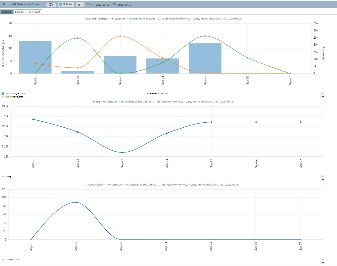
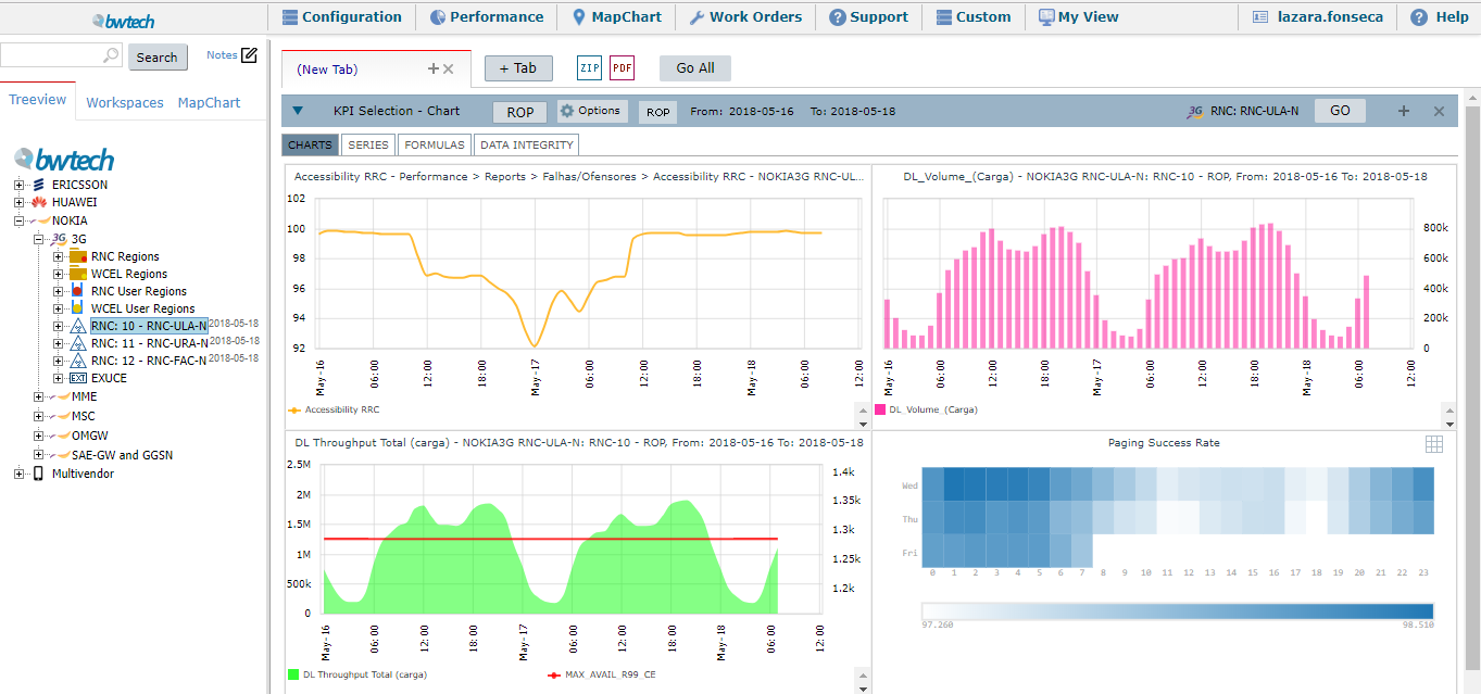
View the generated charts on the screen.
Add different KPIs, different charts, edit legends, types, axis, and colors.
Select GO to run the charts.
View the graphs generated:
One click PM/CM/FM correlation drill down
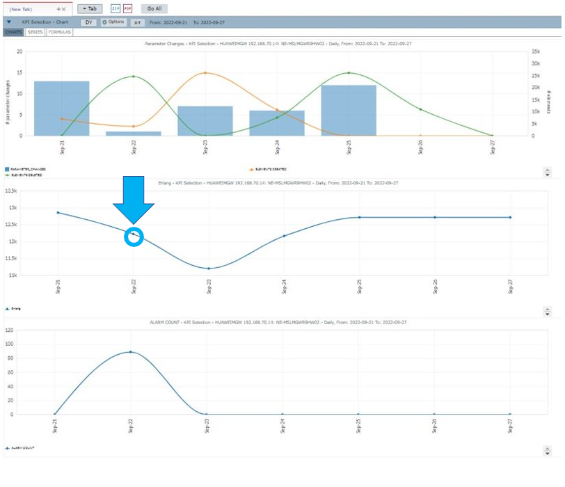
Double-click on a specific point of any of the generated charts to see more information about how the parameters and alarms may have affected the performance.
NOTE: If you double-click on the same date of any of the charts, the results generated by the drill down will be the same.
Parameters Compare
The first analysis refers to the changes in parameters.
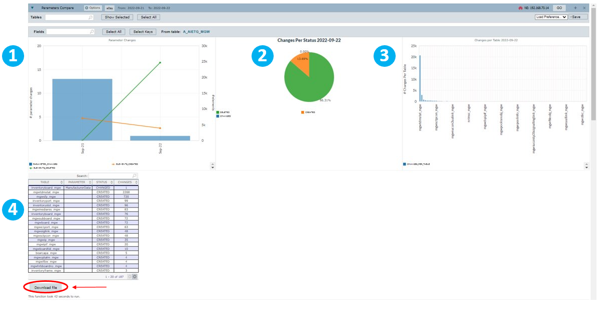
1 – View a comparison between the selected day – September 22 – and the previous day – September 21 – regarding elements created – in orange – and elements deleted – in green.
2 – View a pie chart with information on the percentage of elements created – in orange – and elements deleted – in green.
3 – View a graph with all the changes per table.
4 – View a table with information on the table’s name, parameter, status – Changed, Deleted, Created – and number of changes.
Select Download File to download a file with details about each table.
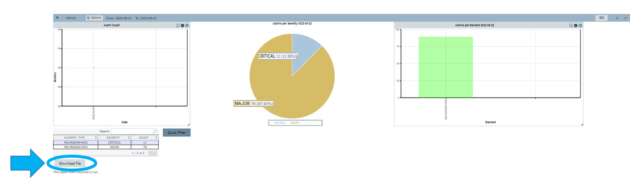
Alarms
The second analysis refers to the alarms that may have affected the performance.
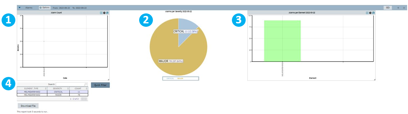
1 – View a graph with the number of alarms that went off on the selected day.
2 – View a pie chart with information on the percentage of alarms by severity.
3 – View a chart with alarms per element. In this case, you see one column because only one element was selected.
4 – View a table with information on element type, severity and number of counts.
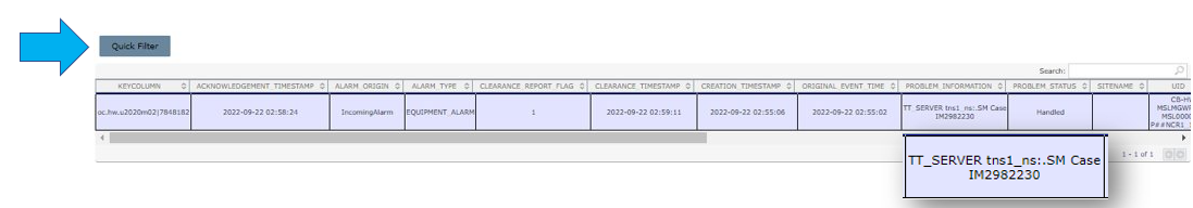
Select an element to view another table with more details on each alarm.
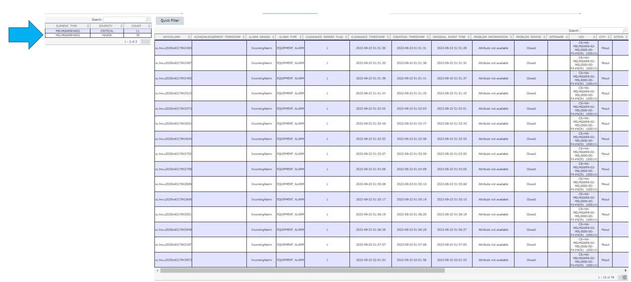
Select the Quick Filter button to filter results for any column.
NOTE: This button can be configured to filter any column of the alarm according to a rule. The configuration is done upon request to Bwtech’s support team.
In this case, select the Quick Filter button to filter the results for the PROBLEM INFORMATION column and view the alarms that show any relevant external information.
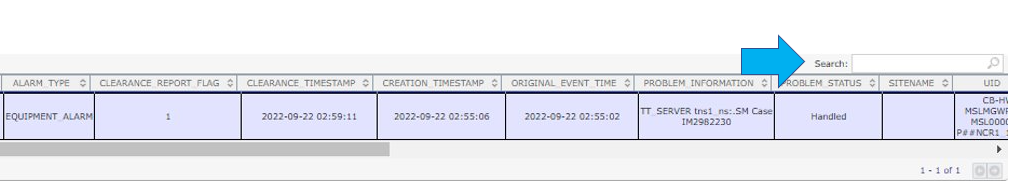
Use the Search field to filter for any information in the table.
Select Download File to download a file with details of the alarms.
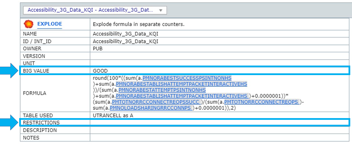
Formulas
This tab shows all the formulas used to create the related KPI and its source table.
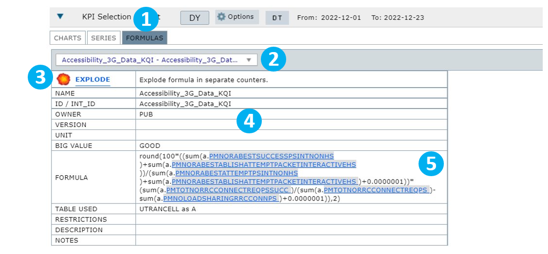
1 – Select FORMULAS to view the formulas used in the selected KPI.
2 – Select the KPI to view its details.
3 – Select EXPLODE to expand the formulas and visualize the counters used in the KPI separately.
4 – View all the fields related to the selected KPI.
5 – View the formulas used by the selected KPI.
The used formulas will generate reports showing the counters separately (numerator, denominator, etc.).
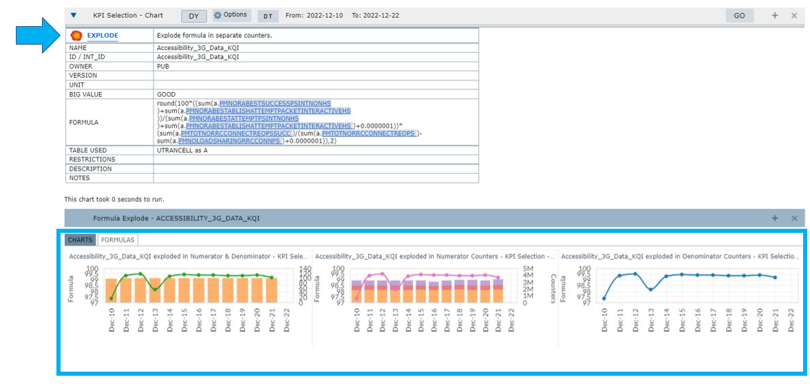
The field Big Value indicates the classification of the KPI as either GOOD or BAD.
For example, if the KPI Drop presents a high rate, the classification is BAD. Otherwise, it is considered GOOD.
The RESTRICTIONS field is responsible for indicating if the KPI contains any restriction set by the creator.