Contents
- 1 NETWARDEN
- 2 Overview
- 3 How to use
- 4 Functions description
NETWARDEN
Overview
NetWarden is an intelligent automation tool designed to assist engineers in focusing on critical troubleshooting actions rather than spending valuable time manually collecting, analyzing, and correlating data by themselves.
By using Machine Learning algorithms, NetWarden automatizes activities and identifies complex network issues that may go undetected by humans or traditional rule-based approaches.
How to use
Log in with your username and password.
A new tab will load on the interface.
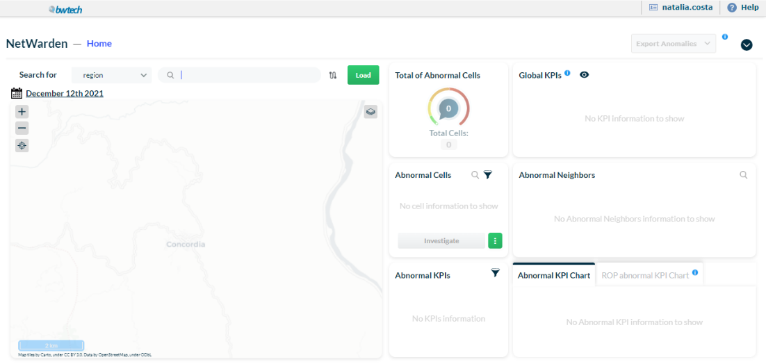
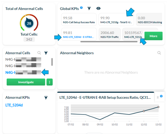
On the right side, it shows:
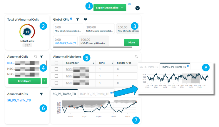
1 – Export Anomalies button used to export the list of abnormal cells in CSV format.
2 – Gauge chart with the total number of cells in the region and the number of anomalies detected.
3 – Section that shows the KPIs aggregated by all loaded elements where:
- White pills represent the global KPI values, indicating that there are cells within the list of abnormal cells with anomalies identified for these KPIs.
- Light grey pills represent the global KPI values with no anomalies identified for these KPIs.
4 – List of abnormal cells in the region. Search for specific cells, apply filters, and order cells by number of affected users.
NOTE: By default, abnormal cells with the highest number of affected users come first in the list.
5 – List of neighboring cells that also present detected anomalies. Select the Search icon to search for specific neighboring cells.
6 – List of abnormal KPIs. Search for a specific KPI or apply filters according to severity and direction.
7 – Chart with a history of abnormal KPI values and gravity anomaly margins, displayed in grey, and their details, such as date and gravity, shown as dots.
8 – Chart with ROP data related to a week-range history of abnormal KPIs, as well as the current day’s updates.
NOTE: Chart 8 provides more recent information, as ROP data is updated more frequently (usually every 15 minutes, 30 minutes or 1 hour, depending on the project). This means you can access the KPIs current day performance as it is updated, enhancing decision-making in investigating anomalies.
Search for anomalies in a region
To identify problems or check the overall health of the network, search for one or more regions and investigate all the multivendor regions available on NetChart’s treeview.
Use the Search bar to search for a region.

Enter the name of the desired region or folder. View all the options that correspond to the search.
Select Load.
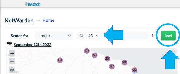
NOTE: We recommend using specific keywords when searching for a particular region or folder as more specific searches generate better results.
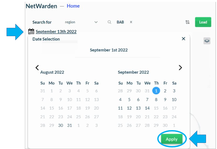
The system automatically chooses the most recent date, typically the previous day, to load the region onto the map panel. If you want to change this date, click on the Calendar icon and select the desired day
Click on Apply to save the changes.
NOTE: If the selected region or regions present no anomalies, the Abnormal Cells list will be empty.
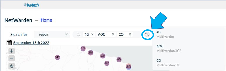
To view the selected cells or regions click on the button beside the Search bar.
Search for anomalies in a cell
To identify problems or check the overall health of the network, search for one or more cells and investigate all the multivendor cells available on NetChart’s treeview.
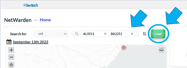
Use the Search bar to search for a cell.

Enter the name of the desired cell or cells and view all the options that correspond to the search.
NOTE: We recommend using specific keywords when searching for a particular cell or cells as more specific searches generate better results.
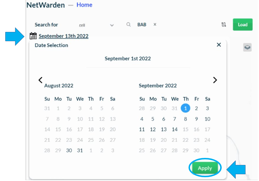
The system automatically chooses the most recent date, typically the previous day, to load the cell onto the map panel. If you want to change this date, click on the Calendar icon and select the desired day
Click on Apply to save the changes.
NOTE: If the selected cell or cells present no anomalies, the Abnormal Cells list will be empty.
View global KPIs
Use this section to view the KPIs aggregated by all loaded elements and the Preliminary Analysis section, which provides a deeper and broader analysis of abnormal cells and KPIs.
Global KPIs
View the region’s global KPIs displayed in pills, where:
- White pills represent the global KPI values, indicating that there are cells within the list of abnormal cells with anomalies identified for these KPIs.
- Light grey pills represent the global KPI values with no anomalies identified for these KPIs.
NOTE: The blue text refers to the KPI of the cell selected on the Abnormal Cells section. It is automatically updated once you click on a different cell in the Abnormal Cells section.
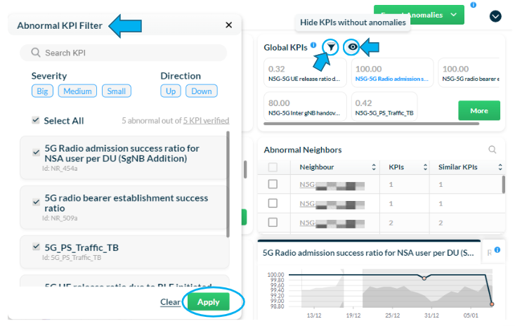
Click on the Filter icon to filter the KPIs by severity (big, medium and small) and direction (up and down).
NOTE: Applying the filter will simultaneously affect both KPI lists – Global KPIs and Abnormal KPIs.
Click on the Eye icon to hide global KPI values without anomalies (light grey pills) and view only the ones with anomalies (white pills) within the list of abnormal cells.
Preliminary analysis
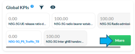
Click on More to view a detailed analysis on Global KPIs, Abnormal Cells and Abnormal KPIs.
View the Preliminary Analysis screen, which shows:
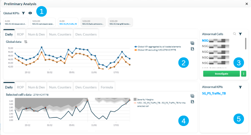
1 – Global KPIs section, showing the KPIs aggregated by all loaded elements.
2 – Global data section, displaying data divided by the following tabs:
- Daily data: it shows the global KPIs aggregated by all loaded elements (blue line) and the global KPIs excluding the selected cell (orange line)
- ROP data
- Numerator & denominator: it shows the total value of the numerator and the denominator in the KPI formula
- Numerator counters: it shows the values of the counters that make up the numerator in the KPI formula
- Denominator counters: it shows the values of the counters that make up the denominator in the KPI formula
3 – List of abnormal cells.
4 – Selected cell’s section, displaying data divided by the following tabs:
- Daily data
- ROP data
- Numerator & denominator: it shows the total value of the numerator and the denominator in the KPI formula
- Numerator counters: it shows the values of the counters that make up the numerator in the KPI formula
- Denominator counters: it shows the values of the counters that make up the denominator in the KPI formula
- KPI formula
5 – List of abnormal KPIs.
NOTE: Global KPIs, Abnormal KPIs, and Abnormal Cells sections are accessible on both the initial screen and the Preliminary Analysis screen.
Change viewing settings
Click on the Table icon located on the top right corner to switch to a tabular view. Click on the icon again to revert to the chart display.
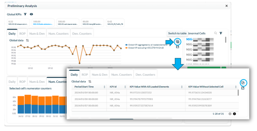
NOTE: Viewing settings do not apply to the Formula tab, as it only shows the details of the KPI formula in text format.
Export data
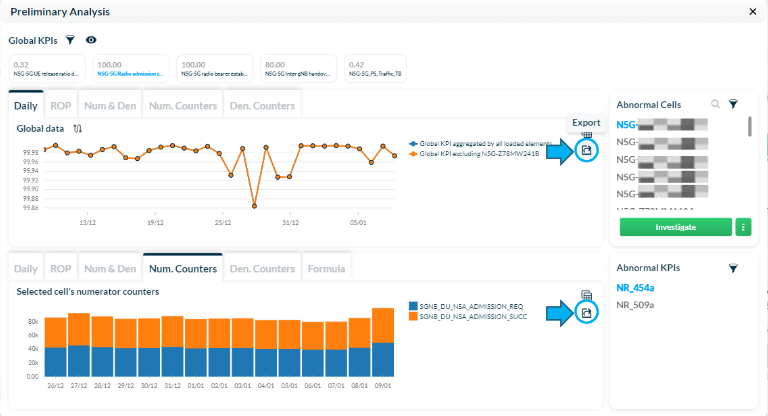
Click on the Export icon located under the Table icon to export the chart’s data in CSV format.
Filter abnormal cells and KPIs
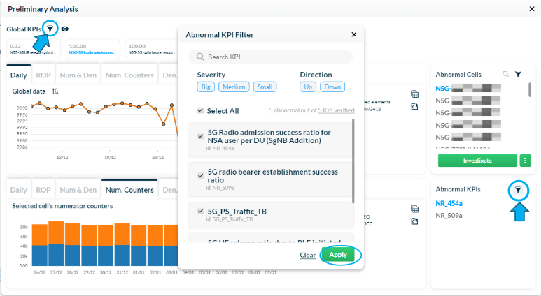
Click on the Filter icon located on the top left corner of the Global KPIs section to filter KPIs by severity (big, medium or small) and direction (up and down).
Select Apply to apply the filters.
It is also possible to apply the same filter to the Abnormal KPIs section, located on the bottom right corner of the screen.
Click on the Filter icon in the Abnormal Cells section to define the parameters of users affected by degradation.
It is also possible to check the number of times any of the cell’s KPI was abnormal in the last seven days.
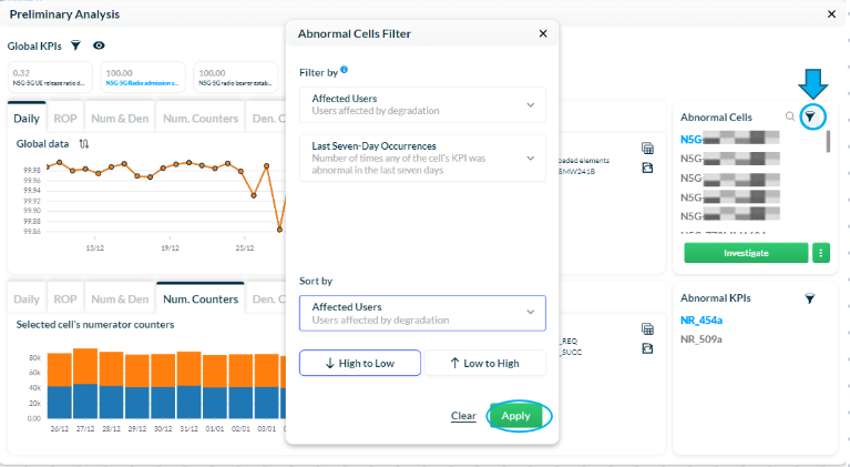
Select Apply to apply the filters and view the updated list of abnormal cells.
NOTE: Applying the filter will simultaneously affect both KPI lists – Global KPIs and Abnormal KPIs.
NOTE: For more information on how to use these filters, refer to the Explore abnormal cells and Abnormal neighbors sections in this document.
Explore abnormal cells
Use this section to explore abnormal cells by applying different filters to narrow down your investigation. You can also explore abnormal neighboring cells and locate elements.
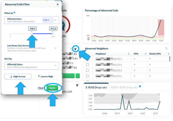
Affected users
Click on the Filter icon in the Abnormal Cells section to define the parameters of users affected by degradation. Order the results by higher impact to lower or by lower impact to higher.
Select Apply to apply the filters.
Last seven-day occurrences
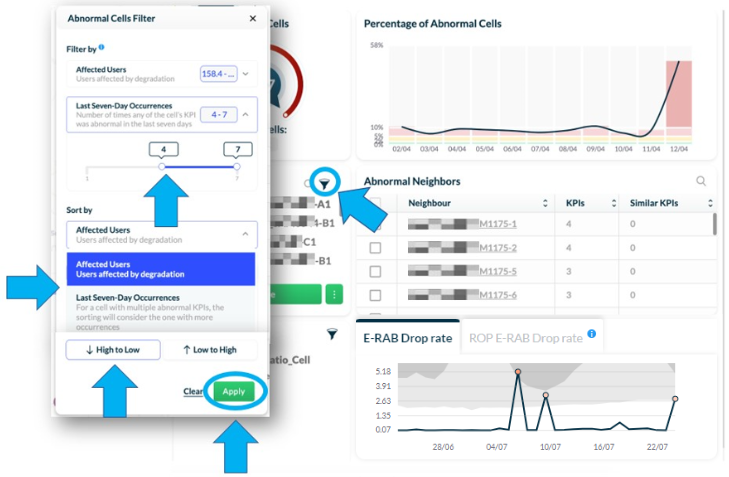
Click on the Filter icon in the Abnormal Cells section to check the number of times any of the cell’s KPI was abnormal in the last seven days.
The number of occurrences varies between one and seven, depending on the performance of the cell and the KPIs configured.
NOTE: Other abnormal KPIs in an element that meets the filter criteria will also be displayed so that relevant information for the investigation is not hidden.
Abnormal Neighbors
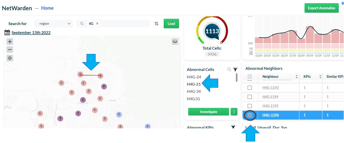
Click on an Abnormal Neighbors’ cell to plot a line on the map and see its position according to the selected element.
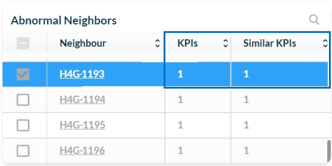
In the Abnormal Neighbors table, identify which neighboring cells have similar anomalies with the selected element.
Click on the Filter icon in the Abnormal KPIs section to define the severity and direction parameters.
Select Apply to apply the filters.
View the total number of verified KPIs and how many are abnormal.
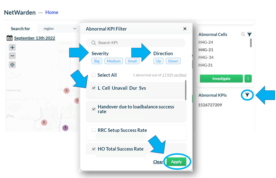
NOTE: NetWarden detects anomalies based on a predefined set of KPIs. If you want to make changes to the list of KPIs, please contact Bwtech’s support team.
Analyse KPI performance
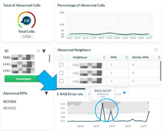
Click on the first tab to view the history of abnormal KPI values and gravity anomaly margins, displayed in grey, and their details, such as date and gravity, shown as dots.
Hover over the dots to see details such as the KPI values, specific date, and gravity, which can be categorized as small, medium, or large.
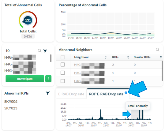
Click on the second tab to view a chart with ROP data related to a week-range history of abnormal KPIs, as well as the current day’s updates.
Gravity anomaly margins are shown as vertical bands, coloring the days considered anomalous, where:
- Light grey represents small anomalies;
- Medium grey represents medium anomalies;
- Dark grey represents big anomalies.
Hover over the anomalies’ color to view their gravity.
Locate elements
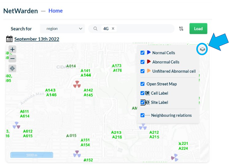
On the map, view the location of the elements in the selected region. The normal cells are displayed in blue, while the cells with anomalies are displayed in red.
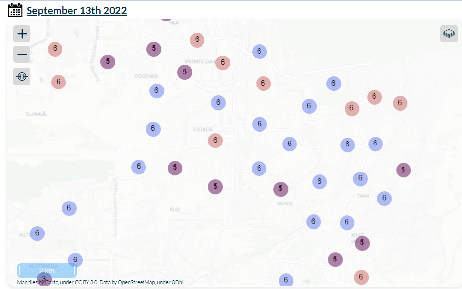
Select the Layer icon to choose which layers to display on the map.
Check the boxes to show or uncheck them to hide the normal cells, abnormal ones, unfiltered abnormal cells, neighboring relations, cell label, site label, and the street map.
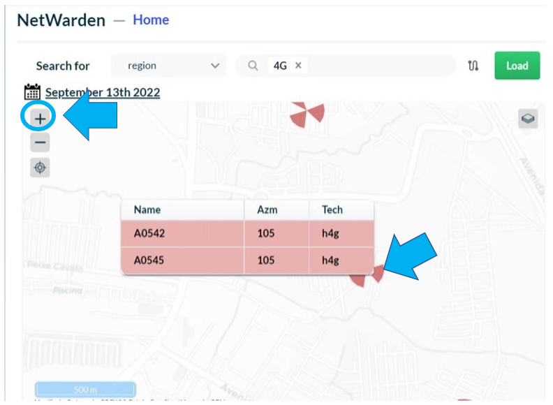
Zoom in or out on the map using the + and – buttons or the mouse scroll.
After zooming in, click on a specific element on the map to see its name, azimuth, and technology.
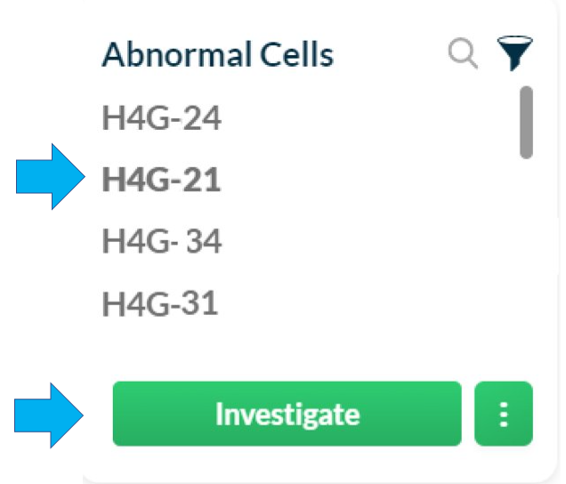
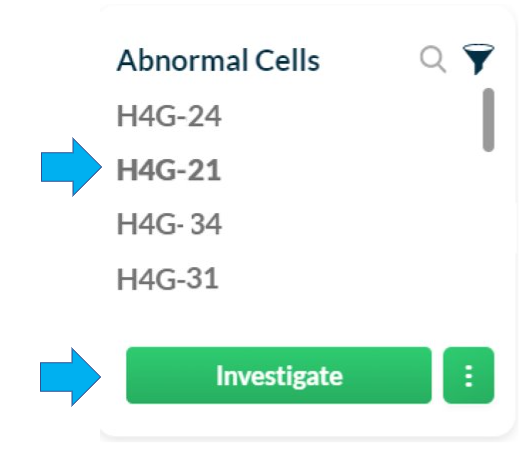
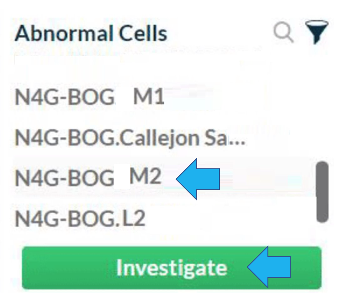
To select an element for further investigation, click on its name on the Abnormal Cells list and select Investigate.
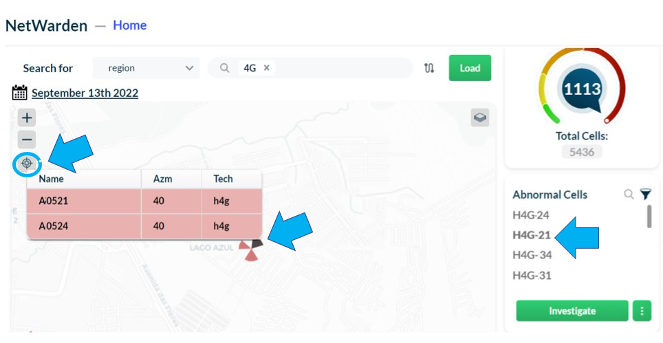
To view the selected element centered on the map, click on the Center button on the upper left side of the map.
Export anomalies
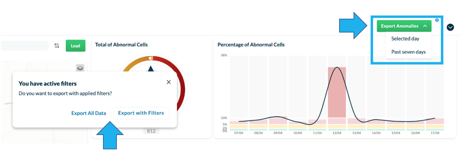
Click on the Export Anomalies button to download a CSV file of the abnormal cells or regions investigated.
Choose Selected day to download a file with information about the day you previously selected on the calendar.
Choose Past seven days to download a file with information about the last seven days referenced to the day that you previously selected on the calendar.
If filters were applied in the Abnormal Cells list, you can choose between Export all data or Export with filters.
NOTE: There is a column named region_name in the exported table. If an abnormal cell belongs to more than one selected region, it will appear two times in the table.
NOTE: The CSV file contains the total of affected users per KPI.
Receive an anomalies report by email
Contact Bwtech’s support team to receive a daily email with a report of all the abnormal cells in the last 7 days.
To do that, provide the following information to Bwtech’s support team:
- The regions that will be present in the table.
- The email addresses of those who should receive the email.
- The preferred subject for the email message.
NOTES:
- The lists of email addresses and regions are fixed. Contact Bwtech’s support team to request any changes to the regions reported or addresses.
- The same email is sent to all recipients, with no variations.
- The email is sent daily in the morning, immediately after the processing of abnormal cell detection for the previous day is finished.
- The CSV file attached to the email will be the same one that is available through the Export button in the application, provided the same regions are loaded for that day.
- Since the table can have several regions, the file can be large. If the file is smaller than 10MB, it will be attached to the email message. If it exceeds 10MB, it will be zipped. If the zip file exceeds 10MB, it will be replaced by a link through which the file can be downloaded. The link will be available for 2 days.
Functions description
Investigate abnormal cells – Checks
Deeply investigate an abnormal cell to discover the issues related to it.
Select the desired abnormal cell and click on Investigate.
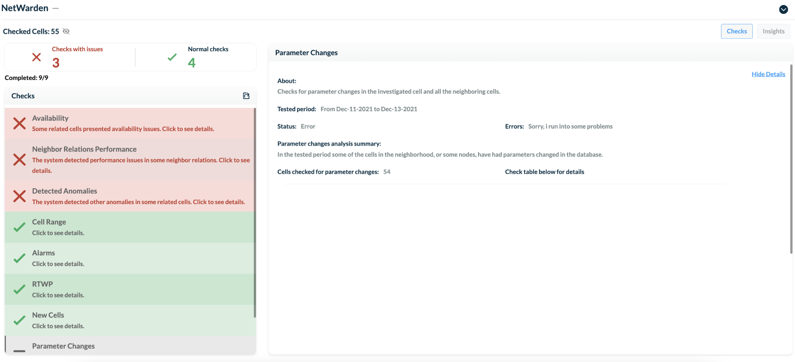
View the investigated Checks on the left and their corresponding details and discoveries on the right.
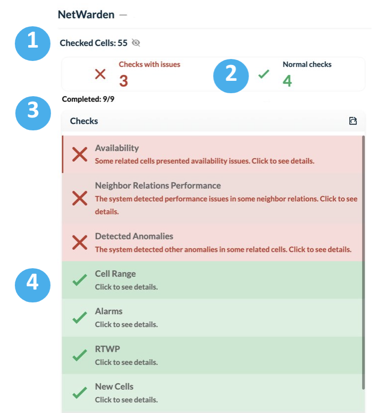
Below the name of the selected element, view:
1 – The total number of cells investigated.
2 – The number of checks with and without issues
3 – The number of checks completed.
4 – The results of the Checks performed.
The system runs 9 automated Checks:
1 – Availability.
2 – Cell Range.
3 – Alarms.
4 – Received Signal Level (RTWP).
5 – Parameter Changes.
6 – Neighbor Relations Performance.
7 – Detected Anomalies.
8 – Transmission Links.
9 – New Cells.
10 – Congestion.
The checks that presented issues are highlighted in red, while normal ones are displayed in green.
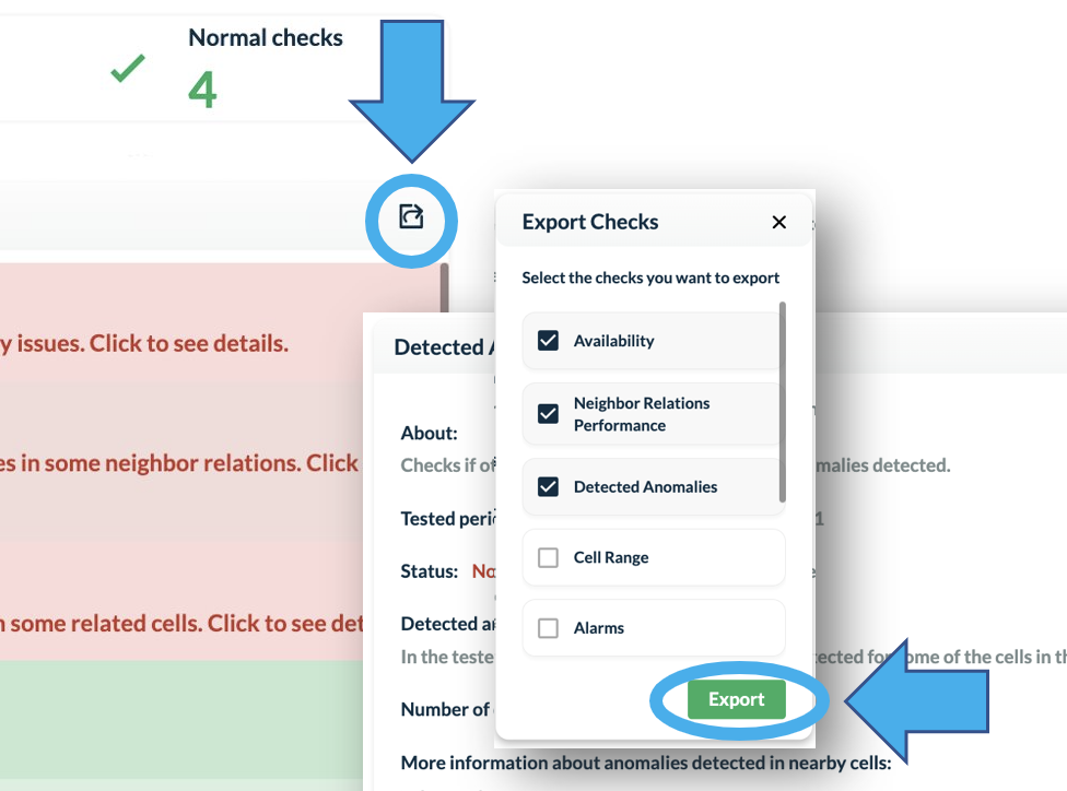
Select the Export icon to download checks in PDF format. Choose the checks that will be present in the file. Click on the Export button to download the PDF file.
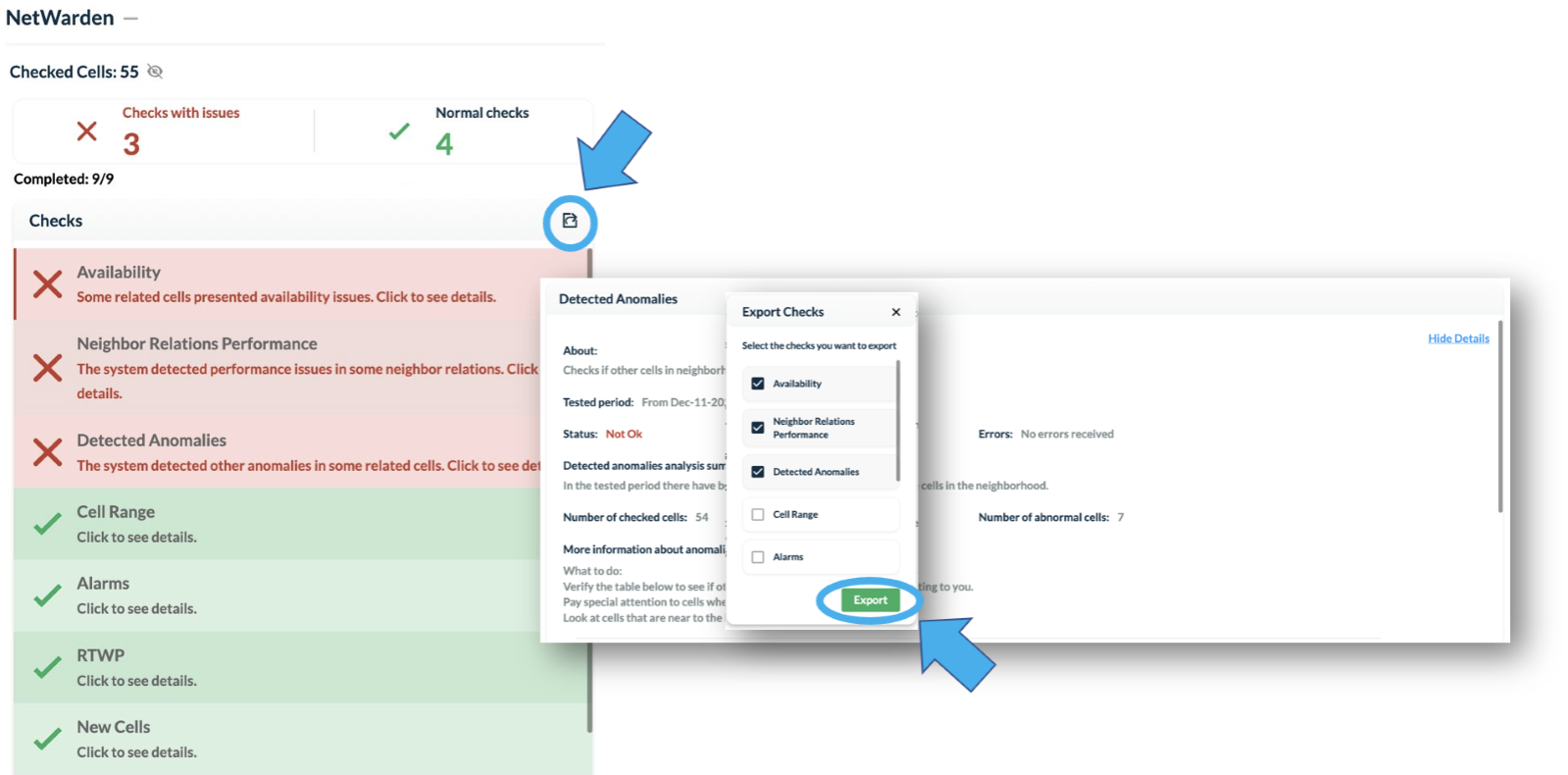
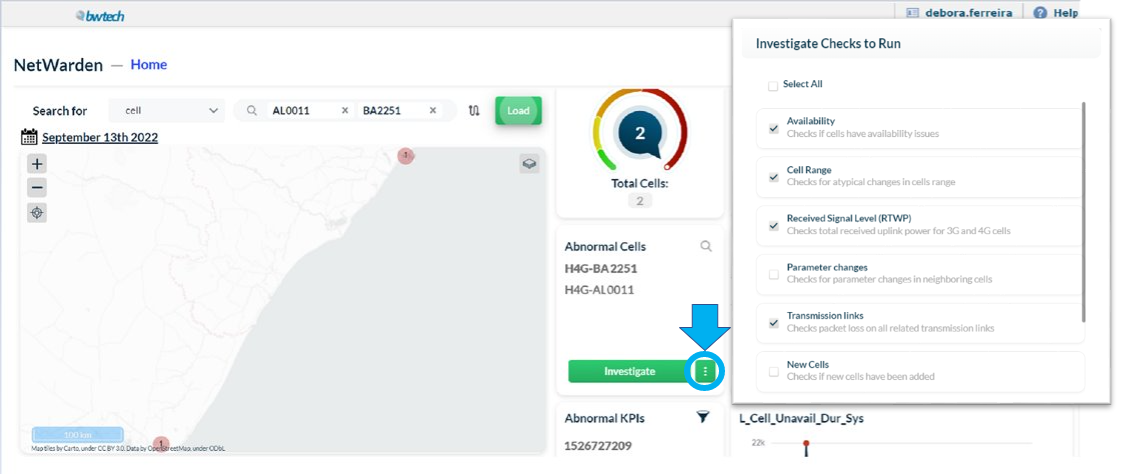
NOTE: In NetWarden’s Home page, define the automated checks that the system will run.
Click on Settings next to the Investigate button inside the Abnormal Cells section and select the desired checks.
Click on the Eye icon located next to the number of checked cells to hide the Checks panel. This will allow the analysis to take up the entire interface, making it easier to view the investigated issue.
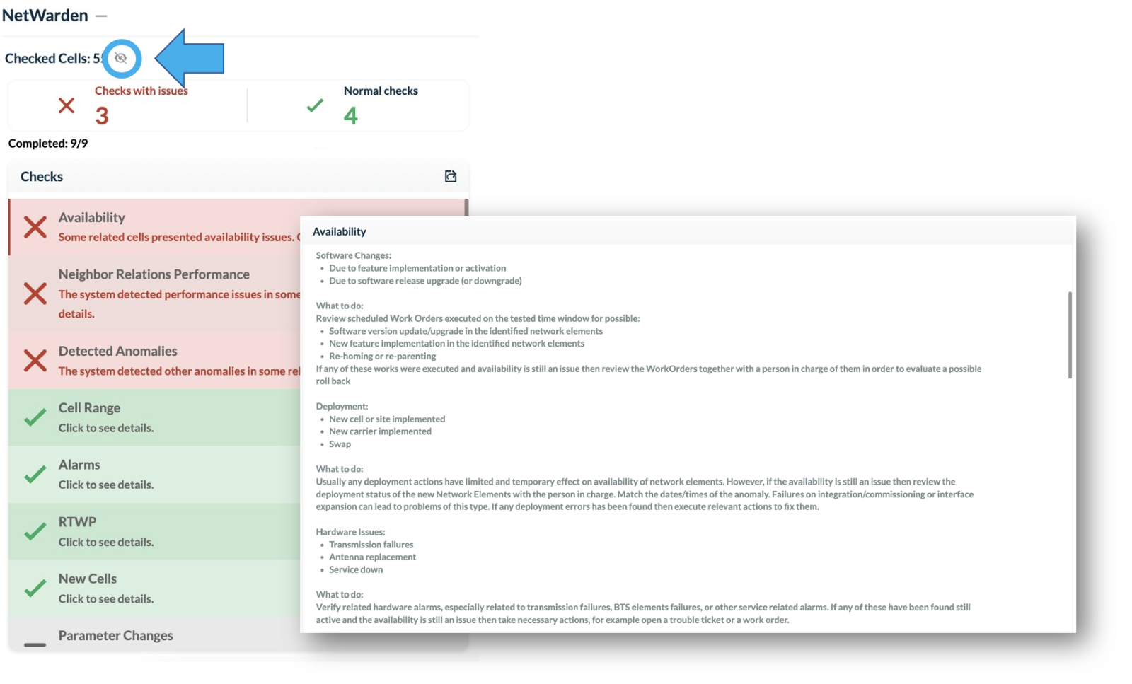
The analysis includes informative charts and tables presenting relevant data along with an in-depth report on each check.
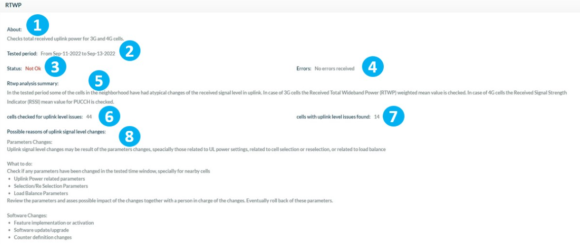
1 – Brief explanation of the check.
2 – Period of analysis.
3 – Status of the check.
4 – Number of errors found.
5 – Summary of the analysis.
6 – Number of cells with issues found.
7 – Number of cells checked.
8 – Possible causes of problems and recommendations on how to solve them.
In the upper right-hand corner, select Hide Details to view only the tables and graphs relevant to the analysis.
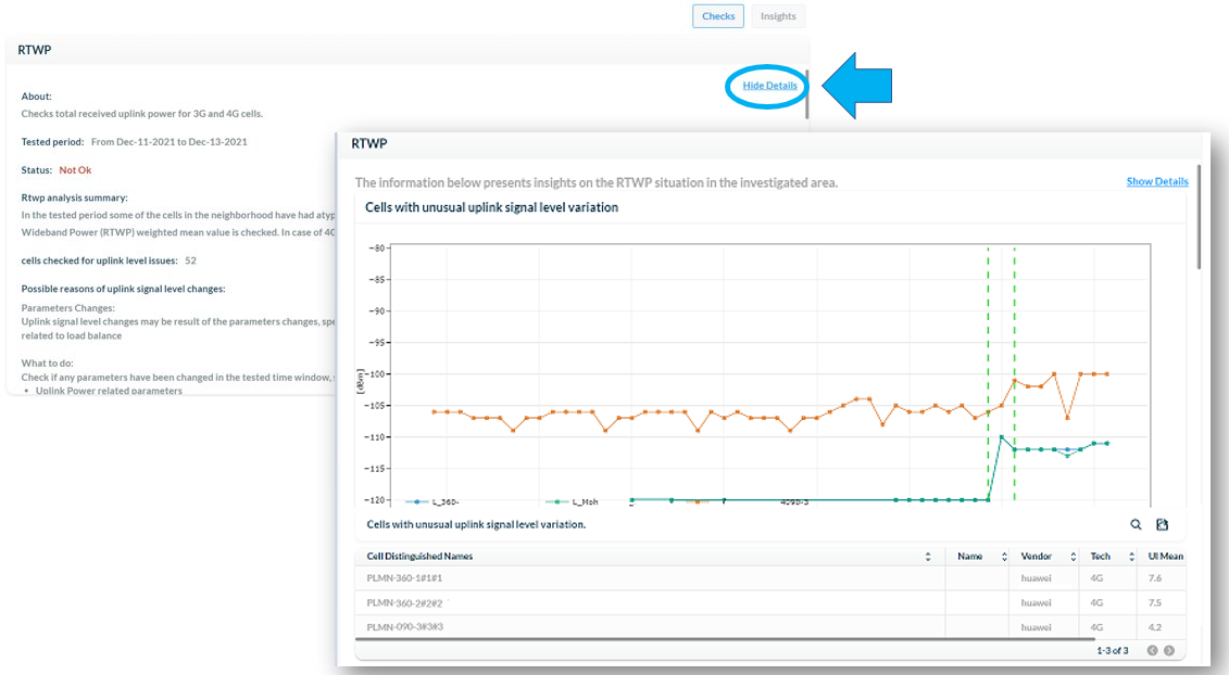
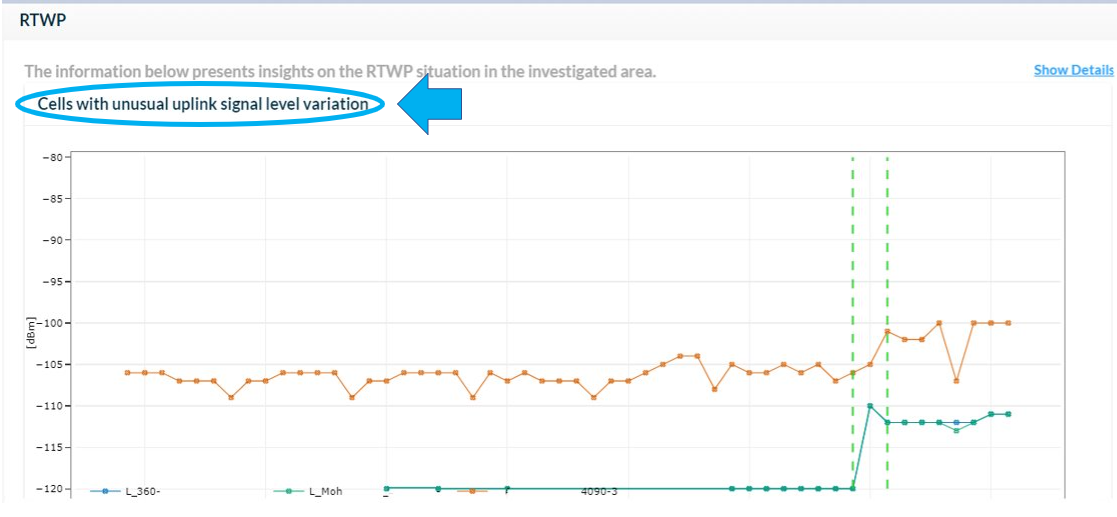
Click on the graph’s name to expand it.
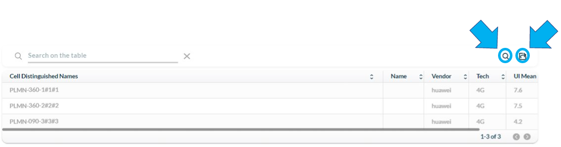
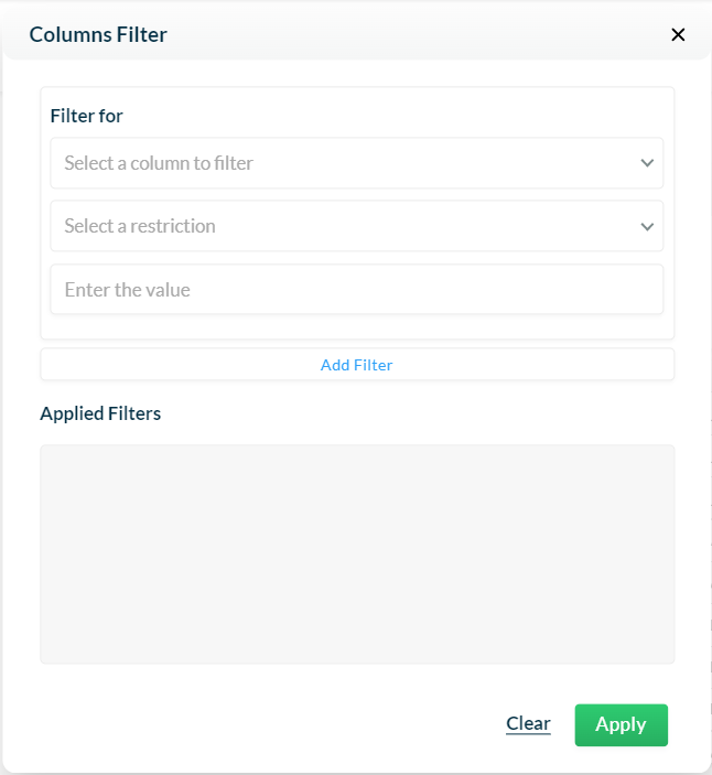
Use the Search tool to quickly find an element, vendor, technology, or other content within the table.
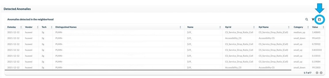
Click on Export to download each check’s table in CSV format for further analysis.
Investigation checks
Availability
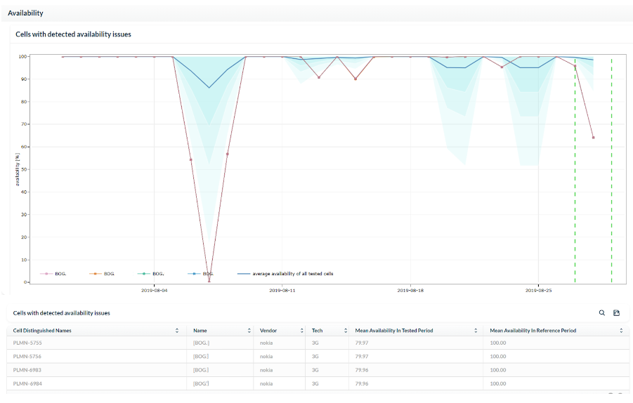
This check investigates availability issues on the selected cell as well as other network cells that may impact its performance.
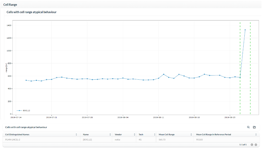
Cell range
This check investigates whether there are any atypical changes in the cell range of the selected cell and other cells that may impact its performance.
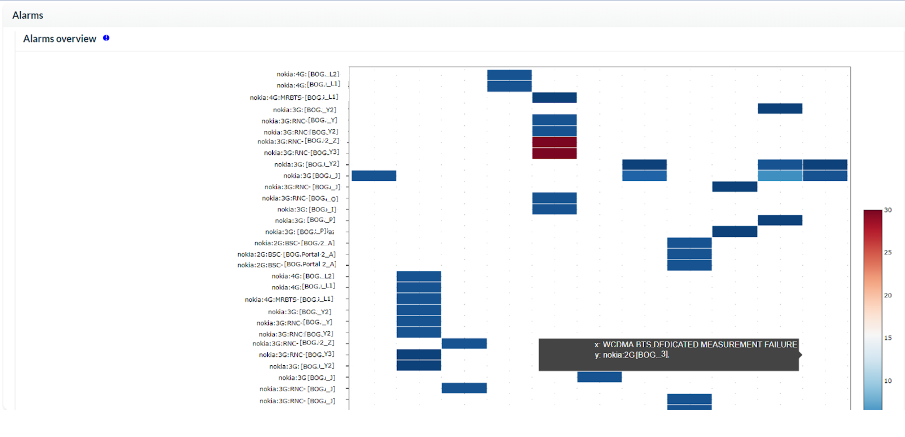
Alarms
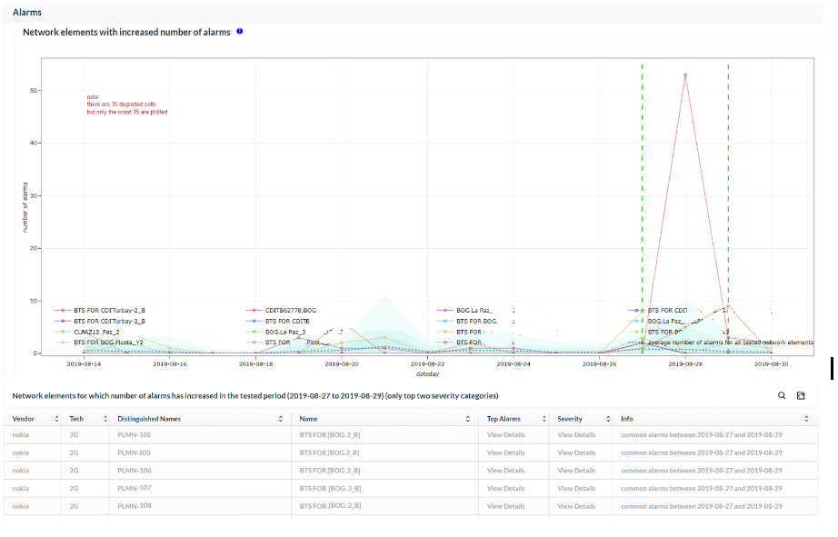
NetWarden checks for unusual alarm patterns on the investigated cell and on others that may impact its performance. This check provides a history of alarms and highlights those with the highest probability of being the root cause and triggering other alarms.
NOTE: The graph displays the top network elements in the region based on the number of alarms they have triggered top network elements are based on the number of alarms.
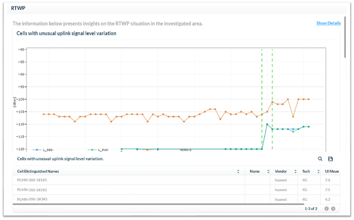
RTWP
This check investigates the total received uplink power (signal level) for 3G and 4G cells.
Parameter changes
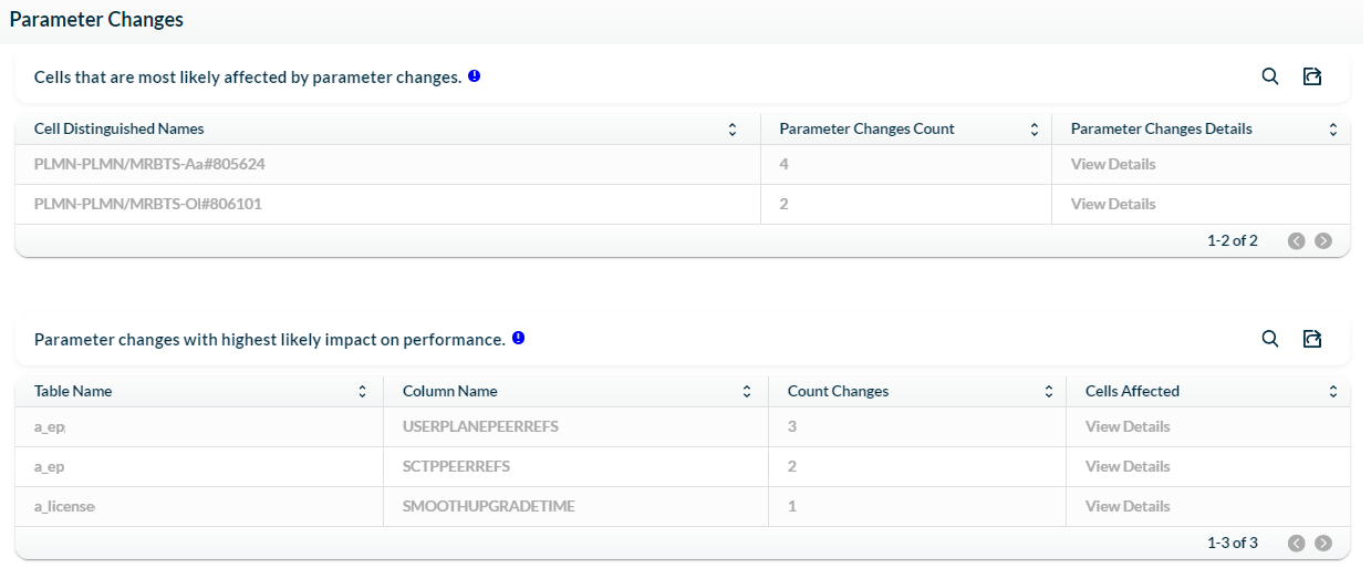
NetWarden provides an intelligent analysis of all changed parameters in the investigated element and its neighbors.
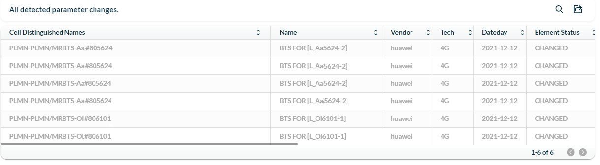
It also shows the elements with the highest probability of being affected by parameter changes, and the data about all parameter changes detected, old and new values, as well as their impact on the overall performance.
Neighbors relations performance
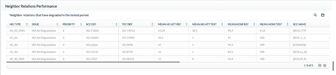
This check analyzes all neighbor relations performance in the area.
- Priority 1: relations to or from the tested abnormal cell.
- Priority 2: relations to or from cells co-located or very close to the abnormal cell.
- Priority 3: other relations to or from cells that are not part of priorities 1 and 2.
It shows the reference value for the number of expected attempts, the value in the selected period, and the handover success rate.
Detected anomalies
This check detects anomalies in other neighboring cells and shows the affected KPIs, the anomaly category, and the ID of the abnormal element.
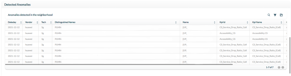
For a deeper investigation, filter elements by categories, such as KPI name, vendor, or technology.
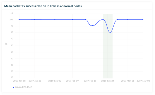
Transmission links
This check shows the analysis of the Two-Way Active Measurement Protocol (TWAMP) regarding issues with packet loss on the IP links.

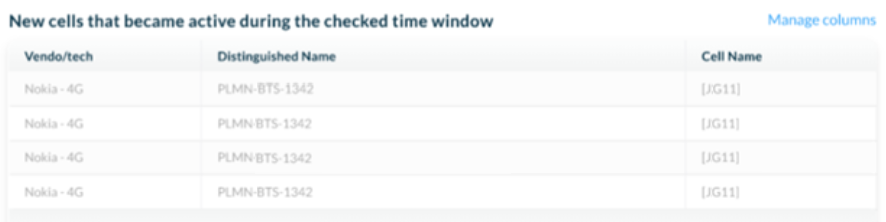
New cells
This check reports the number of new cells that were integrated into the network during the investigated period.
Congestion
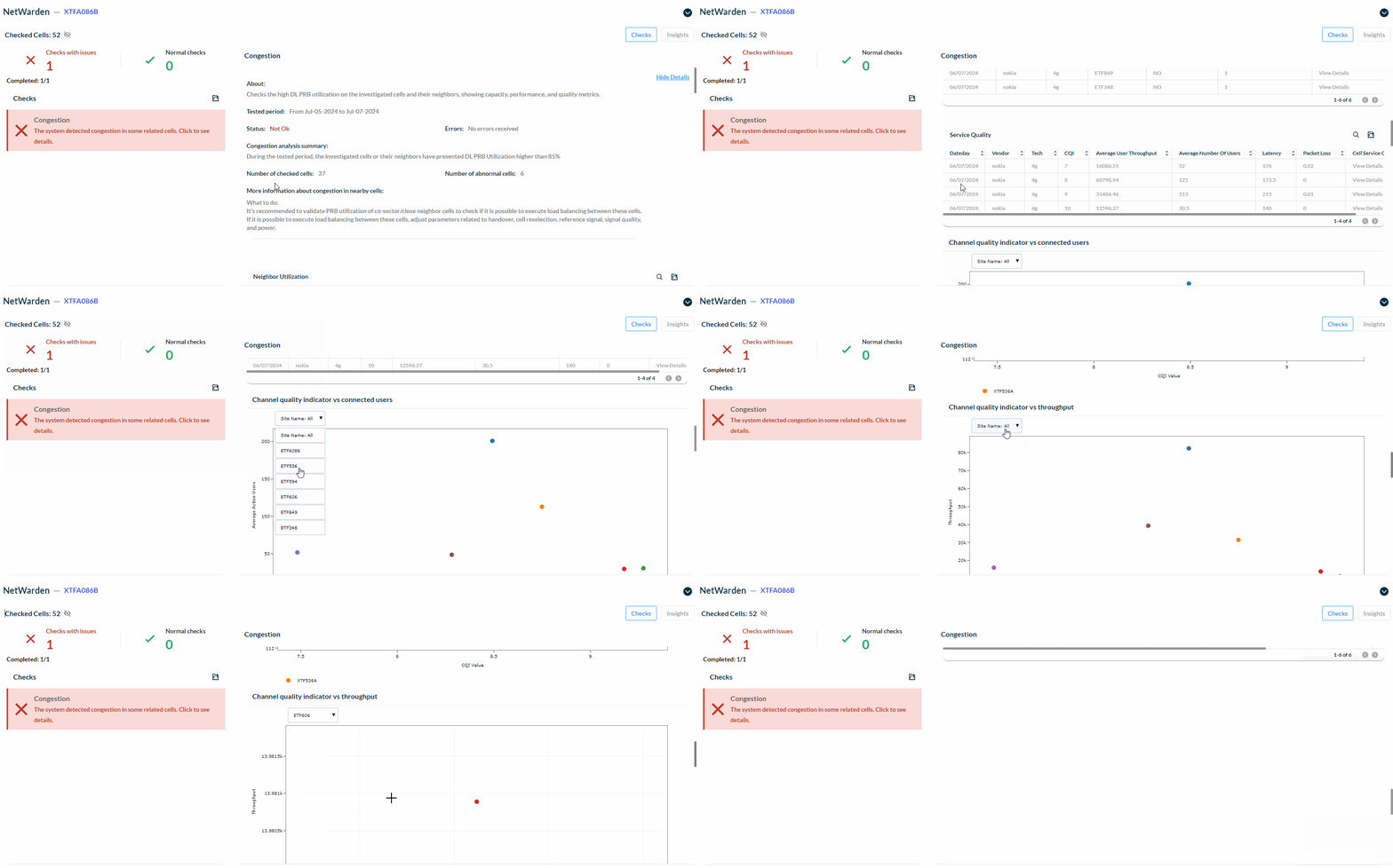
Use the Congestion Check to quickly identify potential congestion based on PRB utilization, CCE utilization on PDCCH, number of connected users, and service quality metrics like user throughput, CQI, latency, and packet loss.
The Congestion Check monitors 4G and 5G RAN technology. It compares actual KPI values against configured thresholds to help you identify potential congestion issues. The default is 85%, but can be changed upon support request.
When a Congestion Check results in a “NOK” status, you can view detailed metrics in interactive charts and tables, showing exactly which cells are affected. This gives you the insights you need to analyze and address congestion effectively.
How You Can Analyze the Results:
- Interactive Charts:
-
- Filter the data by cell or site name.
-
- Click the chart title to expand it for a more detailed view.
-
- Use the legend to control the visibility of data points.
-
- Double-click on a legend item to highlight only the data point of interest.
- Service Quality Information:
-
- Get insights into how congestion affects user experience, including key metrics like channel quality, throughput, latency, and packet loss.
- Sub-tables:
-
- Drill down into specific details to further investigate congestion issues.
What You Need to Know About Congestion:
RAN congestion happens when there’s a mismatch between the demand for network resources and its available capacity. The Congestion Check helps you manage and resolve these issues efficiently.
Data used:
- Performance Management Data:
-
- Downlink (DL) and Uplink (UL) Data Volume.
-
- DL and UL Physical Resource Blocks (PRBs).
-
- Physical Downlink Control Channel (PDCCH)/Control Channel Element (CCE) utilization.
-
- Average number of connected users.
- Configuration Management Data:
-
- Available bandwidth.
-
- Operational carrier.
-
- Cell radius.
-
- Maximum transmitter power.
-
- Transmission mode.
Click on the image below to view an example of the output:
NOTE: To export a summary of the investigated checks, click on the Export icon to export the desired checks in PDF format.
NOTE: To export the tables of the checks analysis, go to the desired table in the check and click on the Export icon located in the upper right-hand corner of the table. The file will be exported in CSV format.
Click on the Search icon located on the left side of the Export icon to find information about specific cells such as name and vendor. Search for details based on the type of check, such as the mean availability in the Availability Check, or search for KPIs that have a determined value in the Detected Anomalies check.

Investigate abnormal cells – Insights
NetWarden offers an insights analysis feature that offers a holistic view of the issues investigated and facilitates quick data interpretation.
On the Investigate screen, click on Insights on the upper right-hand side.
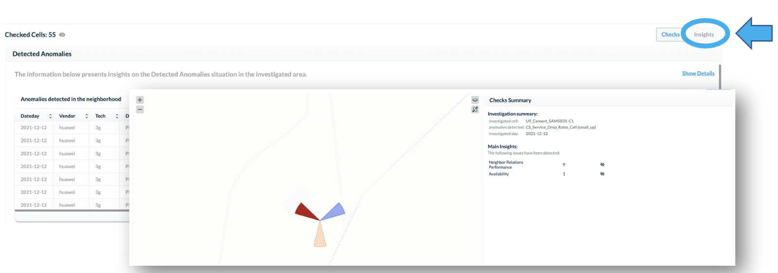
The Insights screen offers a comprehensive summary of the issues found by the investigation, presenting relevant data that allow for a quick understanding of the current state of the network.

On the left side, the Summary Map displays the investigated cell and its neighboring cells. On the right side, the Checks Summary provides details such as the anomaly found, analysis period, anomaly severity, and the main issues found by the checks.
By using this visualization mode, issues can be explored directly on the map, providing a better correlation of the data of the investigated cell.
To customize the map view, select the layers to be shown. Click on the Layers button located on the upper right-hand side of the screen.
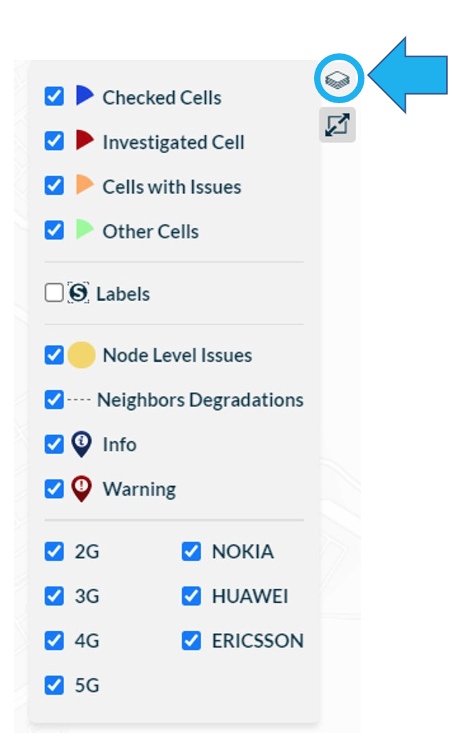
The map displays:
1 – Checked cells: the cells that were checked and did not present any issue.
2 – Investigated cell: the abnormal cell selected for investigation.
3 – Cells with issues: the neighboring cells that were investigated and presented issues.
4 – Other cells: other cells that belong to the network.
5 – Labels: the names of the elements.
6 – Node Level Issues: shows the location of the nodes with issues.
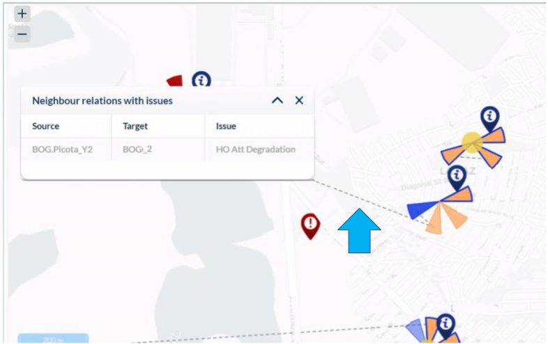
7 – Neighbors Degradations: handover issues.
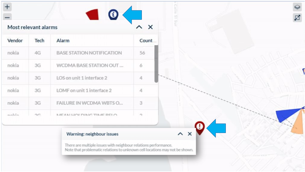
8 – Info: the most relevant alarms detected in the nearest node.
9 – Warning: warnings in areas with many handover issues.
10 – Techs and Vendors: filter by technology and vendor.
Select the Expand button on the upper right-hand side of the map to expand the map’s visualization.
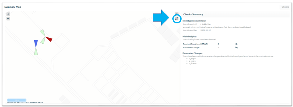
In the Checks Summary panel, in the Main Insights, click on the name of the detected issue to highlight the cells on the map.
The elements with the detected issue are outlined in blue on the map allowing you to quickly identify the affected areas in the region.
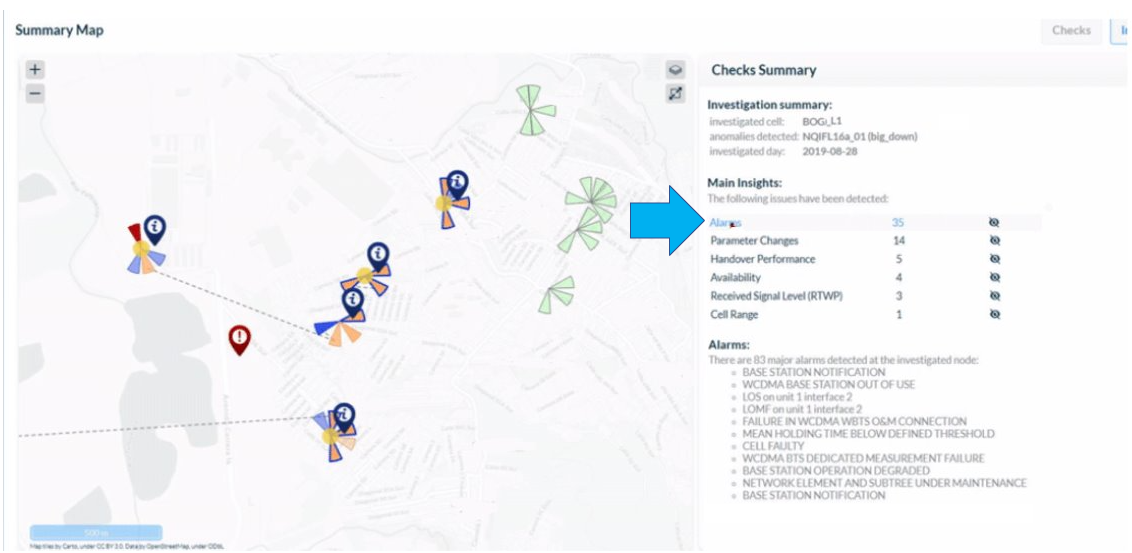
Click on the Eye icon to show or hide elements with a specific issue on the map.

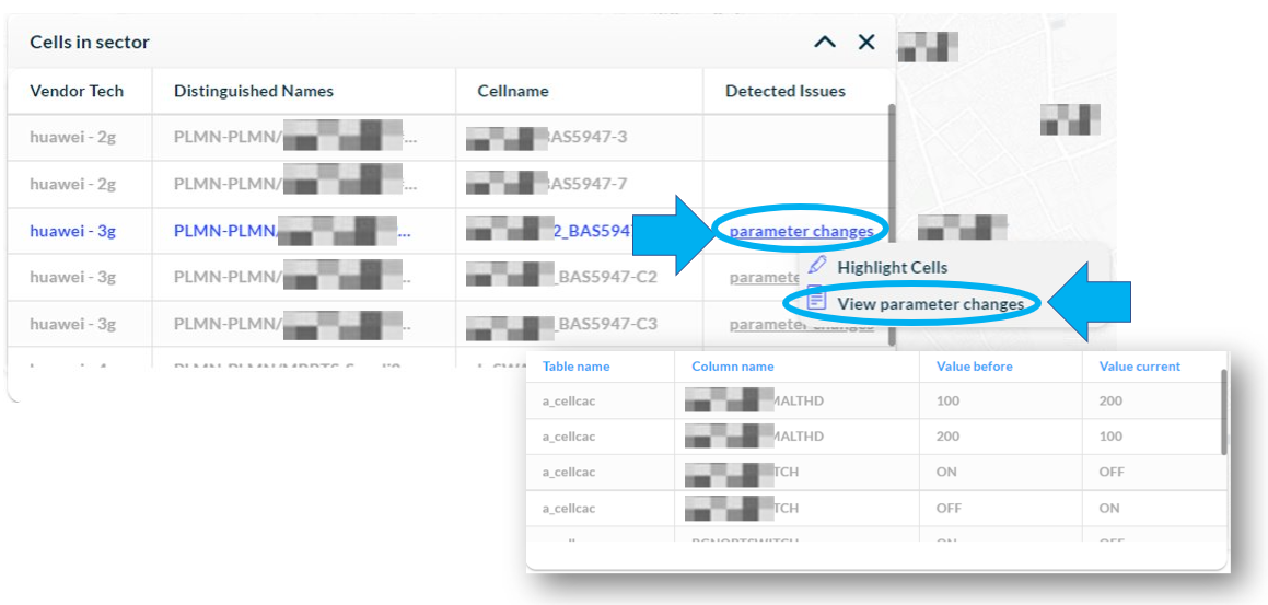
Click on a sector to view which cells belong to it and where the detected issues are.
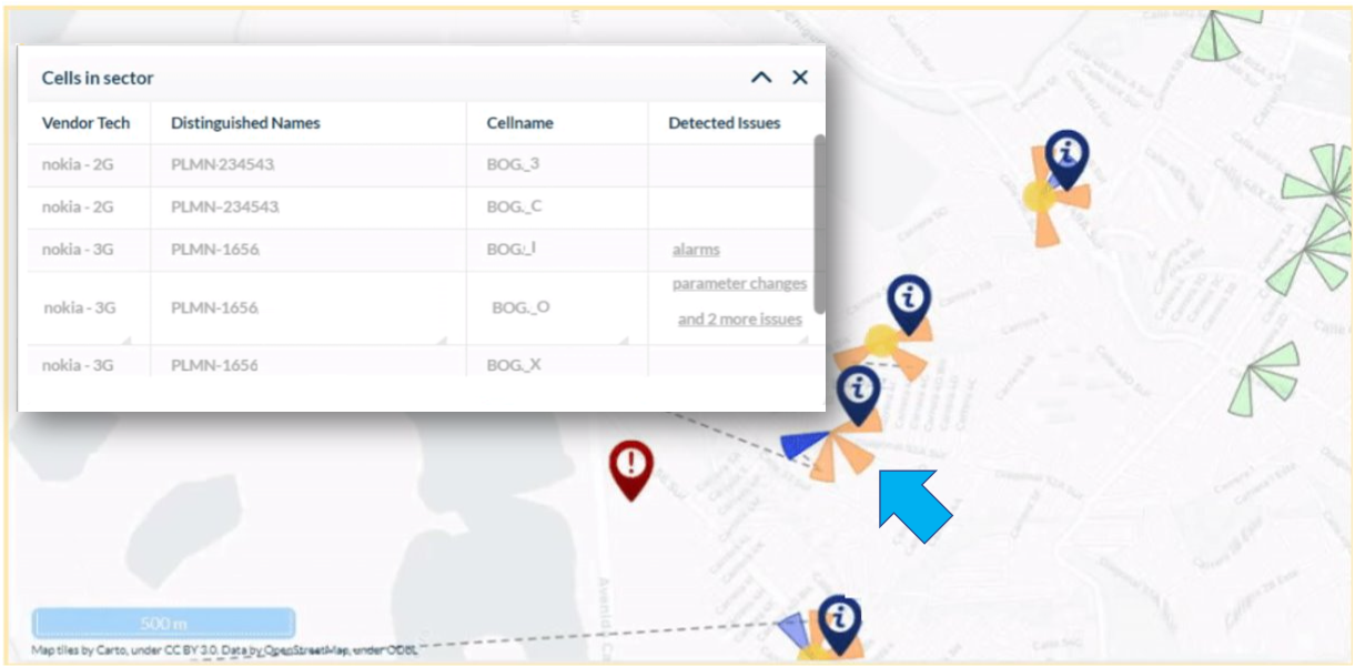
Click on the name of the detected issue to highlight the cells and to see a table with more details about the issue.
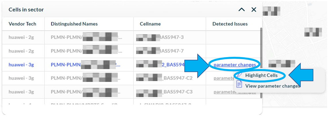
Click on View [name of the issue] to view more details about that issue.
Click on the red or blue pointers to learn more about the alarms and warnings found by the tool.
Click on the dotted line that connects the sectors to learn more about the handover issues. The table shows the source and target cells and the type of degradation found.
Investigate more elements
To investigate more than one cell, after the analysis of the first element, click on the Arrow button on the upper right-hand side of the screen and select the Home button.

Return to the initial analysis page and choose the other element. Click on Investigate to start the new analysis.
Investigate past dates
By default, NetWarden always selects the most day as the chosen period for region analysis. To investigate past dates, click on the Calendar on the upper left-hand side of the main screen.
Select the date for the analysis and click on Apply.
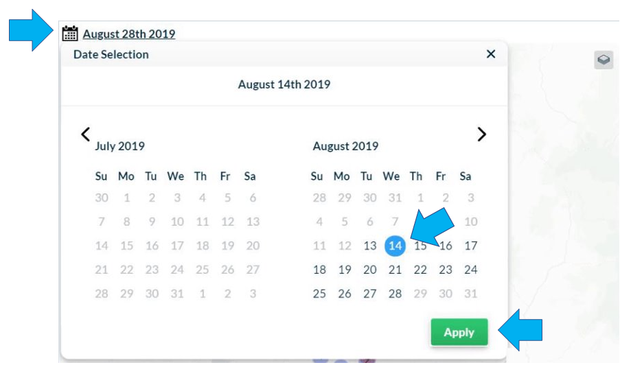
NOTE: The days displayed in dark blue on the calendar indicate that there is data available for analysis.